Re-designing a TV Network’s Mobile App Home Screen
The revamped home screen delivers a more frictionless user experience, elevates the AMC brand, and drives more conversions.
The revamped home screen delivers a more frictionless user experience, elevates the AMC brand, and drives more conversions.
Skills
Research, Strategy, Testing, UI DesignTools
Sketch, Photoshop, pencil & paperThe Challenge
After evaluating performance metrics on its mobile MVP, AMC sought to improve the app’s overall effectiveness while updating the visual style to be in line with new brand guidelines. As a starting point, I was tasked with re-designing the home screen to meet the following business goals:
- Improve discoverability (increase the number of shows and movies watched)
- Boost average time spent watching videos
- Increase conversions to AMC Premium
- Reflect new brand direction: premium, niche, sophisticated, exclusive

Role
This was a two-day design evaluation that I completed for AMC’s product director. As a solo designer, I owned the project from research through final UI design.
Process
User Research
Once I had gathered the business requirements and tested the existing app as a whole, I looked to gain some insights from actual users in order to gain a broader view of its reception and potential usability issues. I showed the screen to several other people in my network who watch at least one AMC show and took notes as they gave it a test run. Based on a combination of questioning and observations, I extracted the following key insights:
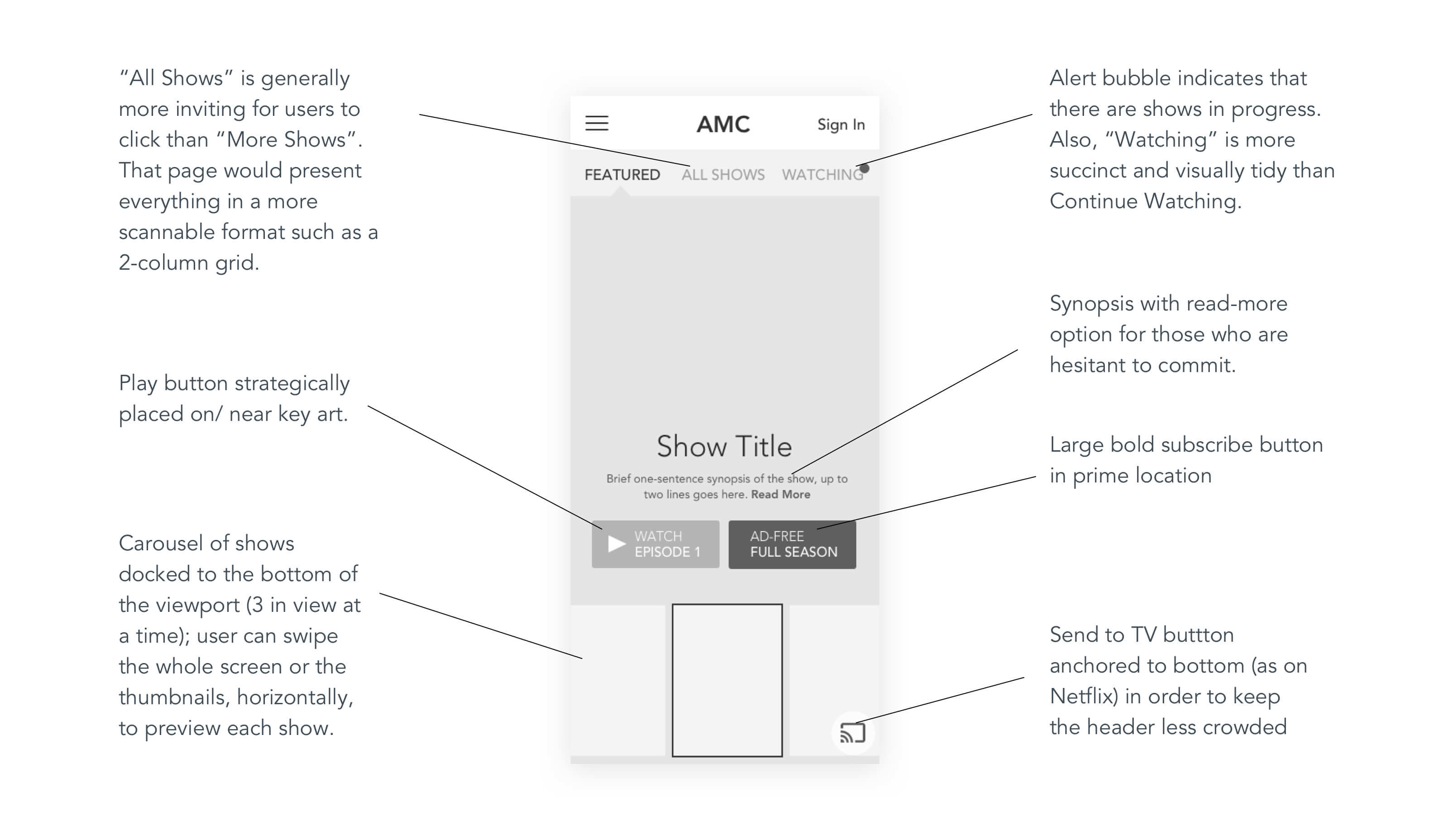
- Users appreciated the accessibility of the 3-tab navigation and felt inclined to explore this first.
- Users were unlikely to scroll down from the top of the page to view more shows because the first show takes up most of the screen.
- The Upgrade/ Watch Ad-free buttons are not visually appealing to click and look more like stickers than actual buttons.
- Users were hesitant to commit to watching a video without being able to quickly read a synopsis of the show; it was not clear to them if clicking on the background poster image would do what they wanted or expected.
- The “New: Episode X” labels confused users because they appear like buttons, but do not take them directly to the expected episode.
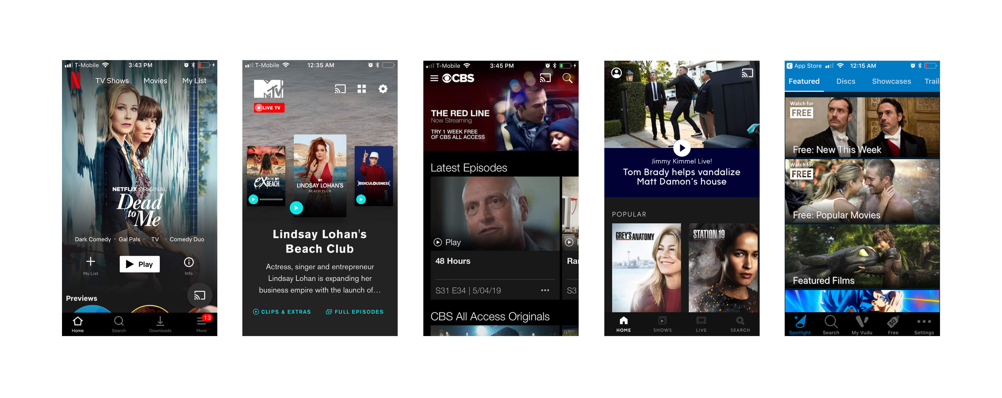
Competitive Analysis
I studied a number of related apps that stream movies and TV shows to consumers, including Netflix, MTV, CBS, ABC, Roku, and Vudu. My goal was to see what UI conventions and features were integral or useful and could potentially be adapted. However, I also paid close attention to what did not seem to work well, both from a visual and user experience standpoint. Conceptually, I liked the rotating carousel feature of MTV’s app. It offered a way to scroll through show in an engaging way. However, I found the layout and visual design choices to be more confusing than helpful.
Solution
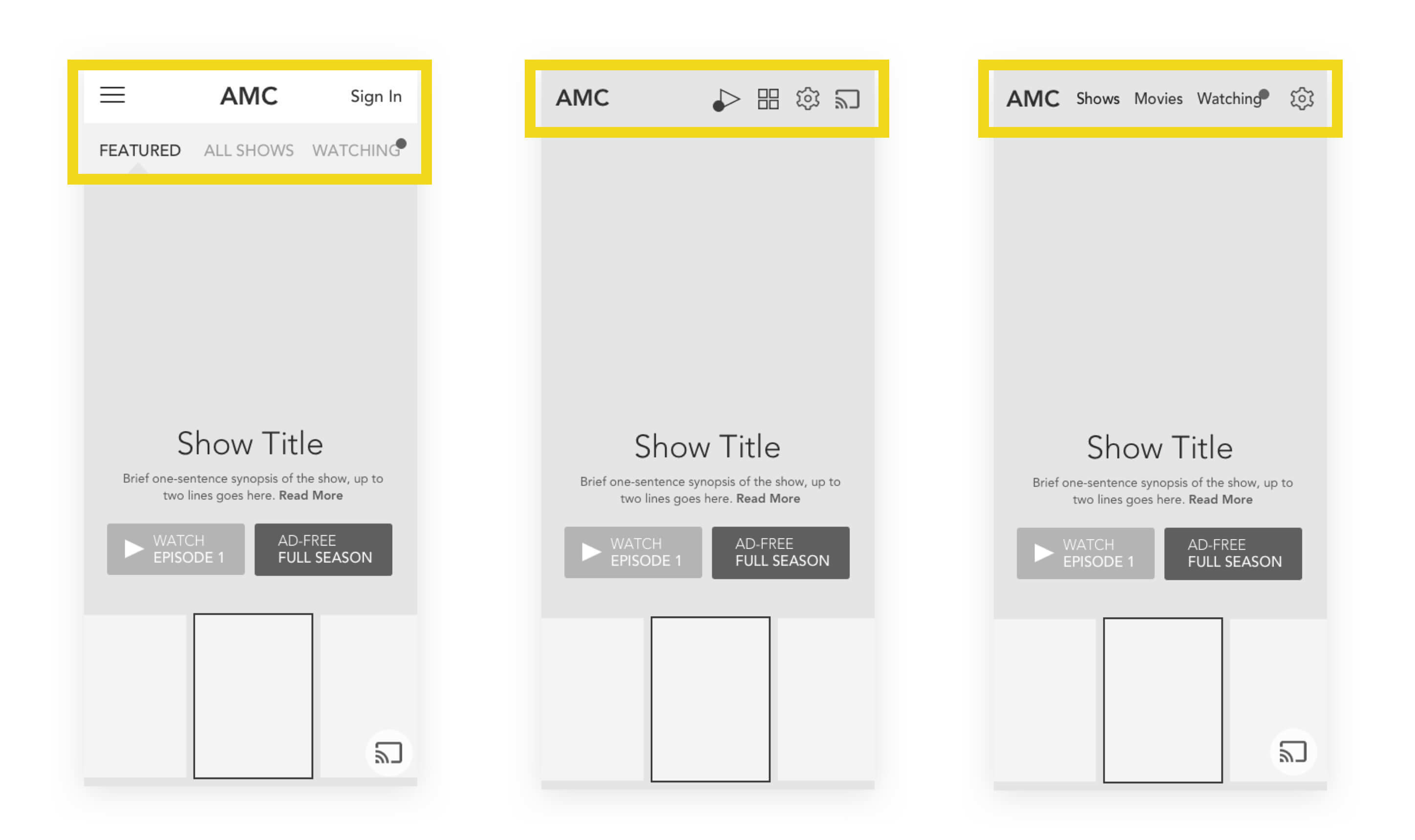
As I brainstormed ways to address the business goals and user needs while vying for the spotlight amongst potential competitors, I identified a number of key opportunities to transform the AMC homepage experience. I highlighted these opportunities in an annotated wireframe of a new design.
UI Design
After some preliminary testing of the wireframe, I created a high-fidelity mockup of the home screen, keeping the style in accordance with overall brand guidelines and ensuring that the crucial “Ad-Free” button really stood out. However, I wanted to see if it was possible to be more economical with the space at the top of the screen in order to allow the key art to stand out further, especially on shorter screens. So I decided to draw up two additional header options. The drawback to Version B is that it uses icons instead of words, which users would need to be able to discern easily. Version C is similar to Netflix’s app, so I surmised it might come across as less unique.
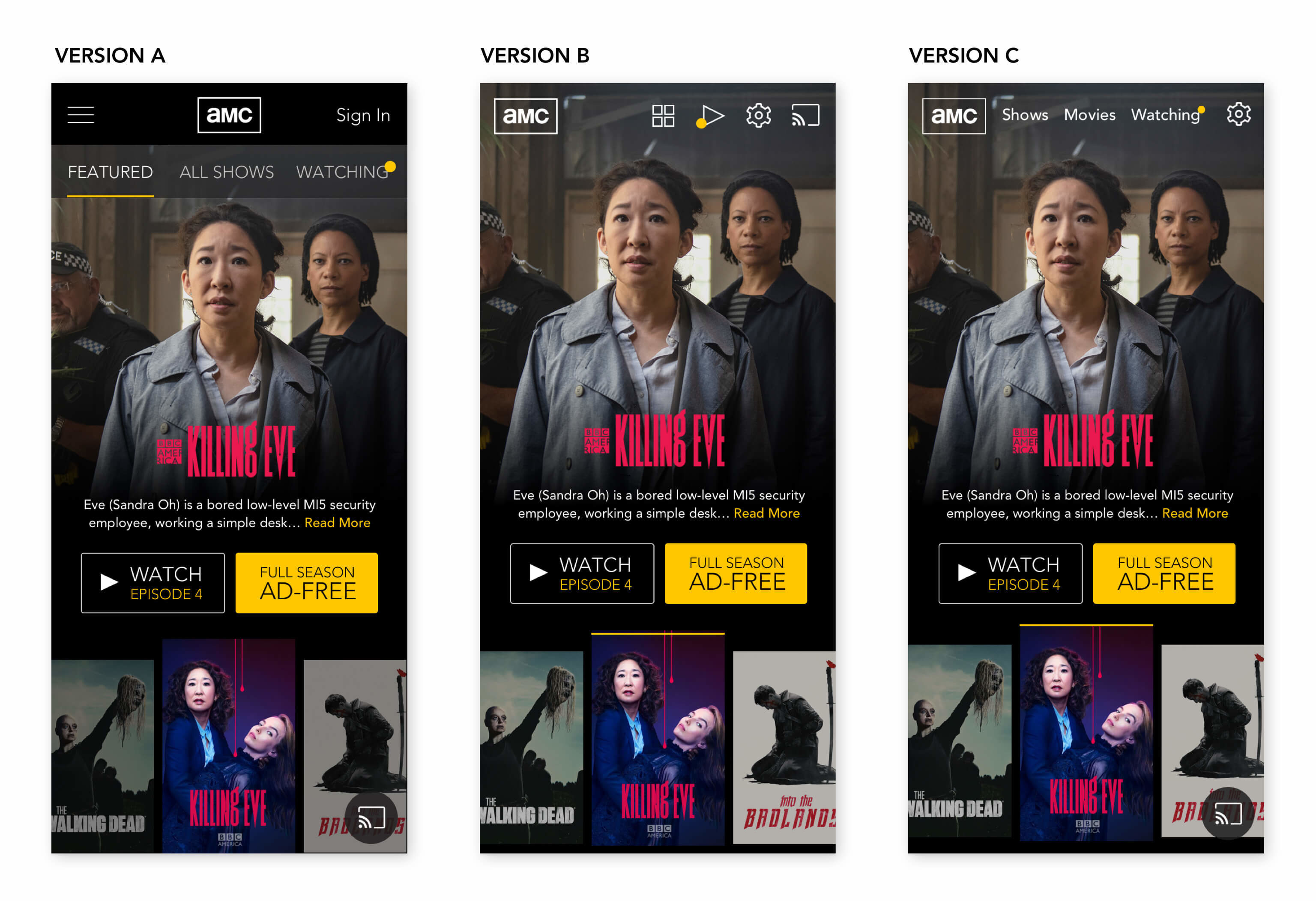
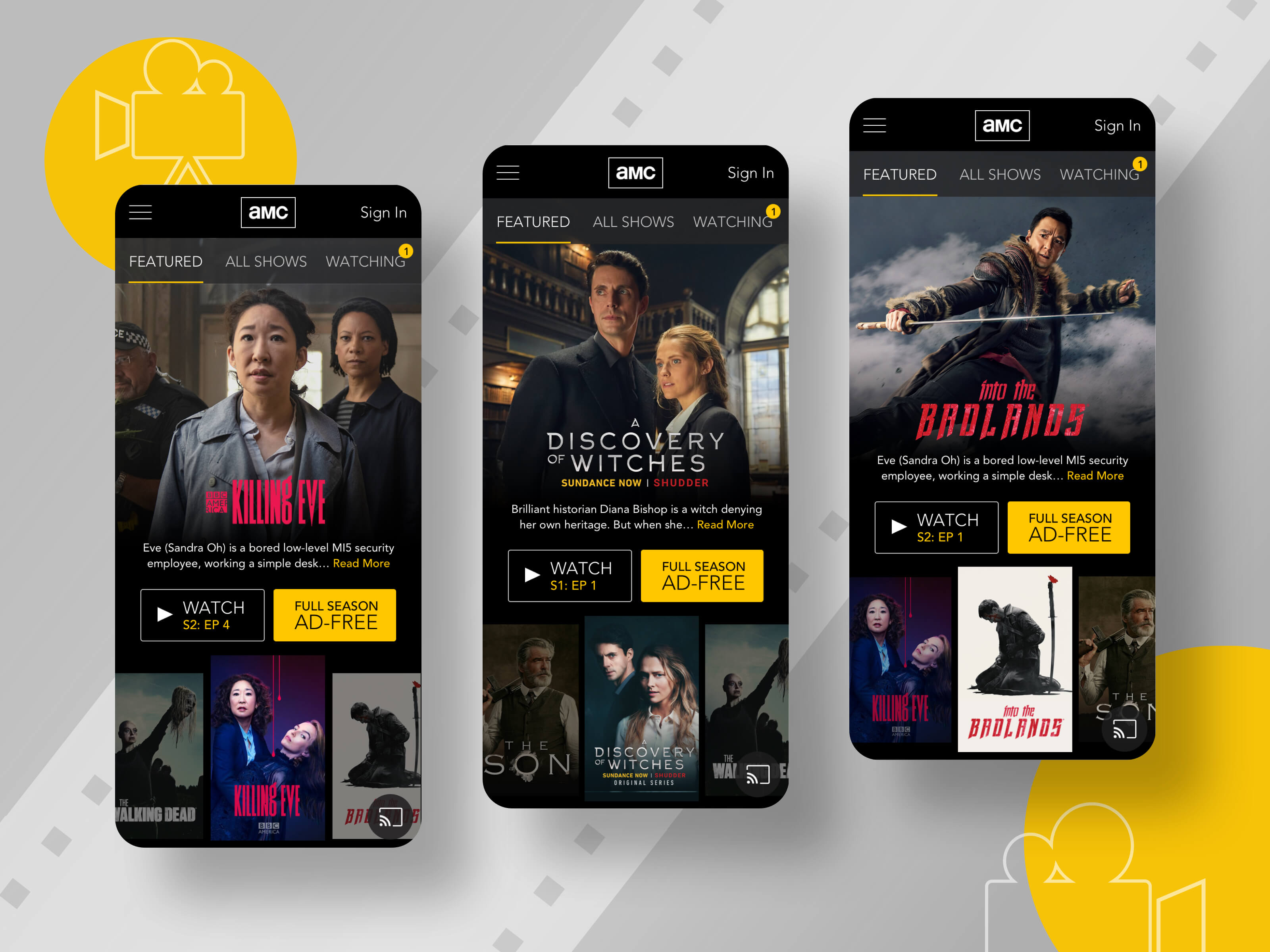
3 versions of the design that I ran through A/B testing
User Testing
I tested all three versions of the design with users from my original research group. Overall, they saw them as a big upgrade from the current home screen. Users preferred Version A overall as they felt it was a “stronger” header and liked seeing the logo and navigation centered. Version B was their least favorite because the play arrow icon was not easily cognizable. In addition, they raised a few additional points of confusion:
- The yellow dot denoting shows in progress was not easily understood
- Users wanted to be able to either choose an episode of a show or watch it from the beginning
Since Version A was the favorite, I focused on making tweaks to that version as follows:
- Replacing the yellow dot with a slightly larger number bubble
- Indicating the Season # inside the Watch button. (This would be programmed based on which episodes the user already watched)
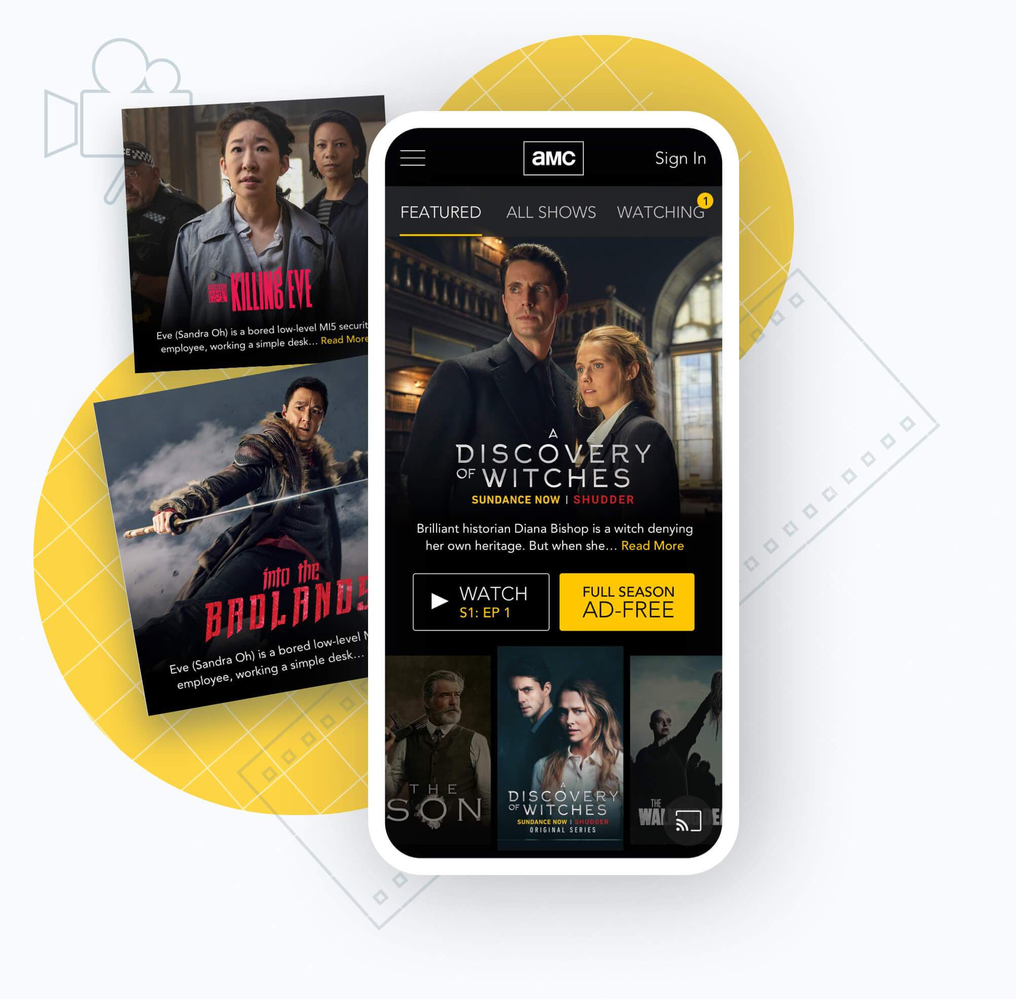
Outcome
The final screens show multiple states of the home screen carousel with different shows featured.