A proposal for a revamped bikeshare system
BikeNYC re-envisions New York City’s service with a user-friendly touchscreen dashboard for unlocking bikes and an enhanced mobile phone app.
BikeNYC re-envisions New York City’s service with a user-friendly touchscreen dashboard for unlocking bikes and an enhanced mobile phone app.
Skills
Research, Strategy, Interaction Design, Prototyping, UI DesignTools
Sketch, Illustrator, Photoshop, pen & paperThe Challenge
I received a design brief for the project by a freelance agency as part of their screening process for UI/ UX design talent.
Design the interface used on a service that provides city bikes on subscription. This will be multiple device, as well as a pickup and pay dashboard located with the bikes. Take advantage of upcoming technologies—voice or face recognition—or utilize any ideas around security for a user to have fewer steps from arriving to getting on a bike.
Role
Over a period of 3 weeks, I owned the entire UX design process end to end, including:
- Product & User Research. I examined and analyzed existing bike share systems and apps and conducted research in the field.
- Interaction Design. I re-imagined the user experience of renting a bike while borrowing from existing conventions that have been proven to work. I created rough sketches and wireframes of the dashboard and app, and a low-fidelity rendering of the bike dock.
- UI & Visual Design. I developed a visual aesthetic and a set of high-fidelity mockups showing different states of the dashboard and app.
Process
Market Research
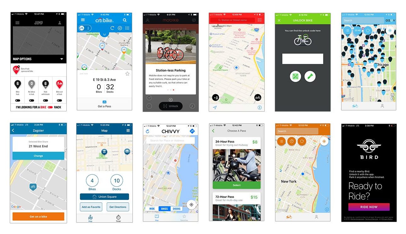
I studied different bike share systems currently on the market, including the mobile app interfaces that customers use to manage the process of reserving and locating bikes. I also looked at the technical components driving these systems.
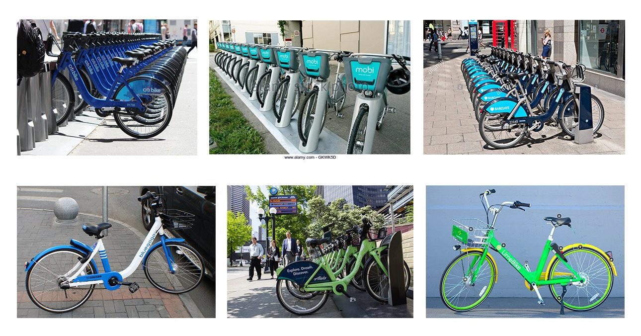
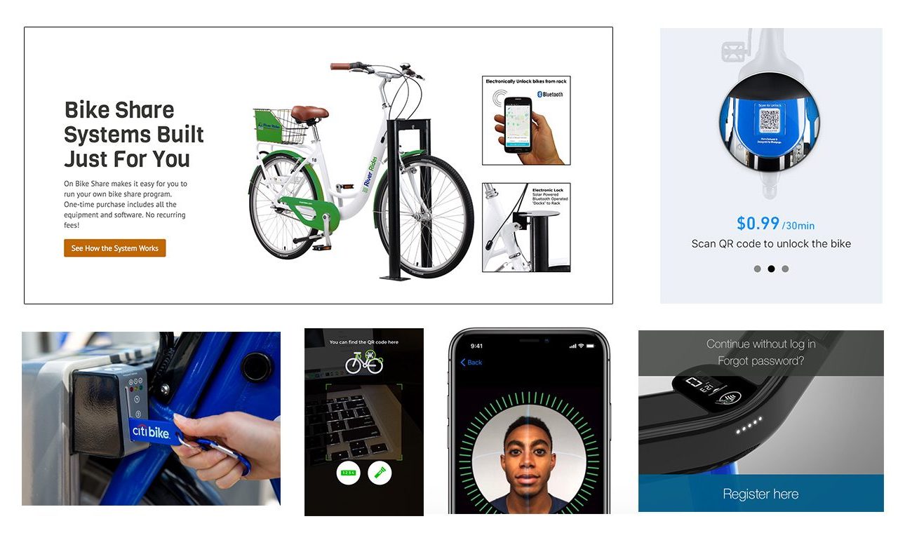
At the time of this writing, big cities still favor designated stations for picking up and returning bikes. The stations have kiosks (usually one per station) and mechanical key-code activated locks on each bicycle dock. Smaller communities and independent services, on the other hand, are exploring “station-less” bikes that can be parked anywhere and unlocked with bluetooth technology or a QR code scanner. The latter option is more convenient and less expensive to deploy, but critics in the larger cities such as New York have argued that it allows for too many bikes to clutter the city. They also cite that companies developing the dock-less security systems are still new and unproven.
Mid-sized cities like Columbus, Ohio are taking a hybrid approach. They are keeping the official bicycle “stations” at designated locations but forgoing the centralized kiosks which can be a pain point for customers (Younger riders who are accustomed to services like Uber enjoy the convenience of hitching rides from their phones and have little patience to wait in line at a kiosk).
Face and voice recognition tech can potentially save a bit of time and effort for repeat customers, but initializing a profile for the system to read can be time-consuming for newcomers. QR-code scanning was another option, but has known security flaws and risks. Numerical access code systems are universally easy to comprehend and have already proven themselves to be successful for bike sharing on a large scale. I favored this option, but I wanted to see if such a system could be improved as far as usability.
User Research
At the outset of this project, I was not familiar with how the process of bike sharing worked. So I downloaded New York’s CitiBike app, signed up for a day pass, and went out to test-drive the system. In addition to getting on a bike and going for a ride, I observed and talked to pedestrians as they went about unlocking and docking bikes. The typical user in Manhattan is young to middle-aged and in good shape physically. They are hipsters or working professionals who want more control over their commutes and have been riding CitiBike for a while, so they have generally grown well accustomed to picking up their bikes, to the point that they did not report trouble spots or grievances in the process. However, I wondered if the experience was the same for first timers like myself…
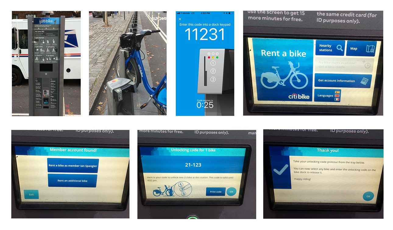
My Experience Unlocking a Bike
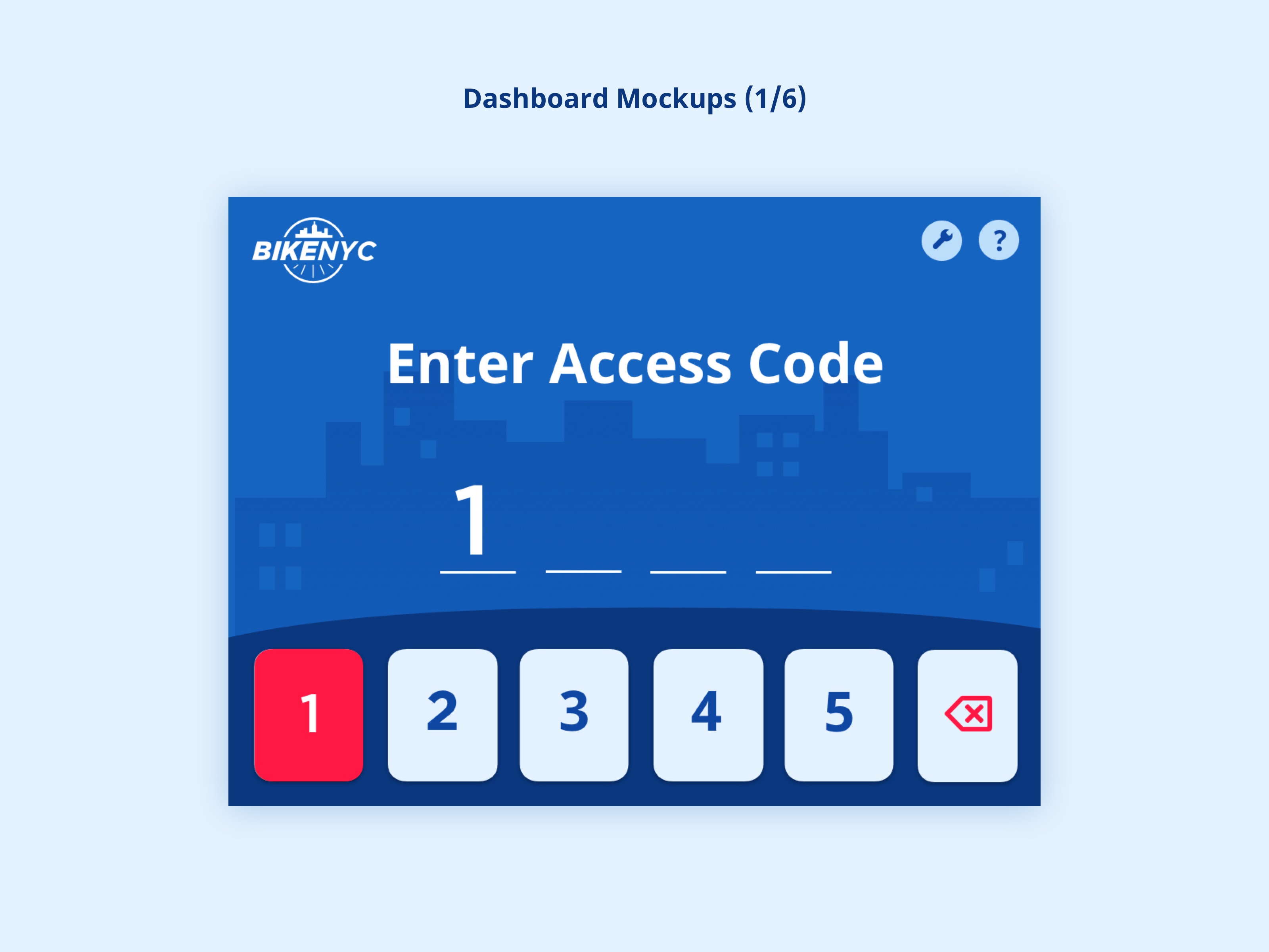
I found CitiBike’s smartphone app to be one of the most intuitive of the many that I tried. I was able to subscribe to a plan and request a code to unlock a bike without any real trouble. Where I encountered a few pain points and saw potential for improvement was in the process of unlocking the bike. Each bike dock has a mechanical lock with a small 3-button panel (1-2-3). The buttons are completely flat and have a light color that does not stand out against the panel, so they are not instantly recognizable as buttons. I had to enter a 5-digit code from my phone’s screen in the correct sequence without the aid of any beeps or success sounds.
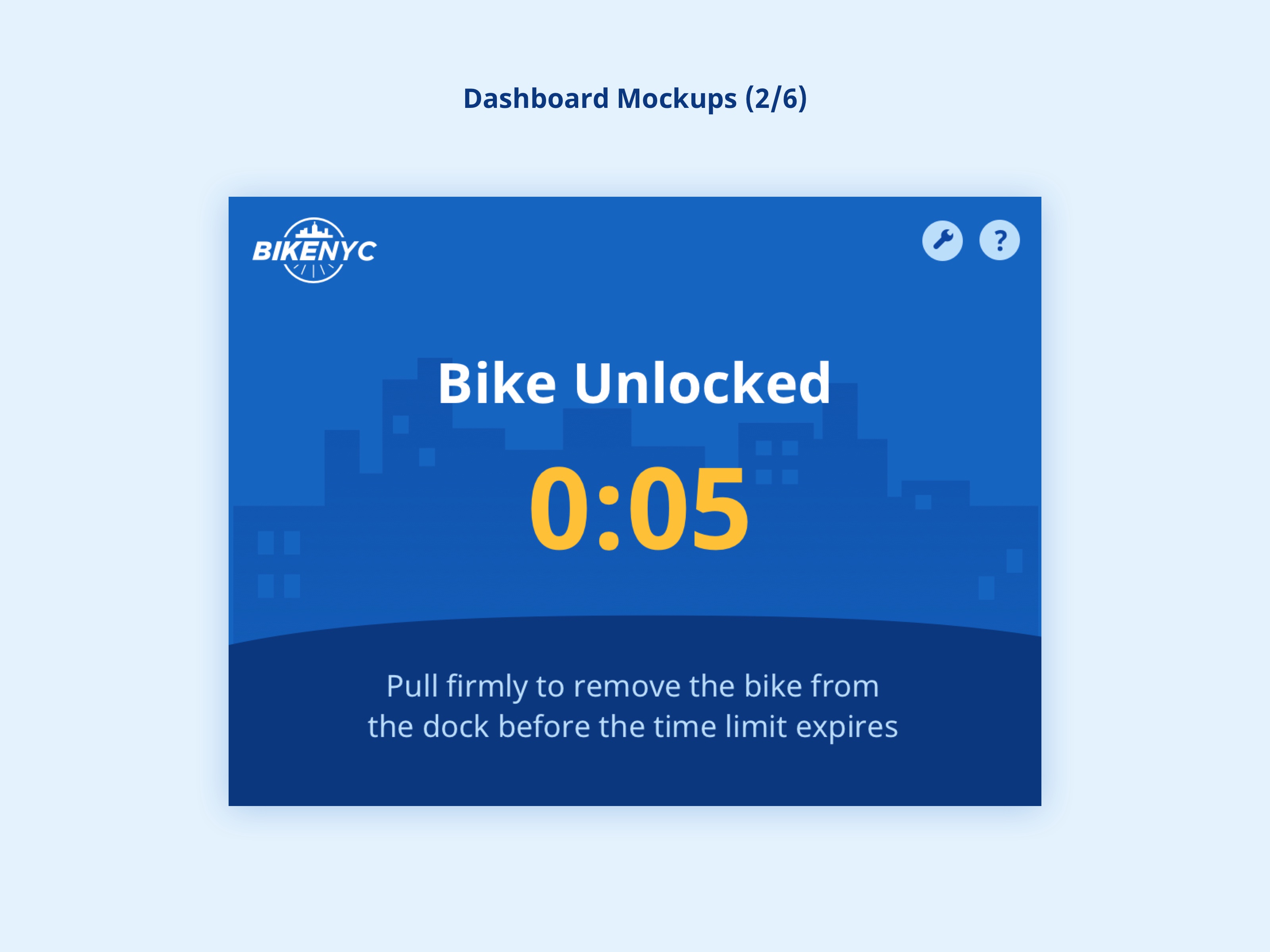
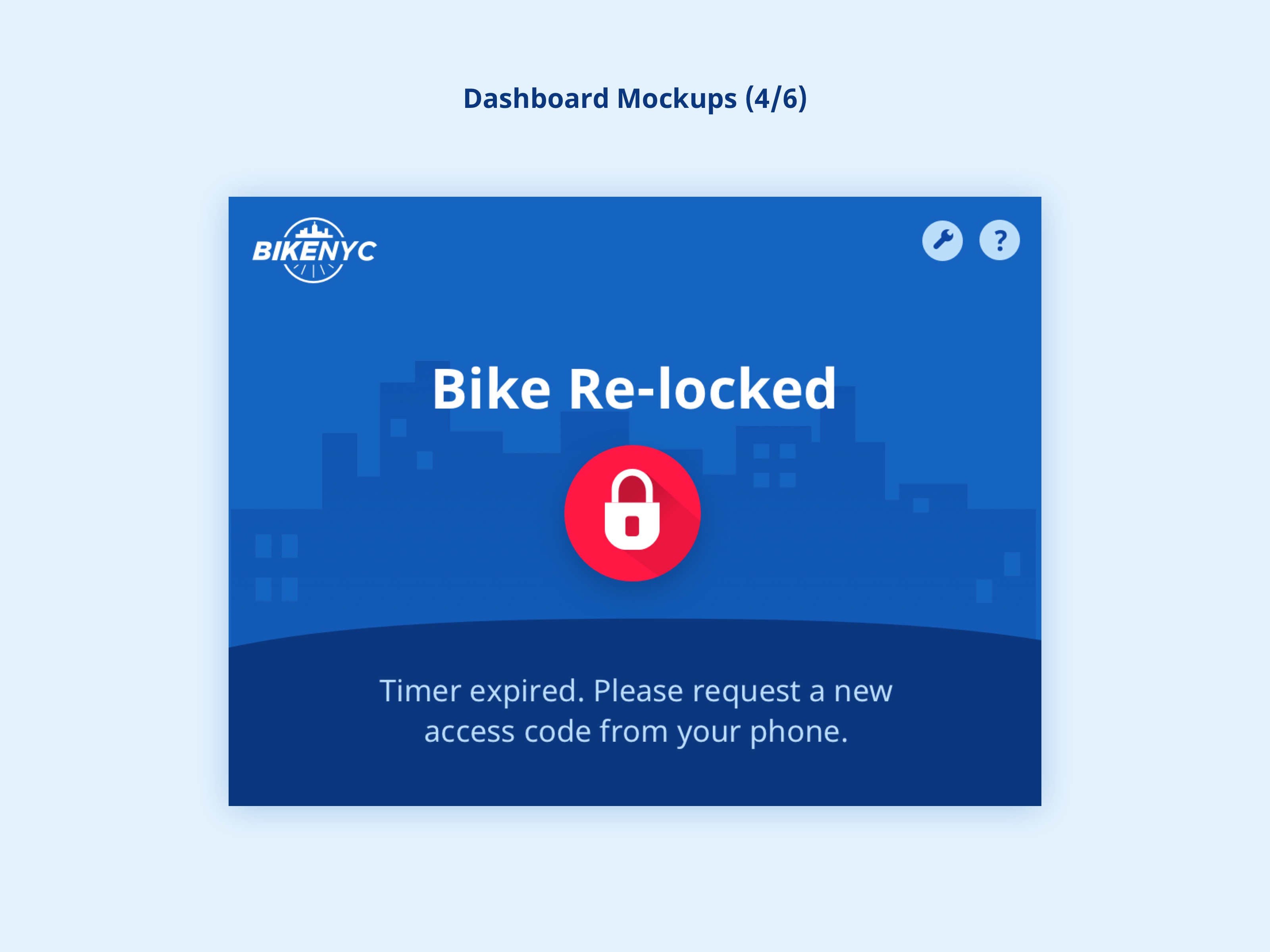
Above the panel, a light changes from red to yellow to green once the final number is correctly entered. When I did this, I tried to remove the bike while the light was still yellow, not aware that I needed to wait for it to turn green. When it finally turned green, I decided to take my time because I was initially having trouble dislodging it. However, there is a five-second time limit after which the bike gets re-locked, and I ran out of time! So I was forced to start over by requesting a new code from my phone and re-entering it. I figured that the lack of instructions near or on the dock itself might be a problem for new users, especially if they don’t remember them from the CitiBike website or the kiosk.
Based on my observations and experiences, I decided to forgo the regular standing kiosk in my system’s design and focus on enhancing the dock itself.
Solution
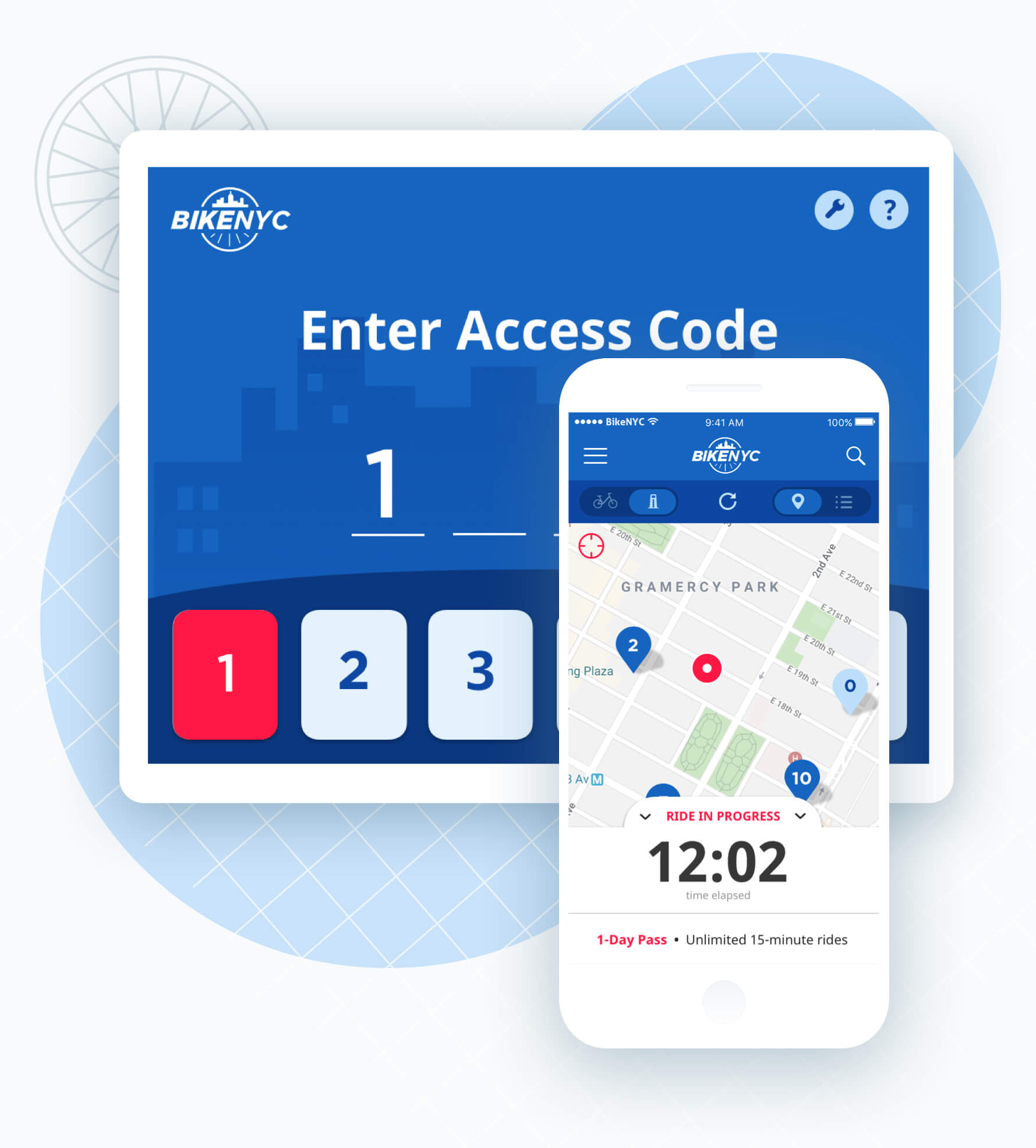
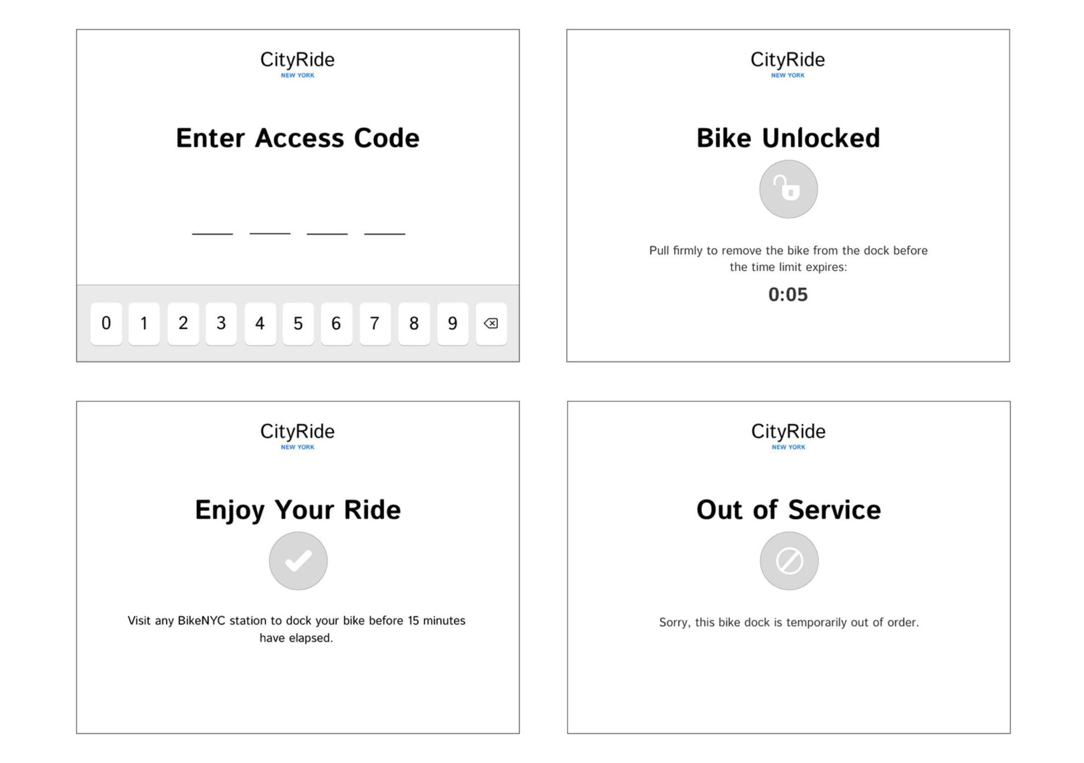
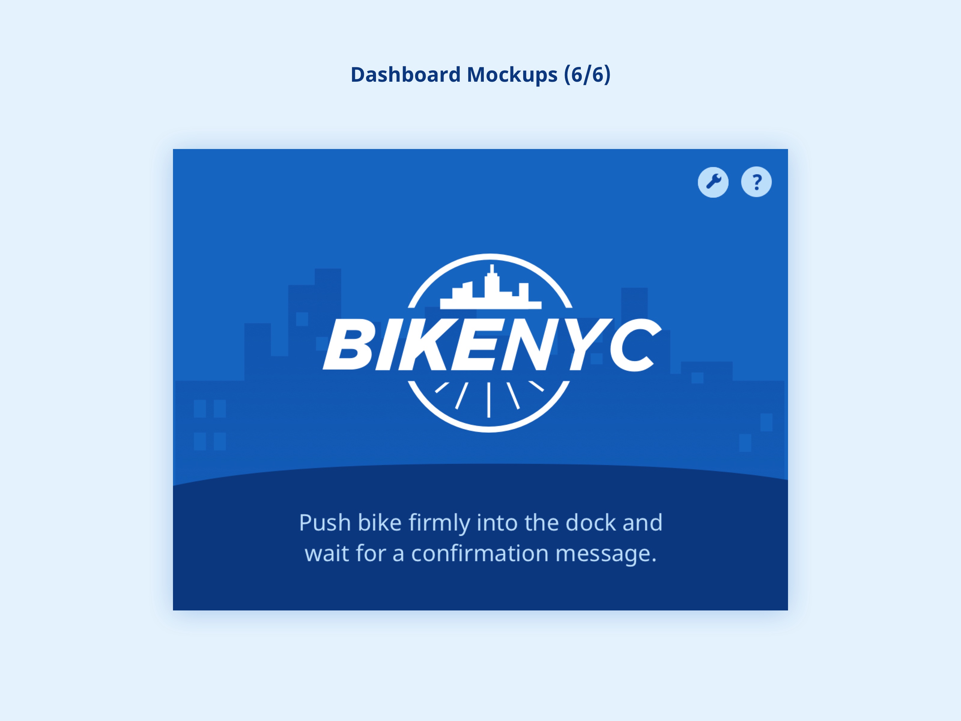
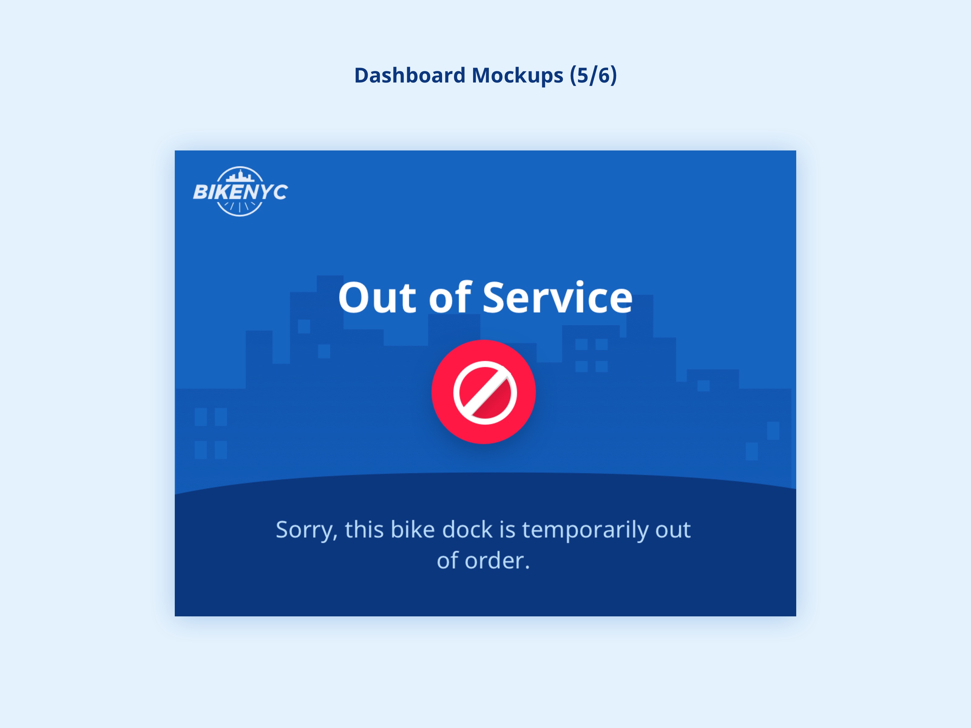
The solution I devised features a new dock design with a small digital dashboard installed at the top. It allows users to enter their access code intuitively and get instant feedback during the process of unlocking a bike.
The system’s companion mobile app borrows conventions from other successful bike share apps like CitiBike, but introduces a few enhancements.
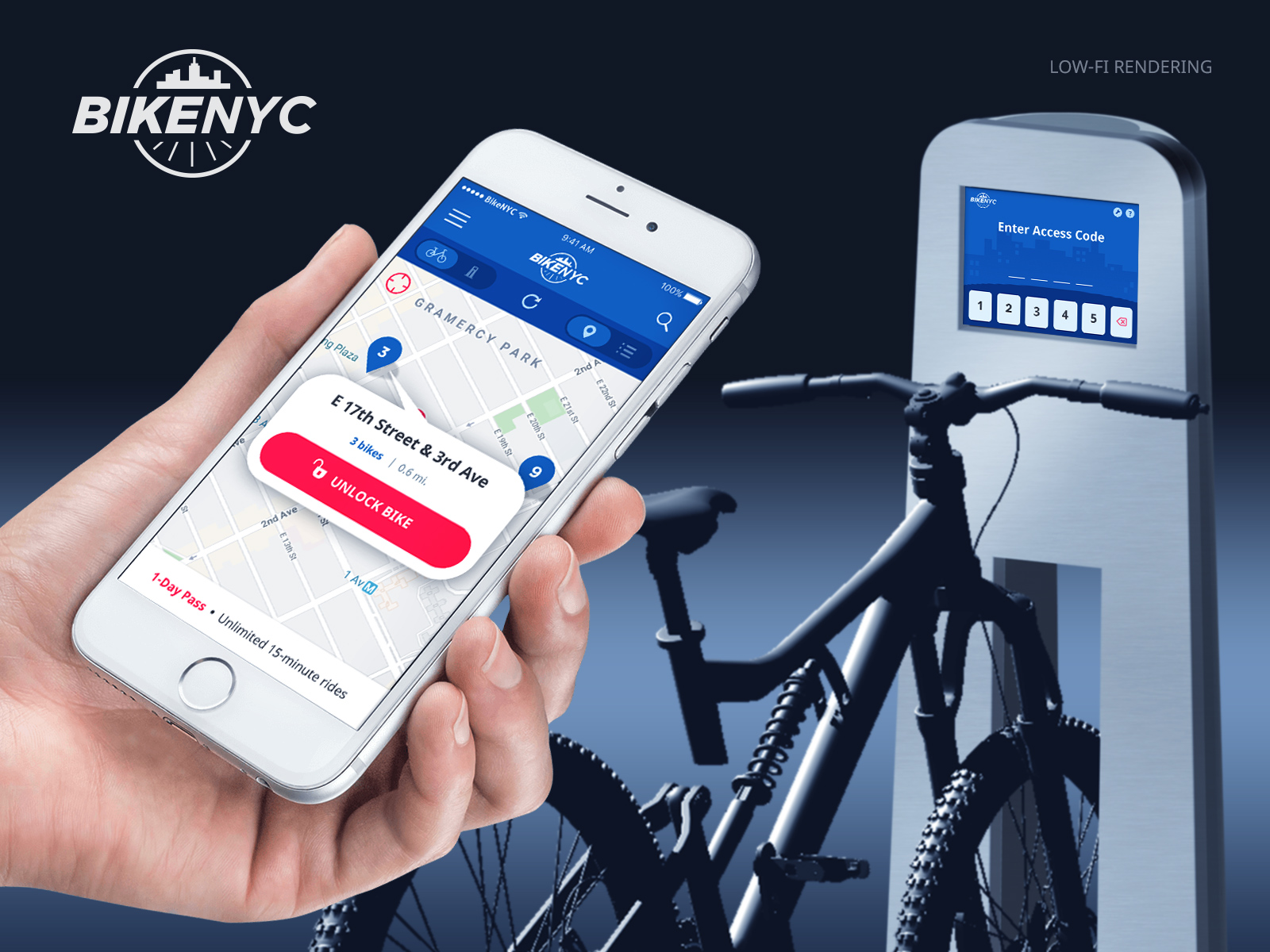
A low-fi, approximate rendering of the system’s components – bike, dock, and app.
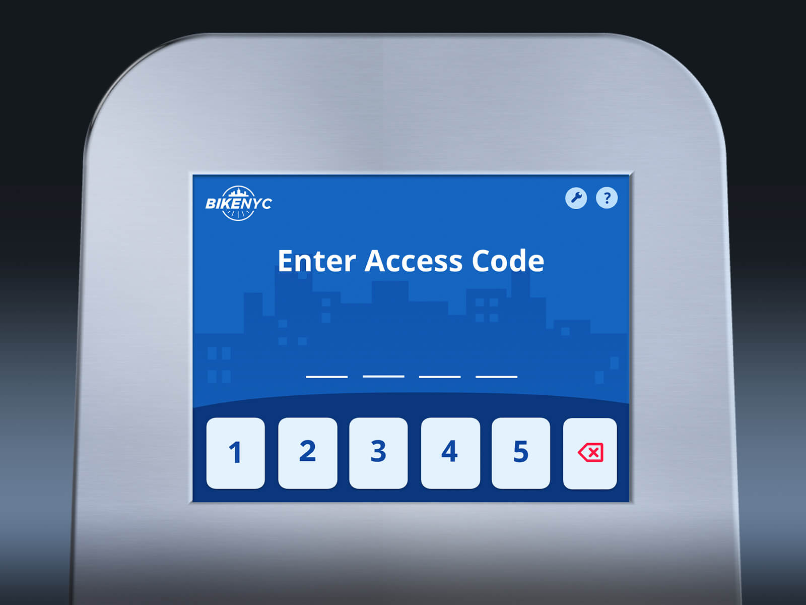
The dashboard screen would measure approx. 6″ x 4.5″
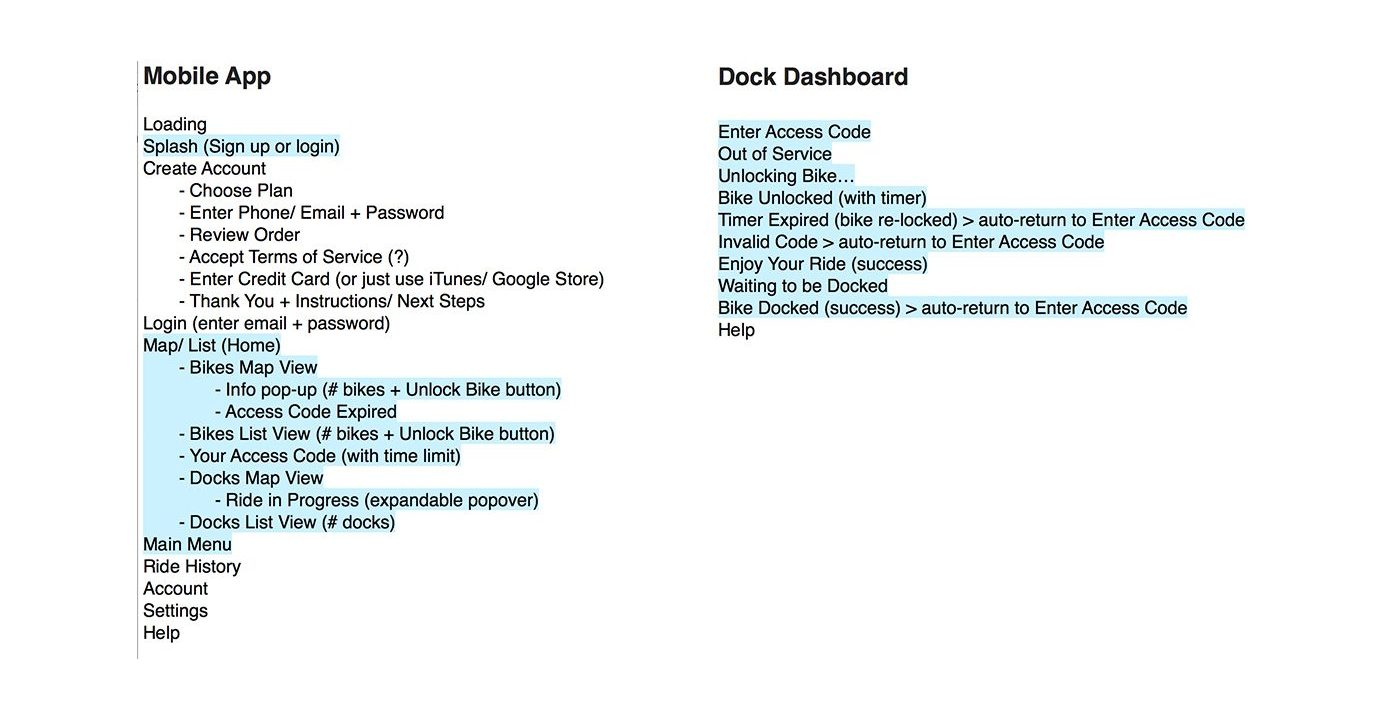
Architecture Outline
One of the first steps I took in my design process was to draft an outline of the architecture for both the mobile app and dashboard. While the outline covers all of the major user flows and states, I limited the scope of my prototyping to the key experiences of finding, unlocking, and docking a bike.
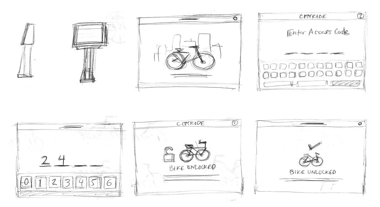
Sketches
I drew preliminary rough sketches of the dock/ dashboard and app on paper to quickly test out different interface ideas.
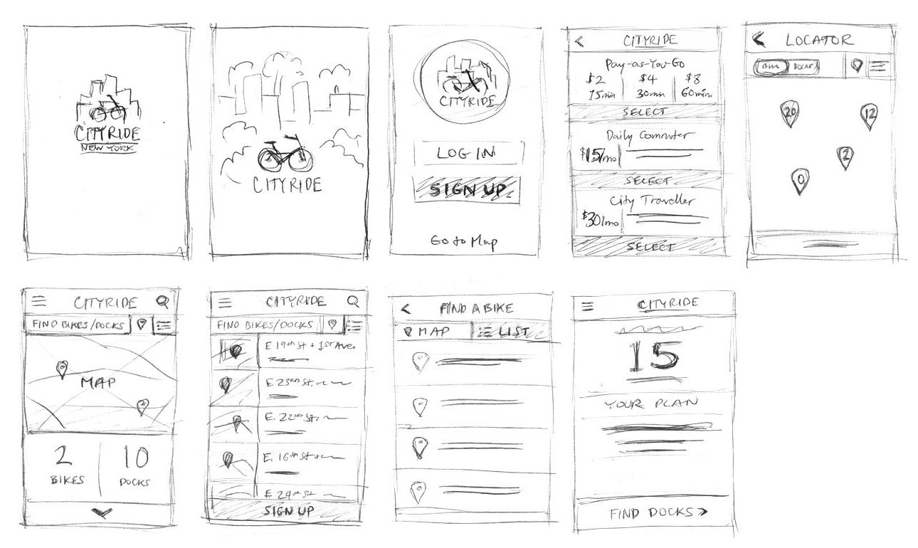
Wireframes
My ideas became more refined as I rendered wireframes of the dashboard and app in Sketch. Features of the dashboard that emerged clearly during this stage included:
- A prominent keypad for entering an access code
- Ability to delete numbers entered accidentally
- Error message shown when entering an incorrect access code
- Timer shown immediately after bike is unlocked
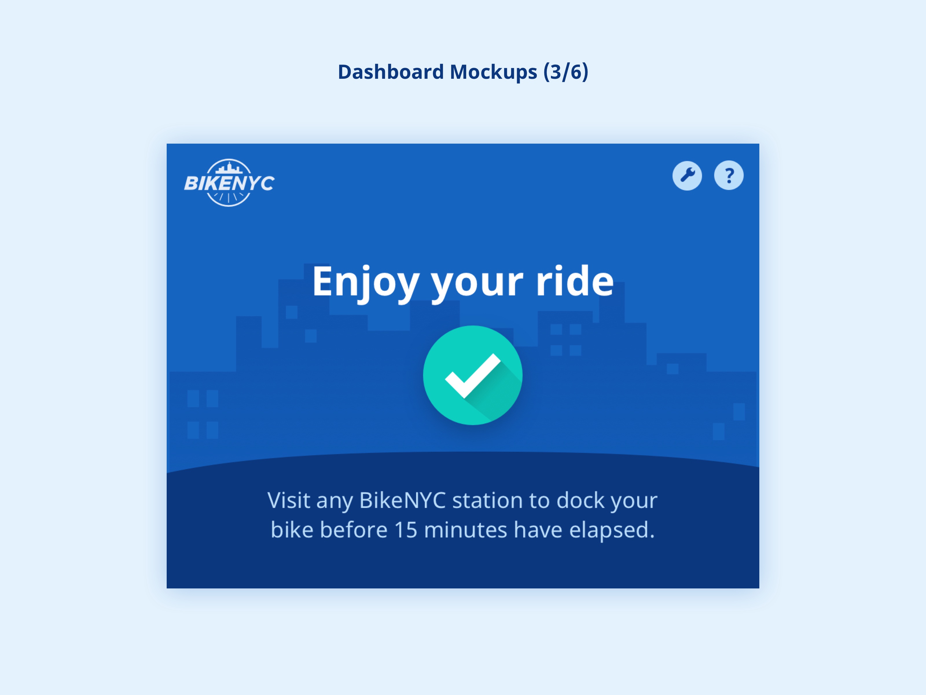
- Success message shown immediately upon removing the bike from the dock
- Color-coded status icons with explanation text
Outcome
High-Fidelity Mockups
I began to consider color and contrast in this stage. One of my priorities was to keep the style modern and friendly, conforming to Google’s Material Design guidelines, and ensuring that the key interactive elements and messaging really stand out.
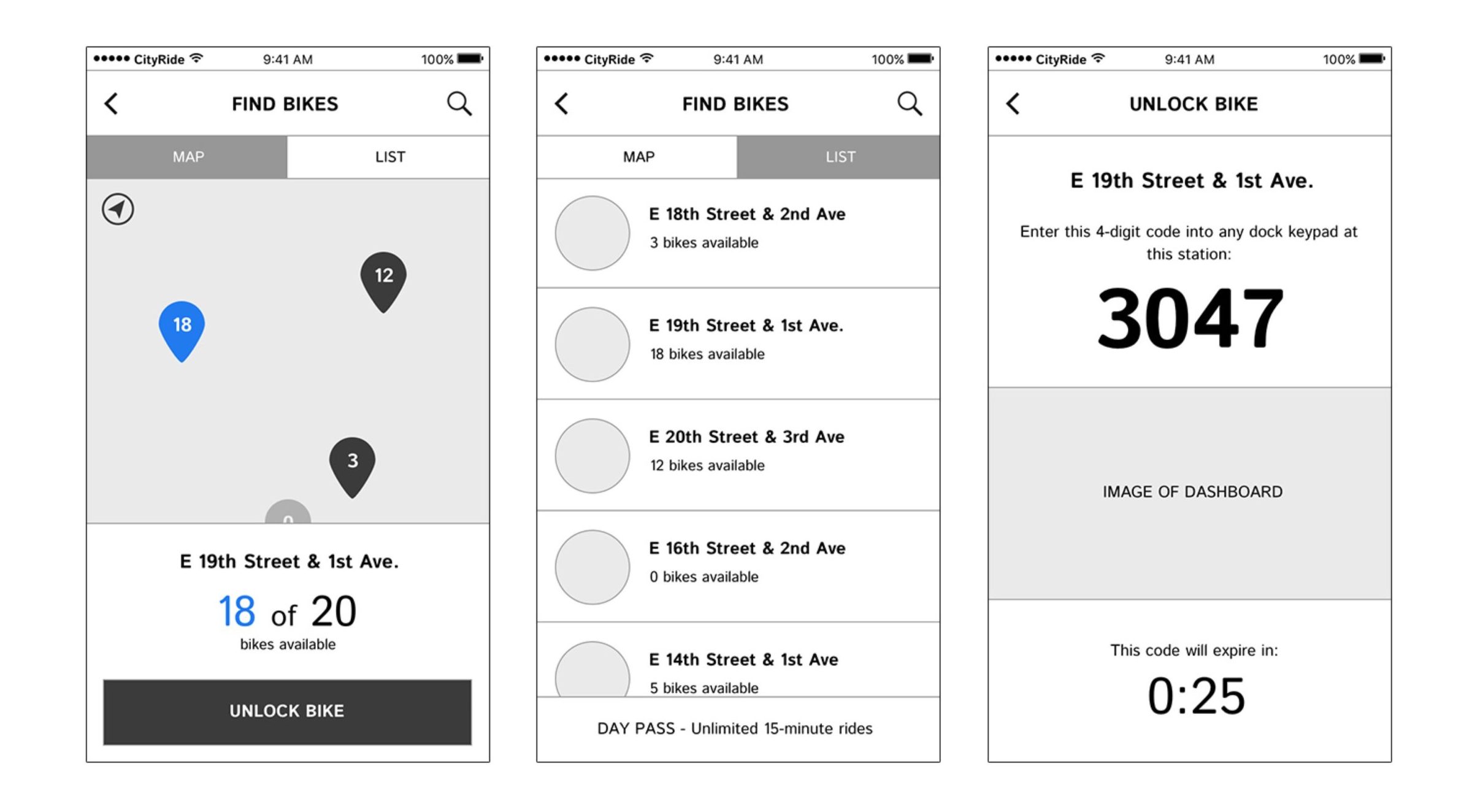
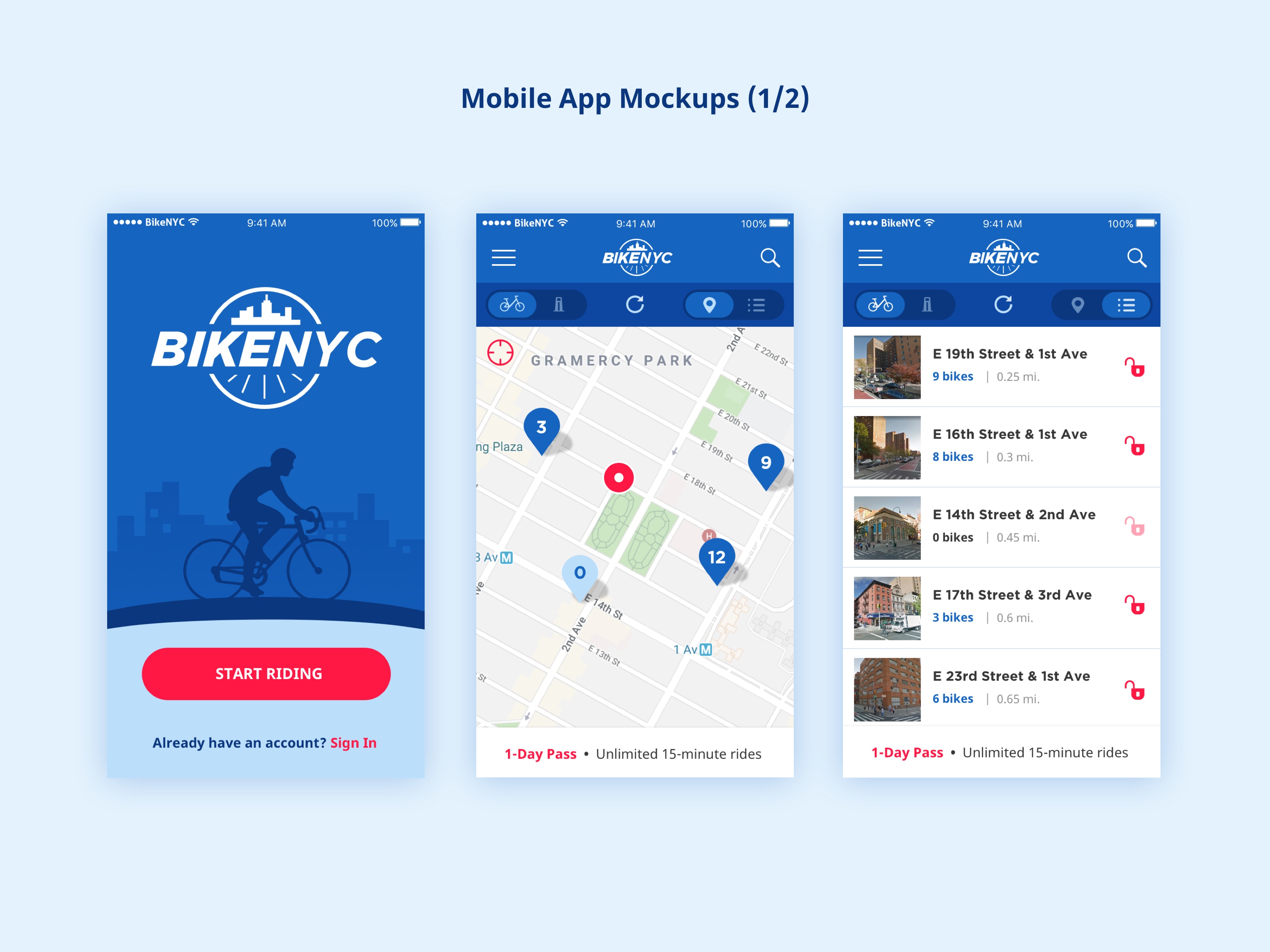
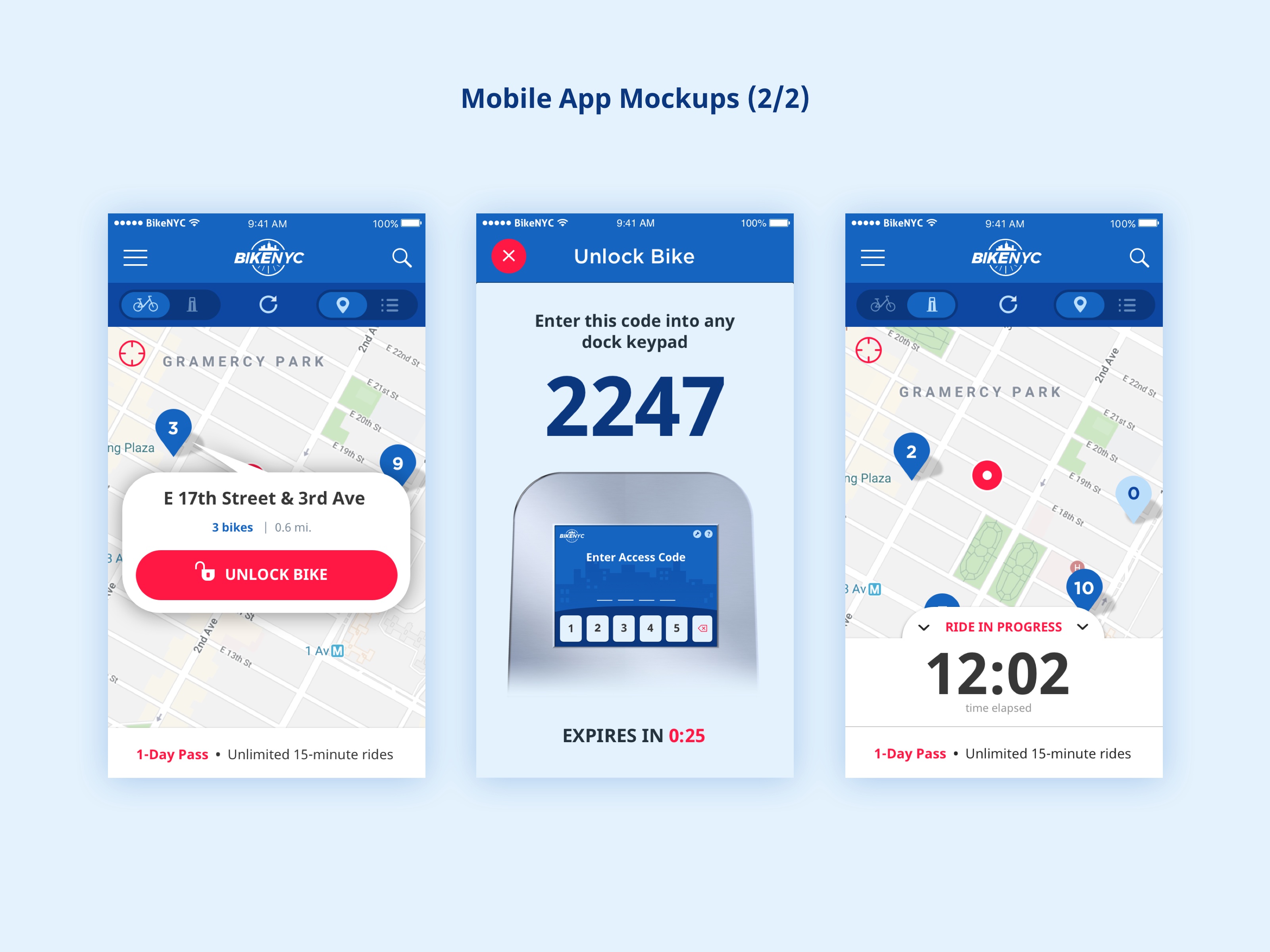
I designed the mobile app’s interface to borrow from CitiBike’s best features and UI which I deemed to be largely successful, but with a number of improvements, including:
- List/ Map view toggle for both bikes and docks, with ability to unlock or dock a bike from either view.
- Google Maps street views shown in List view
- Current subscription plan displayed as a reminder when navigating
The following are selected views of the dashboard and app that I designed in Sketch.
Future Steps
My next step would be to collaborate with an industrial designer to refine the form of the bicycle dock. I believe that size, materials, and other physical specifications are an important part of the experience and overall feasibility. I would also create mockups and prototypes for the on-boarding flows and continue to iterate on the app design through usability testing and product-emotion evaluation evaluation.