A smartphone app for better one-to-one coaching
Coach+ enables freelance tutors, advisors, sports coaches, and their clients to connect, schedule one-on-one meetings, and share organized notes in one convenient place.
Coach+ enables freelance tutors, advisors, sports coaches, and their clients to connect, schedule one-on-one meetings, and share organized notes in one convenient place.
Skills
Architecture, Research, Strategy, Prototyping, Testing, UI Design, BrandingTools
Sketch, Figma, pen & paper, restickable glueThe Challenge
A number of people in my network are part-time independent tutors or coaches. They rely on their smartphones to keep in contact with clientele, especially when they are on the go. I noticed that their ways of conducting business via their digital devices was deficient, so I designed this mobile app to improve the way in which they communicate with their clients.
Role
This was a part-time personal side project that I pursued for several months. As a solo UX designer, my activities included user research, comparative analysis, strategy, information architecture, prototyping, testing, and interface design.
Process
User Research
In interviews with several tutors and coaches, I uncovered several key motivators and issues in their work.
The more experienced and established coaches did not prefer coaching newbies or dabblers and wanted to attract more committed, long-term clients. They were also reluctant to take new clients on very short notice.
Some of the athletic coaches I spoke with liked to encourage further learning by sharing notes and video clips over text messages with their clients. They wished they had a better way to organize the notes so that clients would not easily forget them.
Some of the coaches’ scheduling systems for setting up lessons were ad-hoc or antiquated, and not mobile-friendly.

User persona of a coach
After synthesizing my research and mapping out a week-long user journey, I identified some key opportunities:
- Make it simpler and more efficient to convert clients for follow-up lessons.
- Discourage clients from requesting lessons on short notice.
- Create a reliable space for coaches to document and organize feedback or notes and make these easily accessible to the client.
- Allow coaches more control over which clients they take on.
Ideation
I used the S-C-A-M-P-E-R method in tandem with free brainstorming to generate ways to shape the opportunities into specific smartphone features. The core feature concepts that came out of this process included:
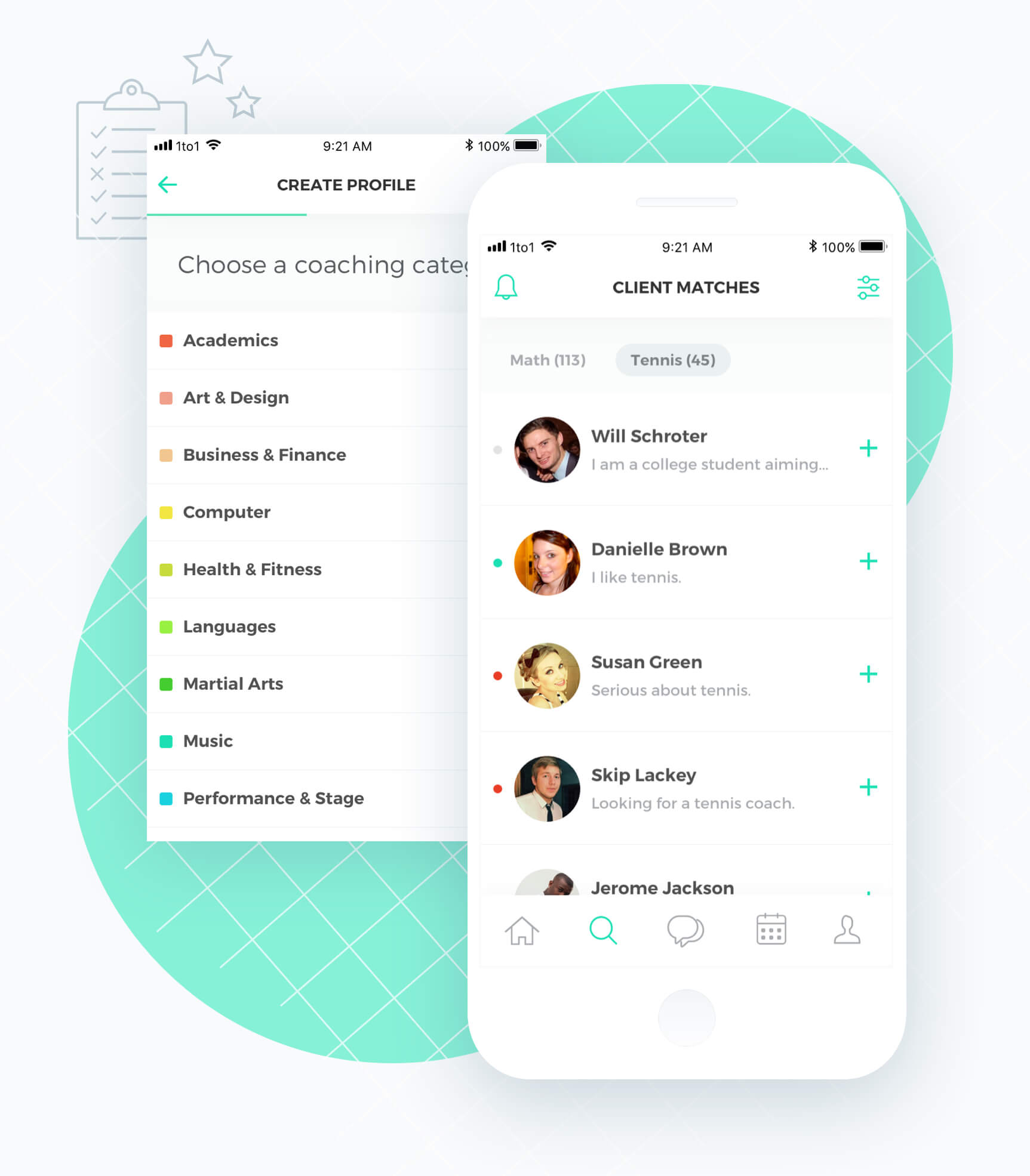
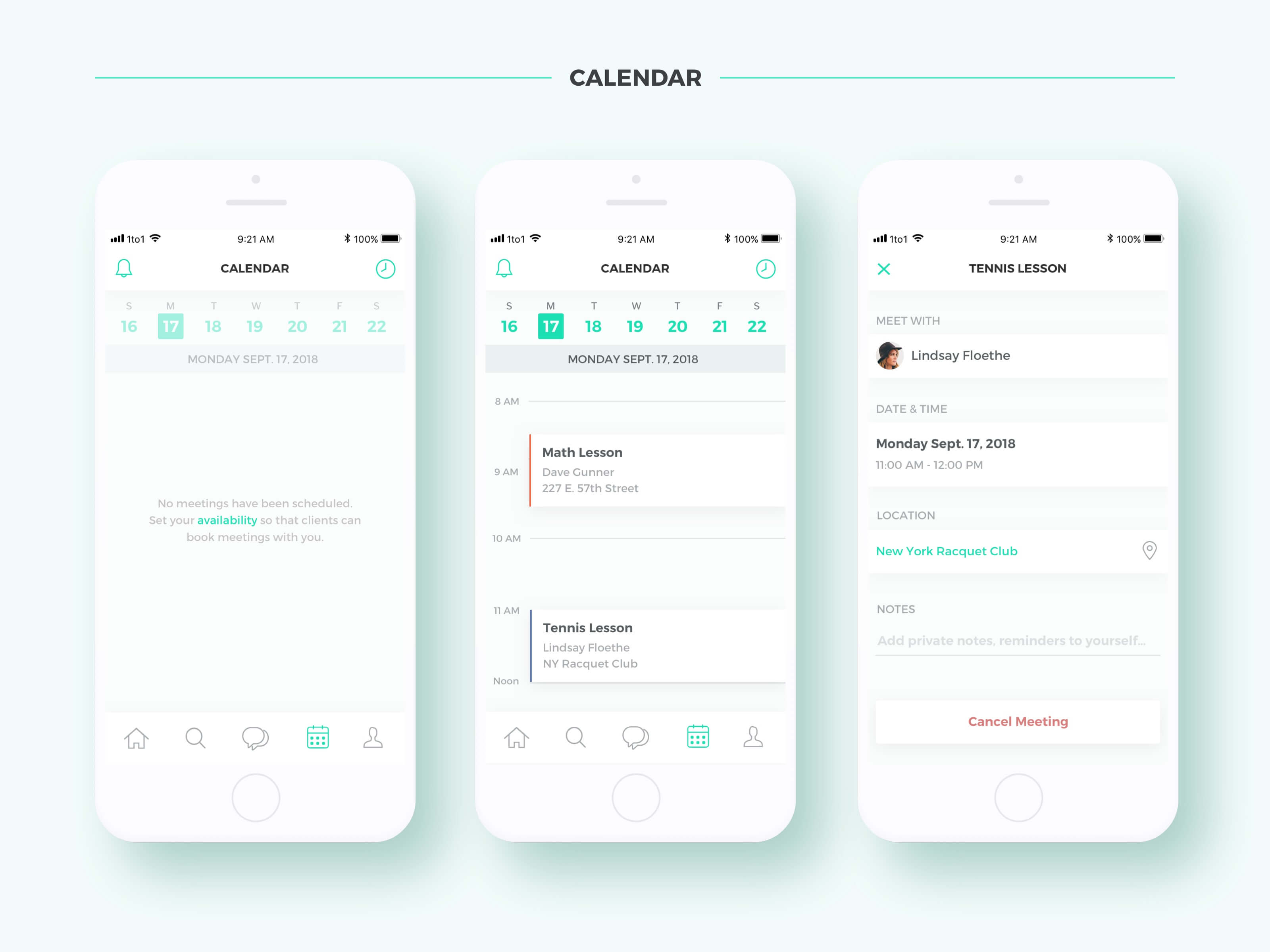
- A modern, mobile-friendly calendar and scheduling system with built-in reminders for lessons.
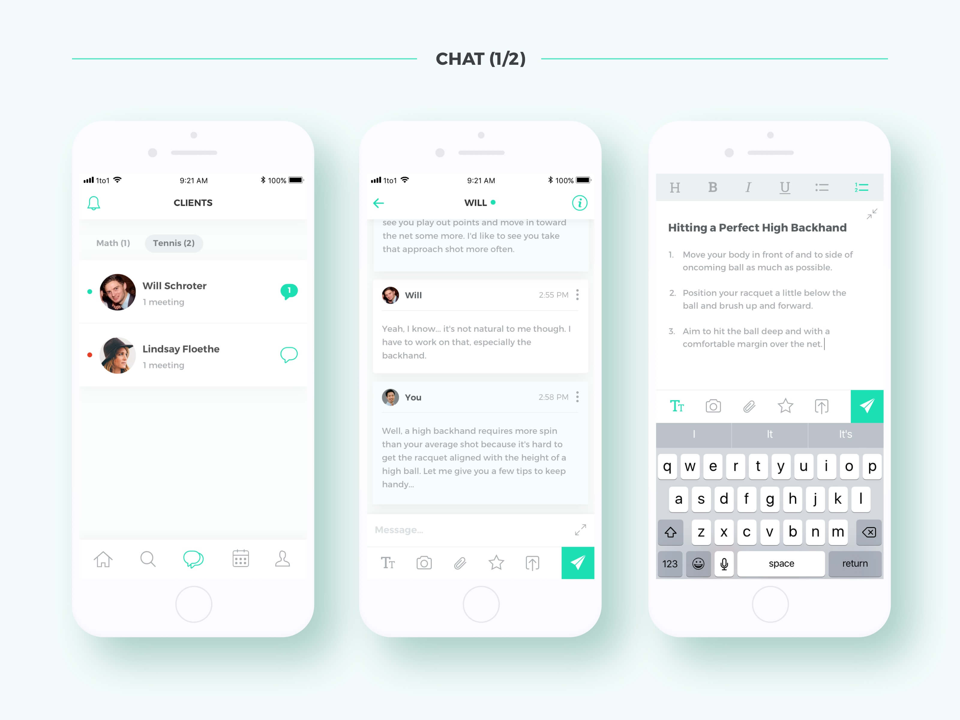
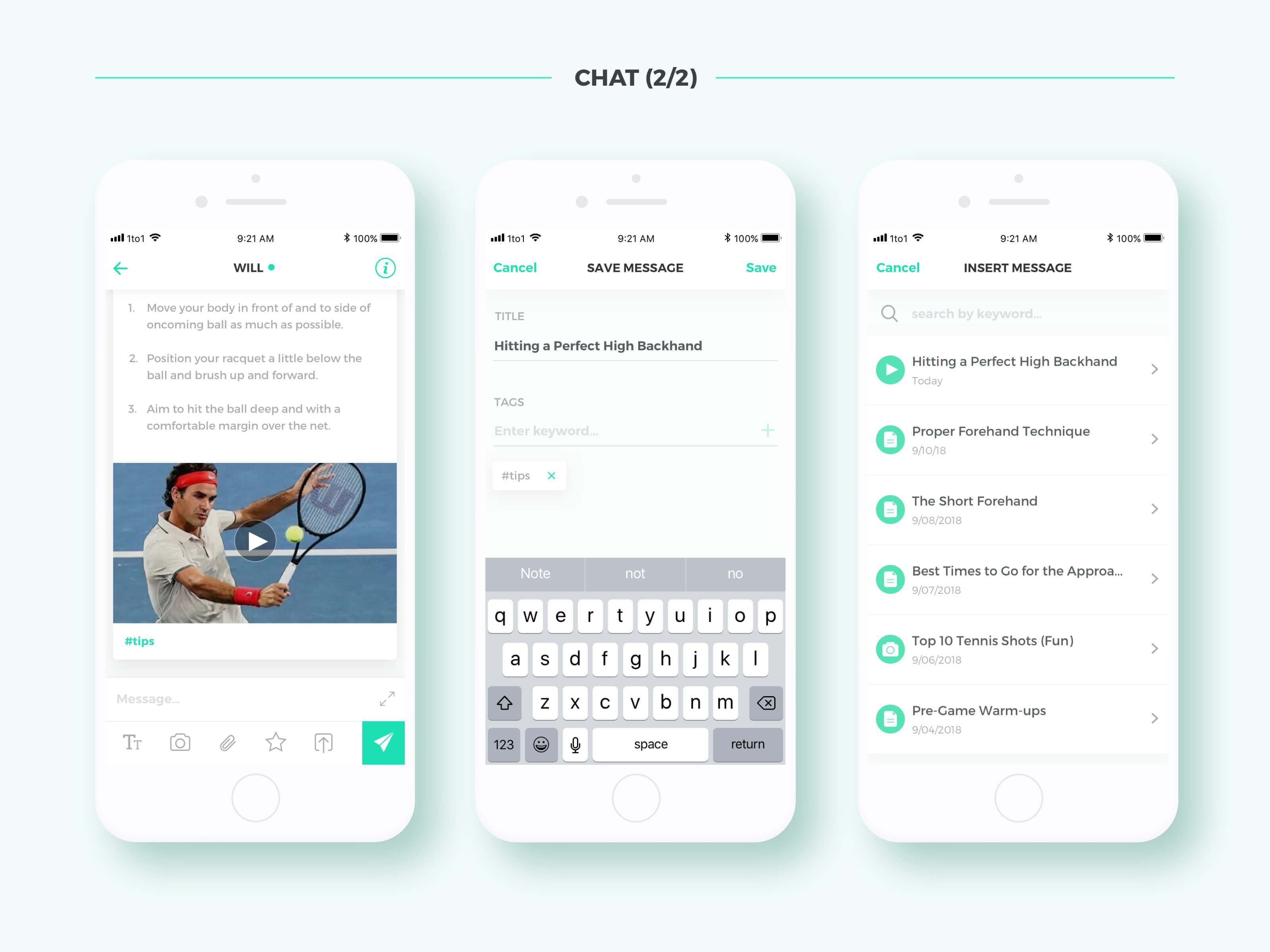
- A rich media messaging system for coaches to easily create formatted messages and to tag them into organized threads for the client to review later.
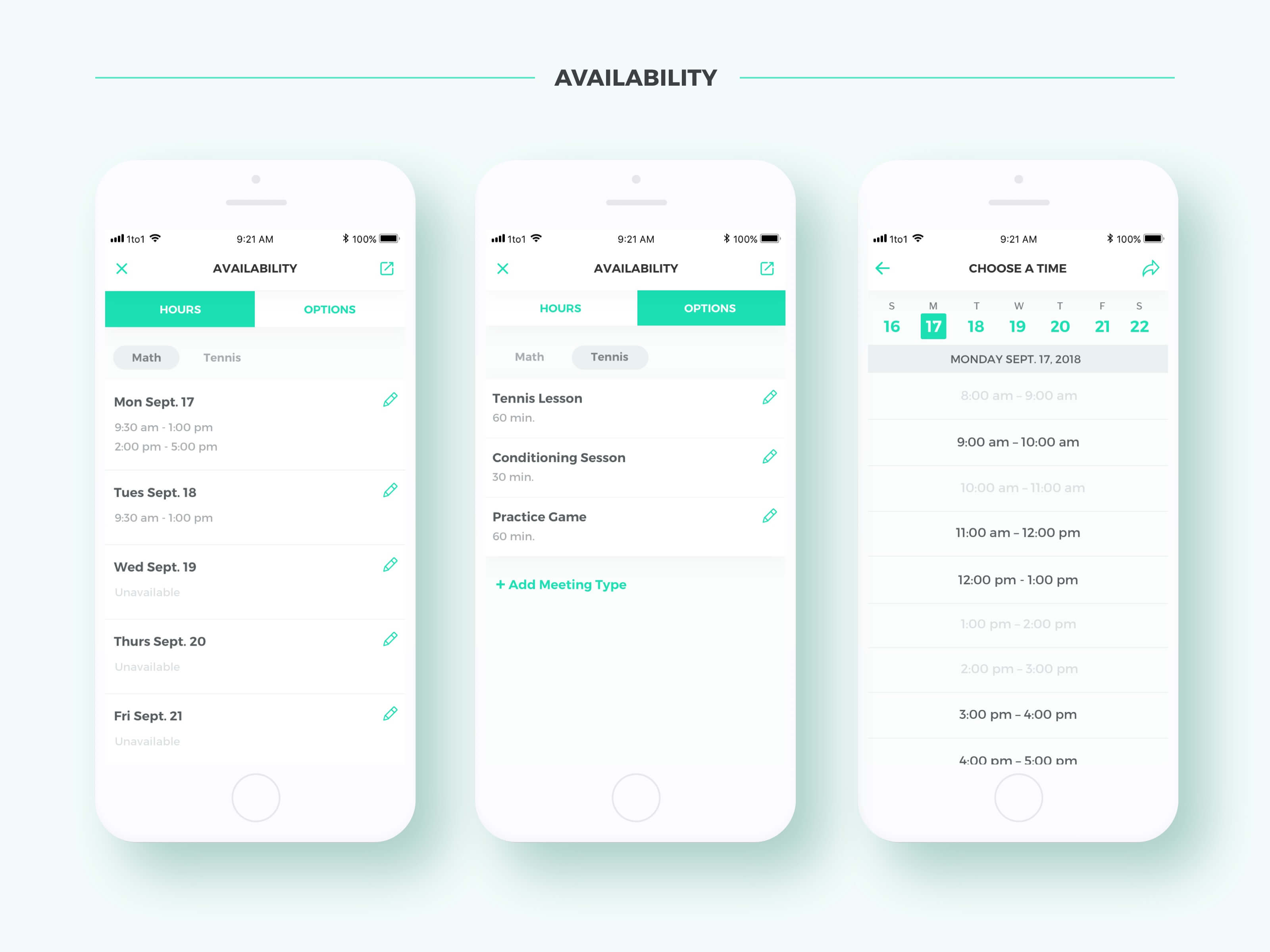
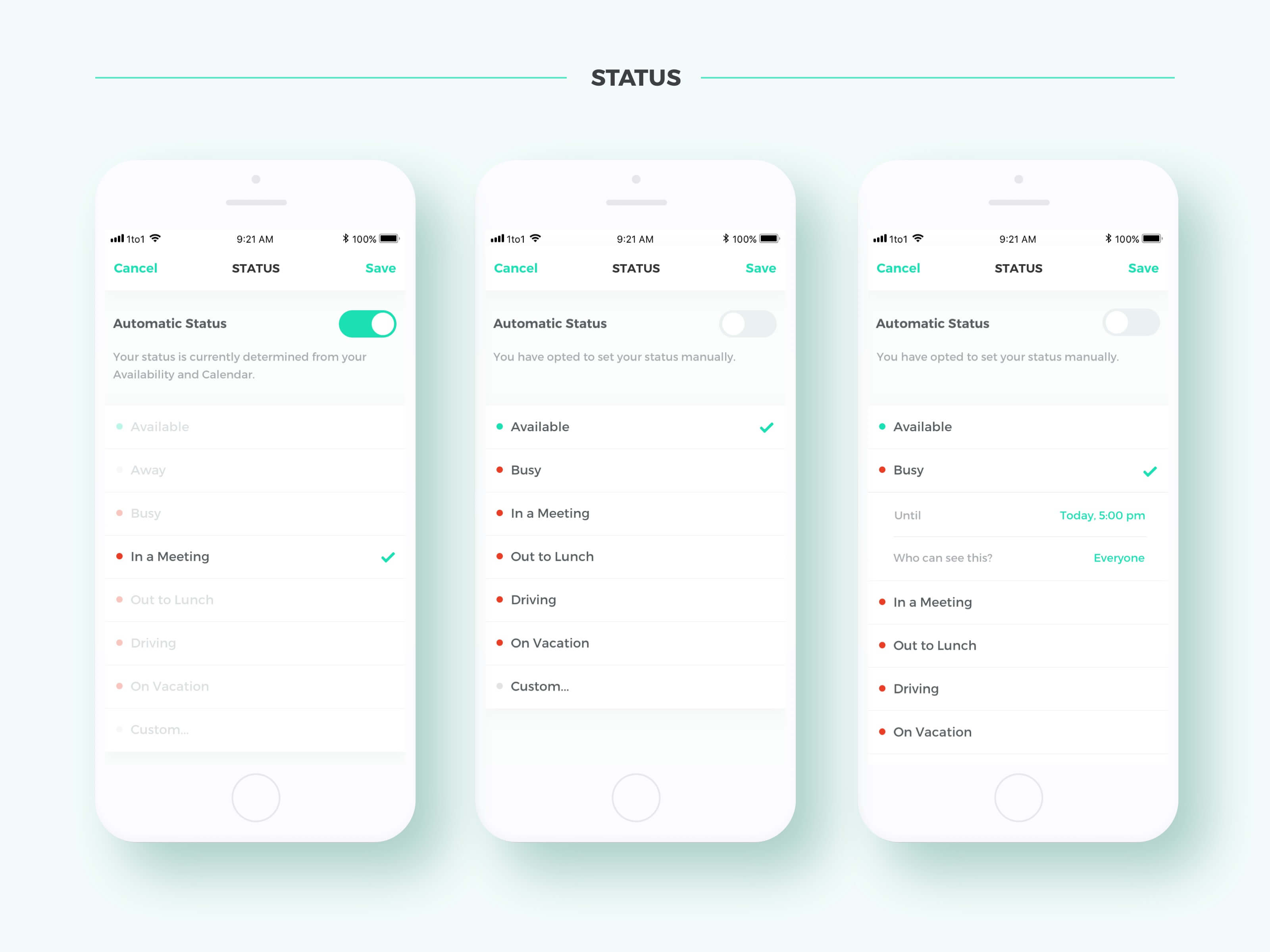
- Options for coaches to set their availability and status.
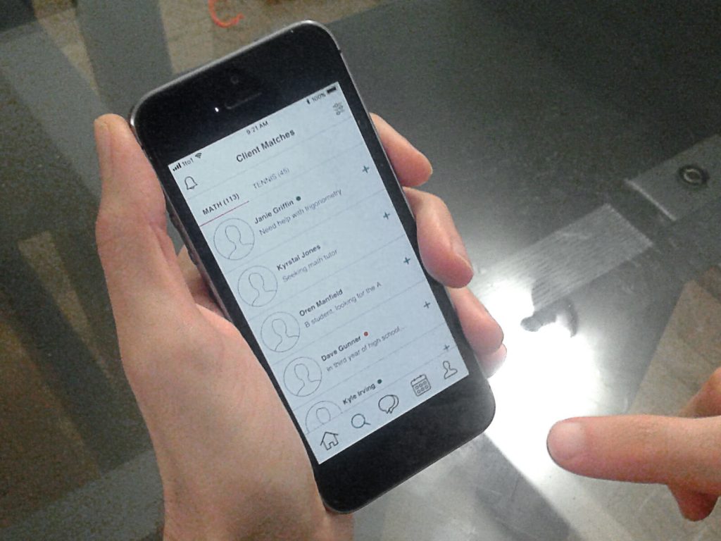
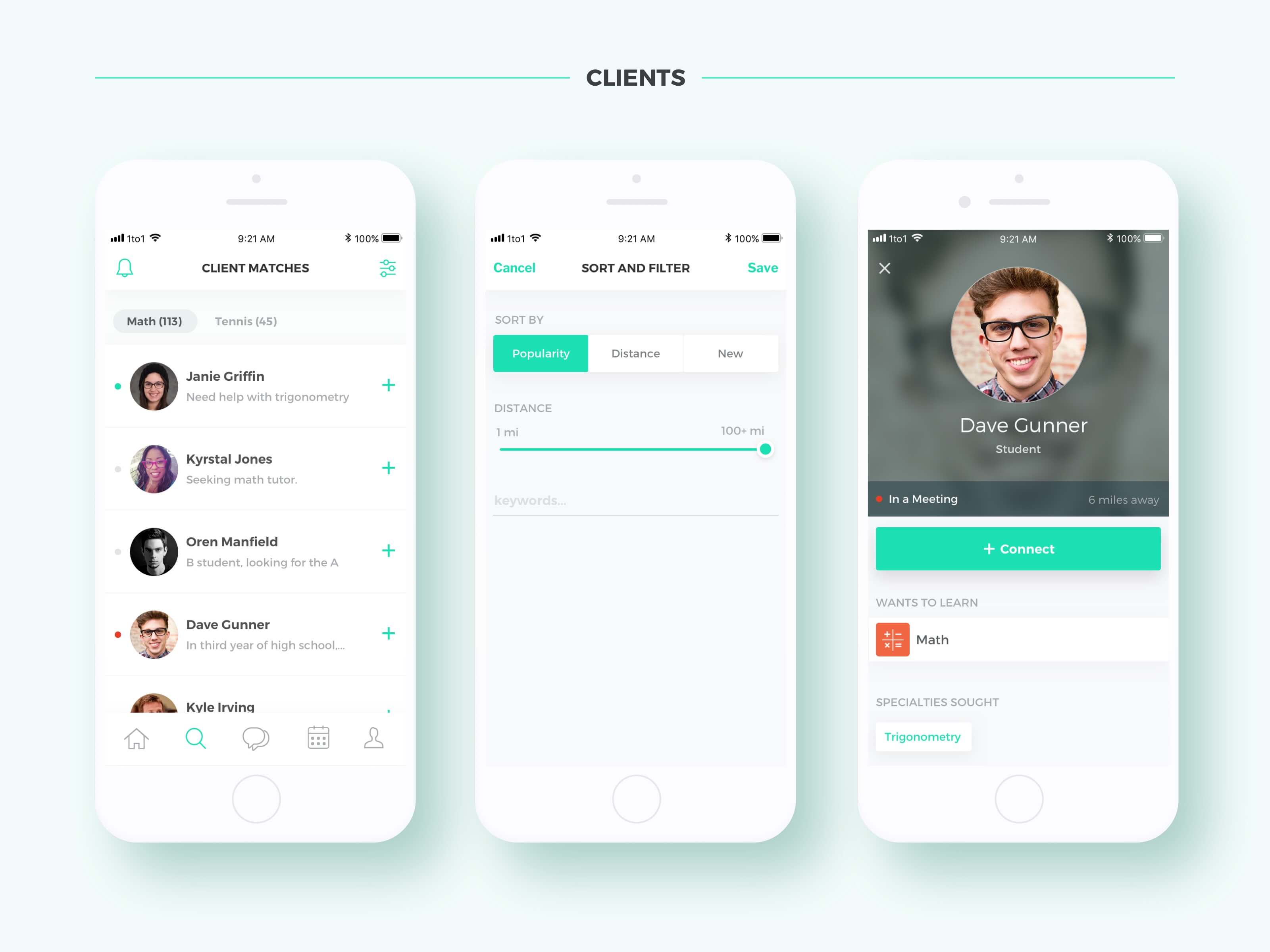
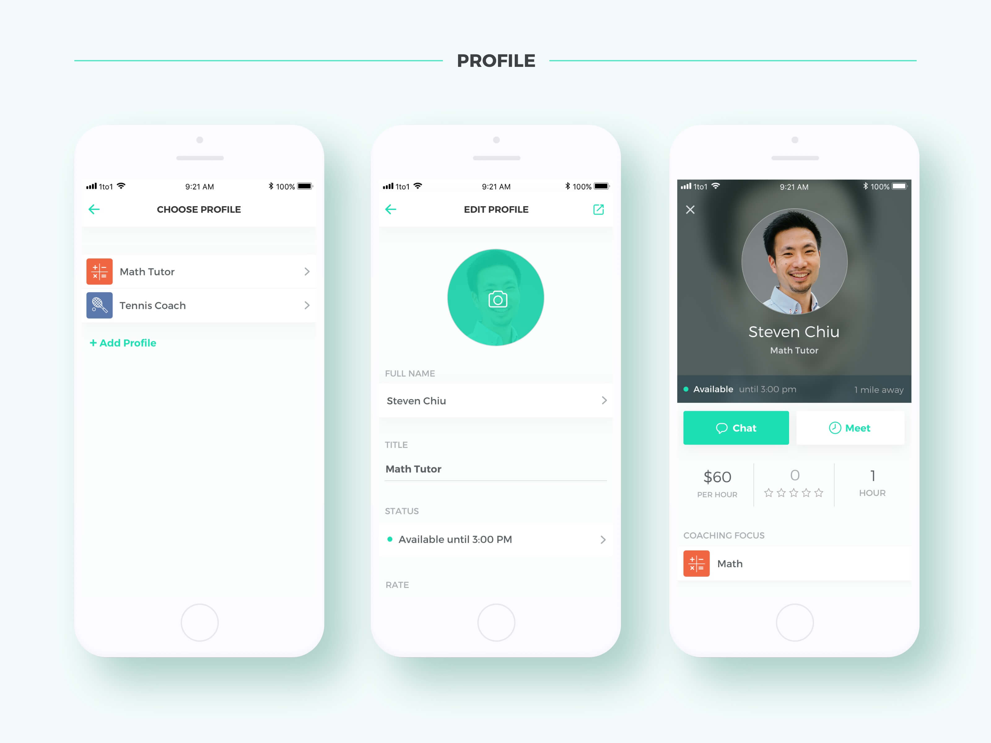
- Client and coach profiles, matching, and search filters.
I created sketches and paper prototypes of the features and showed them to a few coaches for initial feedback. I later used that feedback to inform more detailed wireframes. Nevertheless, the early comments I received validated the overall direction I was proposing.
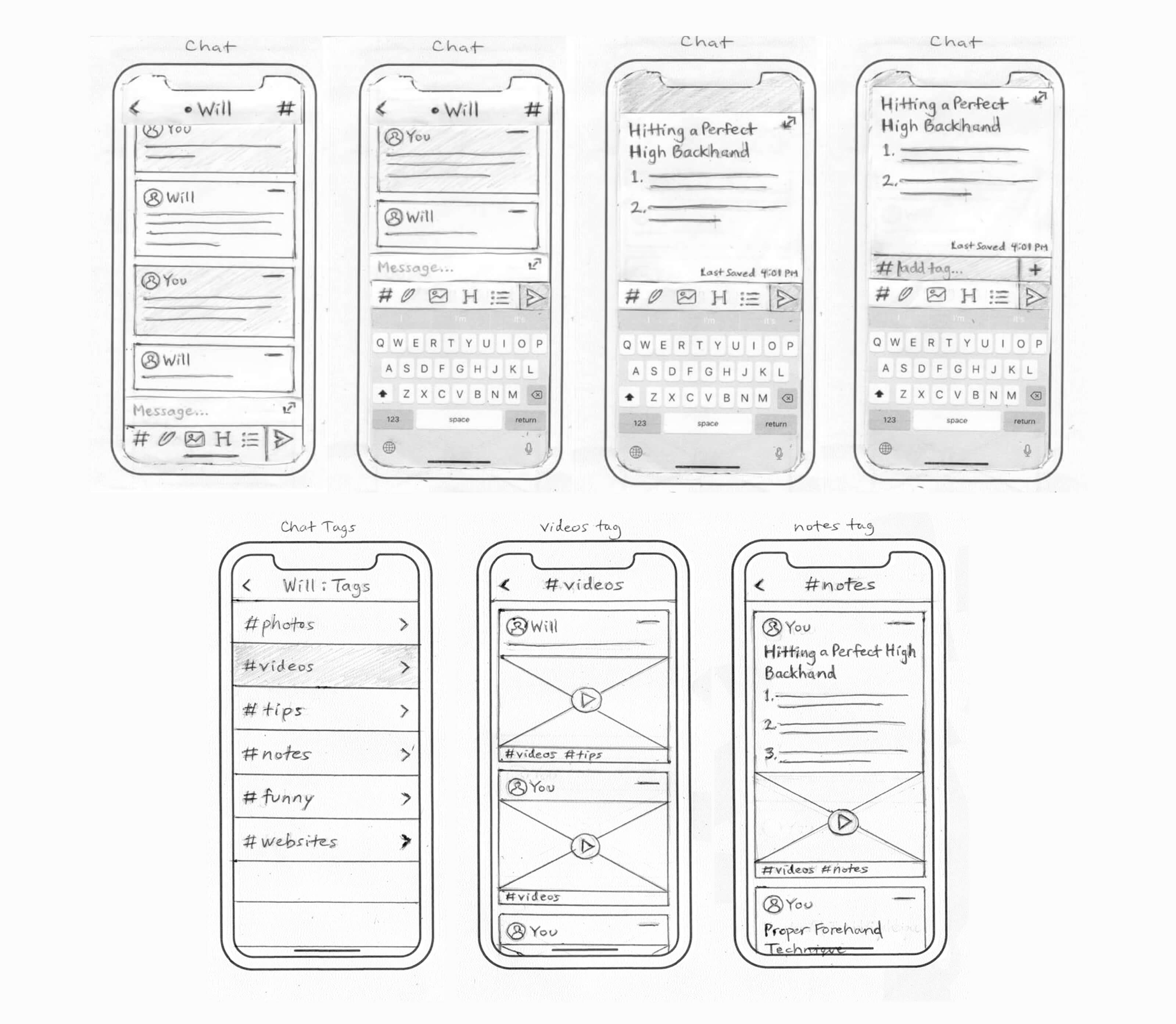
Paper prototype and sketches of the rich media messaging and tagging feature
Comparative Analysis
I analyzed the user interfaces of a wide range of communication-focused apps that offered relevant functions. These included Slack (messaging and tagging), Calendly (scheduling), Apple iCal (calendar), Uber (onboarding), Roomi (matching), WhatsApp (messaging), WeChat (messaging), Brief (messaging, productivity), Basecamp (productivity) and many more. I combined what I considered to be the best and most efficient UI patterns from these apps.
Wireframes
After drawing up a rough outline of the application architecture, I began to lay out a set of mid-fidelity wireframes in Sketch, covering almost all of the user flows and states. As I tested and revised the user flows, I was able to refine my map of the overall architecture.
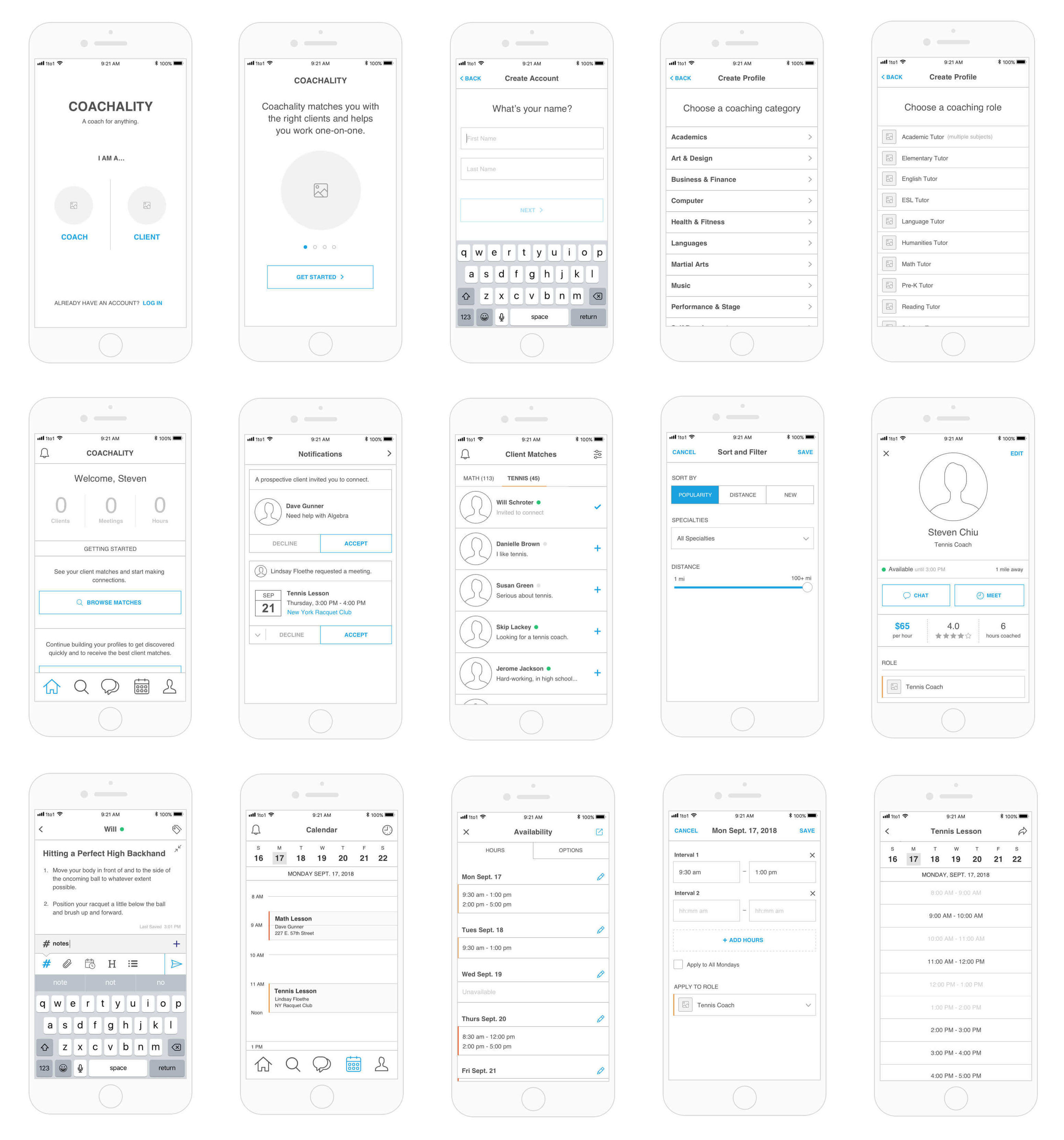
Selected wireframes (10 of 100+)
User Testing
Using Sketch’s built-in prototyping tool with its Cloud and Mirror services, I developed a clickable prototype from the wireframes and tested it privately with the coaches. My method involved a combination of observation and note-taking (to assess the usability of the interface), and some questioning (to understand the basis of their choices and opinions). I asked participants to think out loud as they made decisions about what to click.
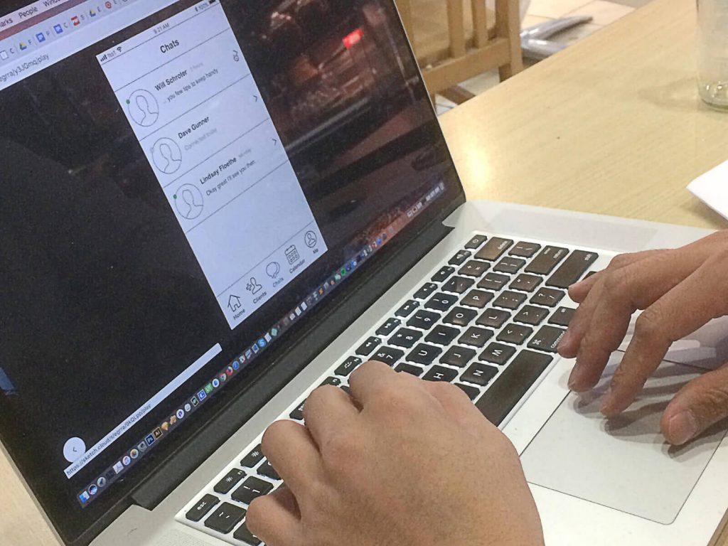
Two coaches testing the prototype. View a full demo.
Participants showed the most affinity and enthusiasm for the in-chat tagging feature, the ability to write rich-text messages to their clients, and the intuitive format of the calendar. However, the testing process revealed that there was room for improvement in other areas. Several coaches who taught two or more distinct subjects or activities requested the ability to maintain separate profiles for each line of work. These coaches also preferred searching for each type of client in a separate list rather than in the same view.
Incorporating Feedback
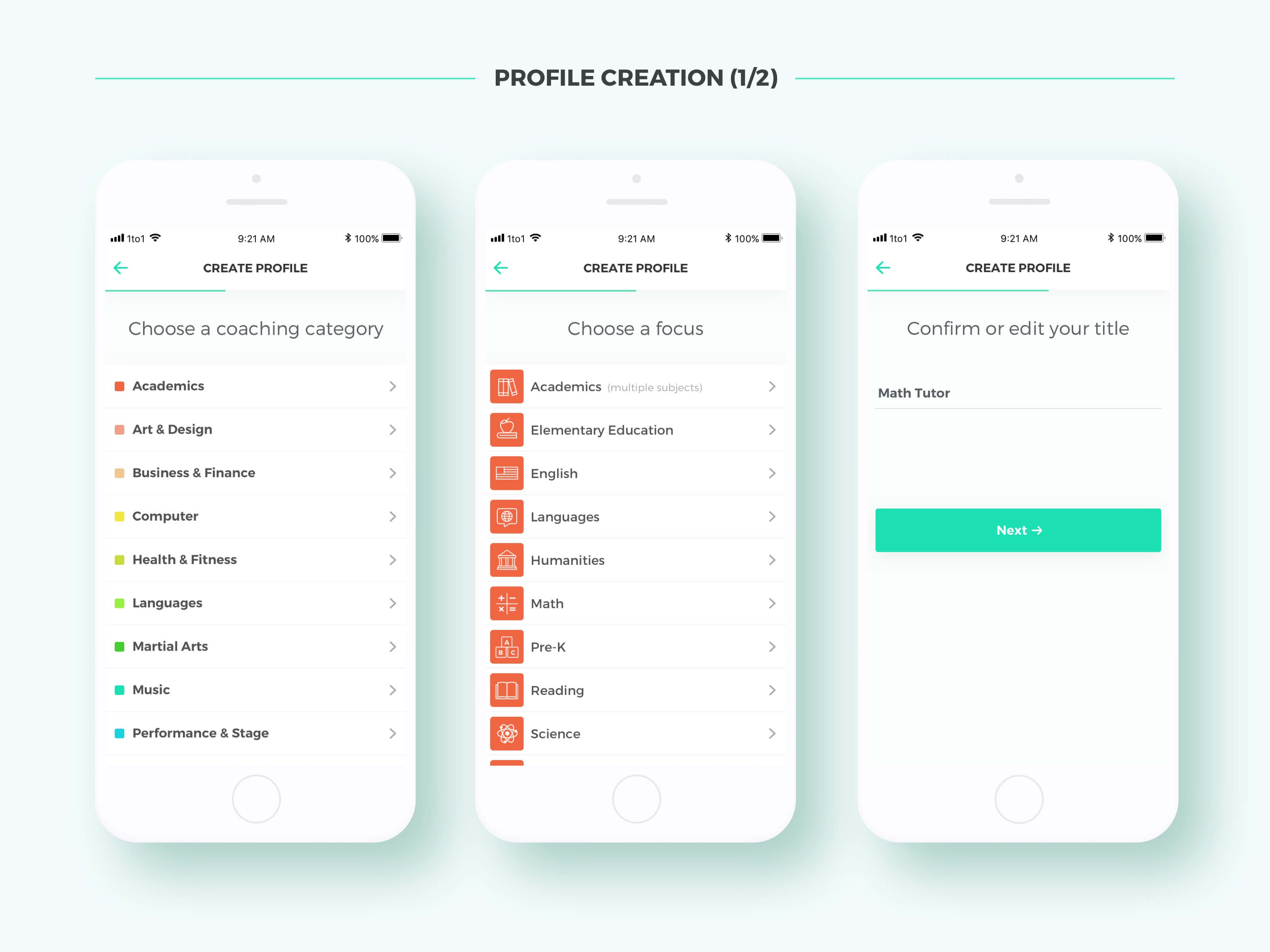
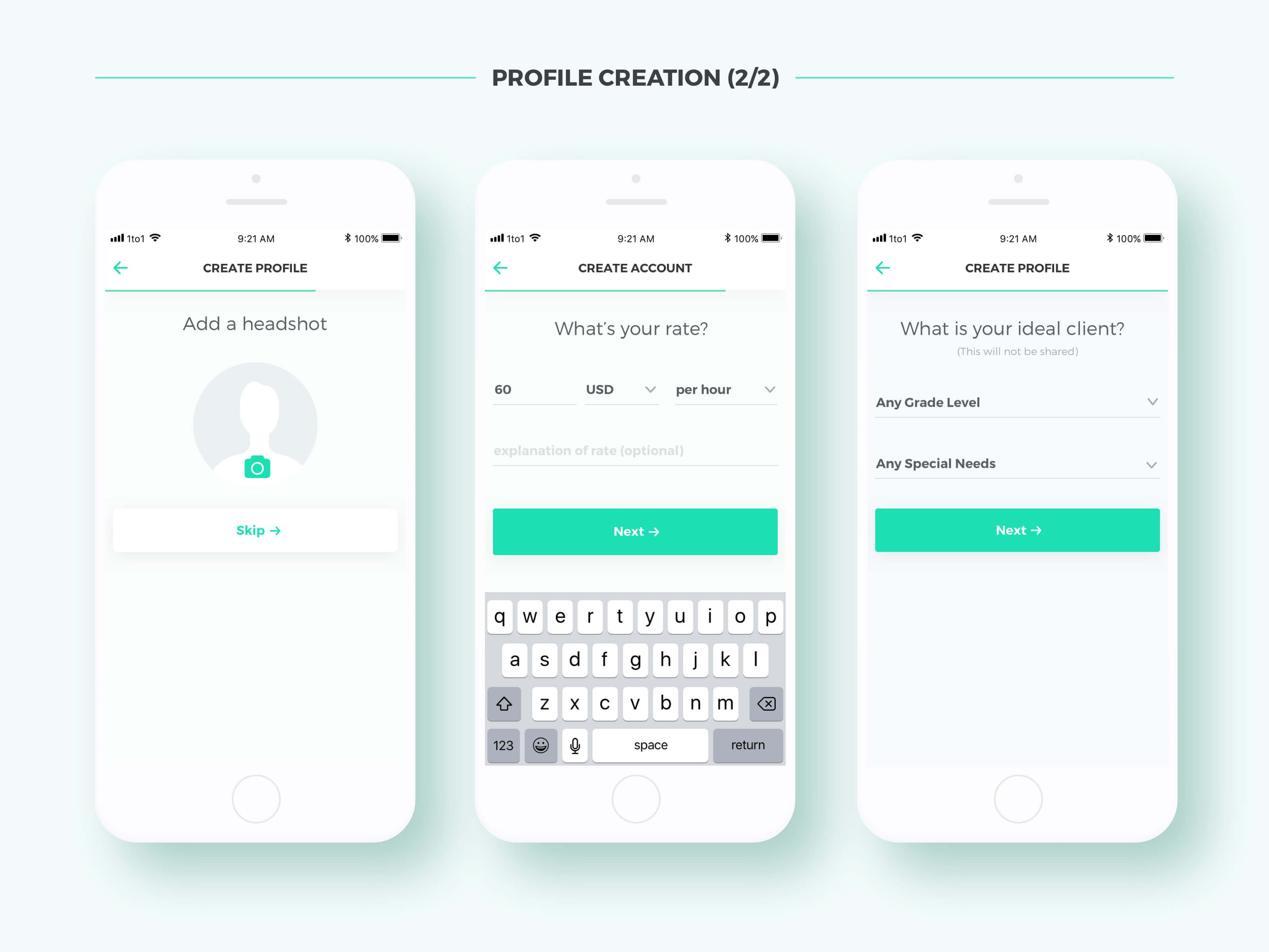
Partitioned profiles added a new layer of complexity to Coach+ and was one of the biggest architectural challenges to tackle. I needed to ensure that each profile a user generated would be sufficiently unique and identifiable while not over-encouraging the users to create multiple profiles as this could make the app less manageable. Ultimately, I devised a comprehensive list of categories and roles for coaches to choose from in the on-boarding process. These would determine the basis of each profile. I also created split views within the list screens to draw a clear separation between different types of clients.
Other issues that I uncovered and resolved during the testing process included:
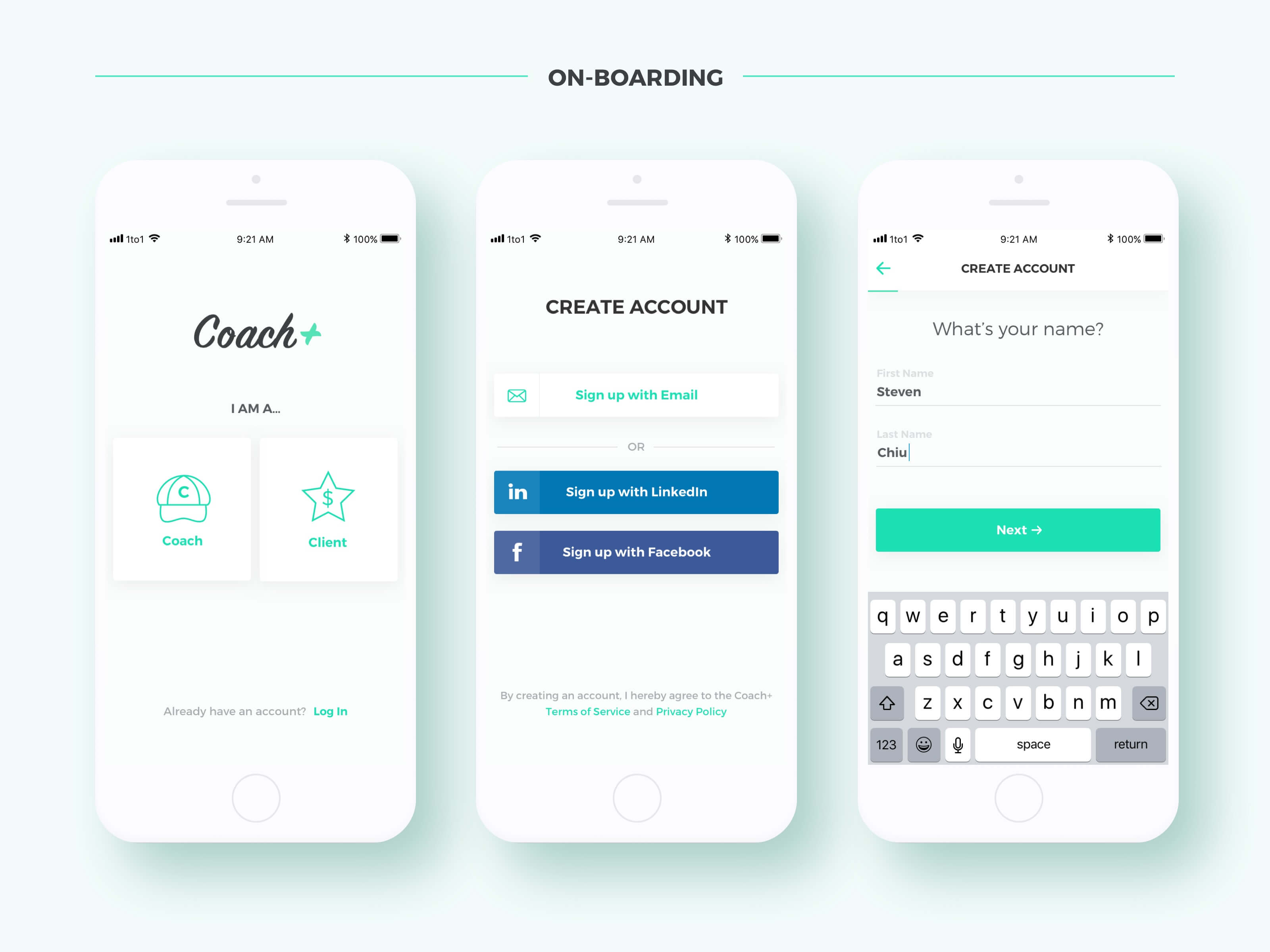
- Overly formal language in the on-boarding screens (ex: “Services Provided”), deterred a few users. To address this, I made the prompts more conversational.
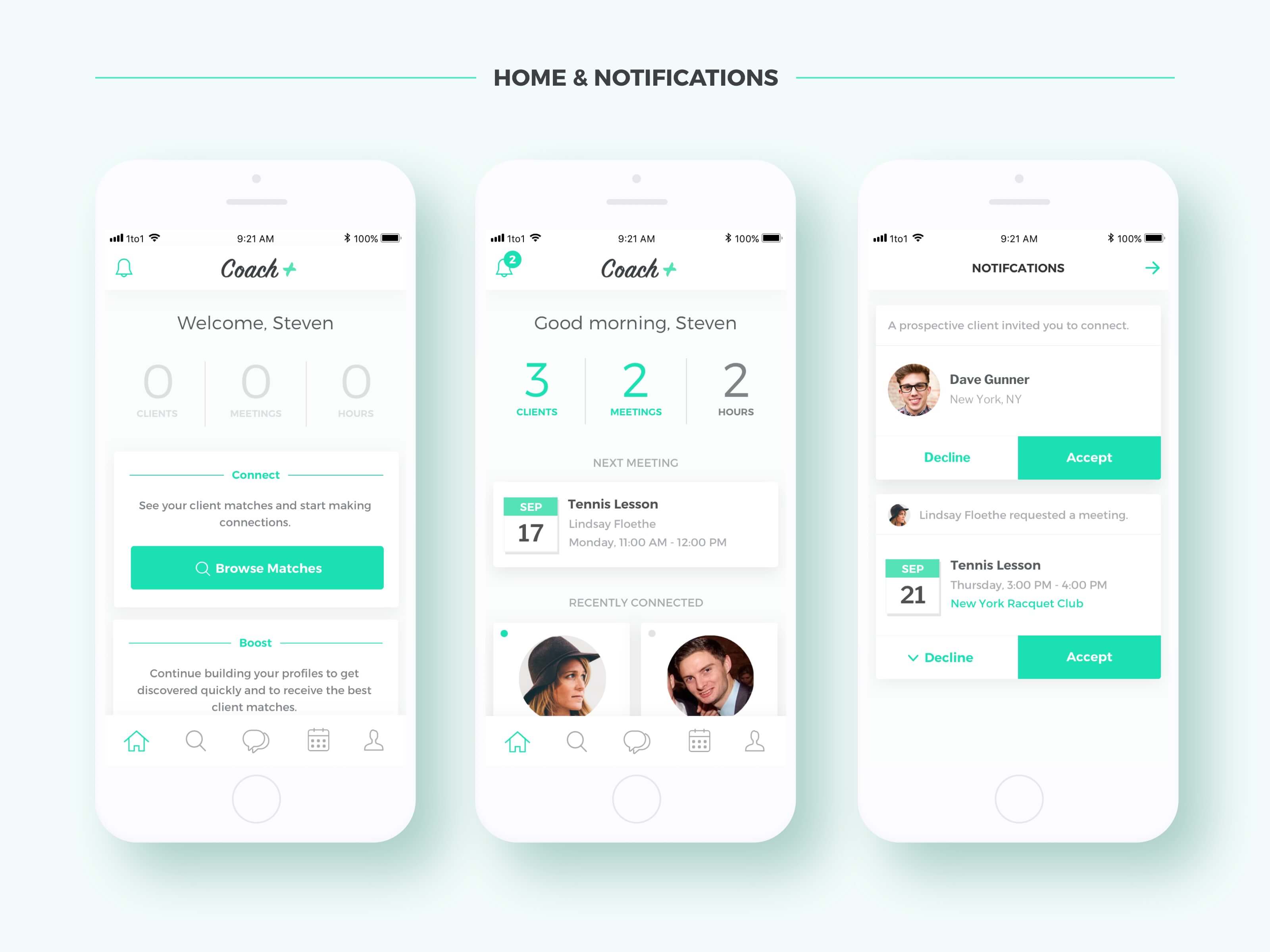
- When notifications were mixed with meeting reminders on the home screen, it confused some users. So I separated them into a dedicated panel, following the example of Instagram.
- Users were reluctant to manually block out all of their non-coaching engagements, such as vacations, in the calendar. Hence, I decided to remove the option to add general “events” and rely fully on syncing with their other calendars, as Calendly does.
- Coaches did not prefer to enter their available meeting times in the same way that a client might select them (by clicking on 60-minute blocks, one at a time). To address this, I followed the lead of Calendly again, letting users enter precise time ranges in text fields.
- Some users became confused by the Tags icon at the top-right corner of the Chat view. To fix this, I replaced it with an info icon (similar to the one in Apple Messages) which links to a detail view containing tagged messages, photos, videos, and past meeting info.
Outcome
High-fidelity Mockups
Following a few rounds of prototyping and testing, I rendered nearly 100 high fidelity screens of the app in Sketch.
Clickable Prototype
I created a high fidelity interactive prototype by importing the Sketch files into Figma.
Testimonials
Coach+ is the app I’ve been looking for. As a tennis coach, I have no alternative but to text my clients, recording notes and scheduling lessons. This is an inefficient and unsustainable process that Coach+ has solved. In demoing the app, I found it very intuitive and easy to accept bookings, add comments and tag them into categories. Ian has taken the time to interview my coaching needs, and has added key features such as uploading videos for clients to reference pro technique. I am very hopeful this app gets developed and I cannot wait to use it!
Tennis Coach, 37 yrs. old
As a graphic design instructor, a writing coach and a math tutor, Coach+ would be ideal for my needs. It accommodates the broad range of teaching work that I do, while allowing me to promote distinct services separately, for maximum impact and reach. This means a targeted profile and targeted client matches for each type of subject that I teach! In addition to these unique benefits, Coach+ has many other awesome, well-designed features, including a friendly calendar and messaging system, that I would find very helpful. Should this app get launched, I will be the first to use it!
Design & Academic Tutor, 38 yrs. old
Next Steps
I plan to expand and further refine the high-fidelity prototype by testing with more coaches and covering less common use cases. At the same time, I will look for more specific input from the second major user group — clients — in order to come up with the best parallel design for their side of the app.