Website designs for six high-traffic editorial brands
Part of one of the Internet’s largest content recommendation networks, the Static suite of websites features content spanning movies and TV, celebrity culture and entertainment, women's lifestyle, food, and gaming.
Part of one of the Internet’s largest content recommendation networks, the Static suite of websites features content spanning movies and TV, celebrity culture and entertainment, women's lifestyle, food, and gaming.
Skills
UI Design, Branding, Responsive Web DesignTools
Photoshop + Photoshop Ink plugin, CSSThe Challenge
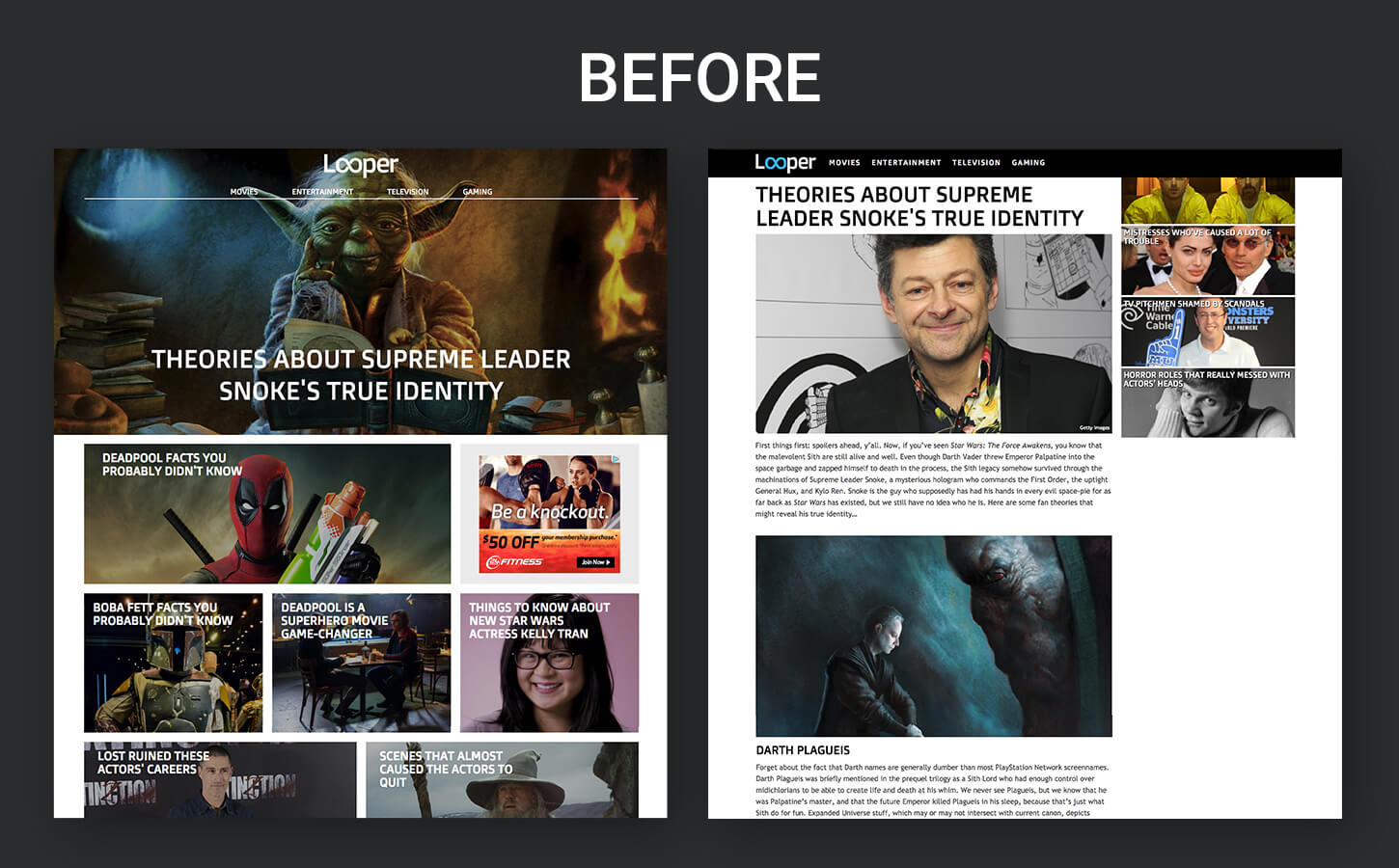
ZergNet’s Director of Digital Products, in charge of growing their media brands, tasked me with re-designing Looper.com, NickiSwift.com, and Grunge.com which had been quickly assembled and launched by the development team without any designer involved. Looper was growing and already receiving a lot of traffic, but it lacked aesthetic appeal, consistency, and credibility as a premium brand. In addition, the article pages suffered from ambiguous information hierarchy.
In the beginning, there were a number of constraints to consider. One was that the product owners wanted to maintain the overall template and menu structure. The other was that a 300×250 ad needed to stay fixed at the top of the right sidebar on the article pages, even as the user scrolls.
Role
As the sole designer on this project, I was responsible for fully revamping the user interfaces of Looper, NickiSwift, and Grunge, and designing three additional sites from the same template that had been developed. I also created style guides and worked closely with developers to guide CSS coding implementation and to run quality assurance testing before each release.
Process
Phase I Designs
Given the high-level constraints on structure, I did a minimal amount of sketching before proceeding to Photoshop. As I re-designed each page, I made a number of identifiable improvements in addition to elevating the aesthetic appeal.
On the home pages, I initially split the top featured story into three modules in order to attract a higher number of clicks above the fold. I also introduced greater visual separation and contrast for the additional content immediately below the featured stories.
On the article page, I moved the section sub-headers above their respective images to improve organizational clarity and readability. I also incorporated an author name, twitter handle and date.
For desktop screens, I made room for additional content widgets to be immediately visible on the right sidebar by reducing the image sizes and keeping the design more open and clean. I introduced dividers to break up different types of content. On a more global level, I specified a consistent fixed site header with social media icons to be used on all of the pages.
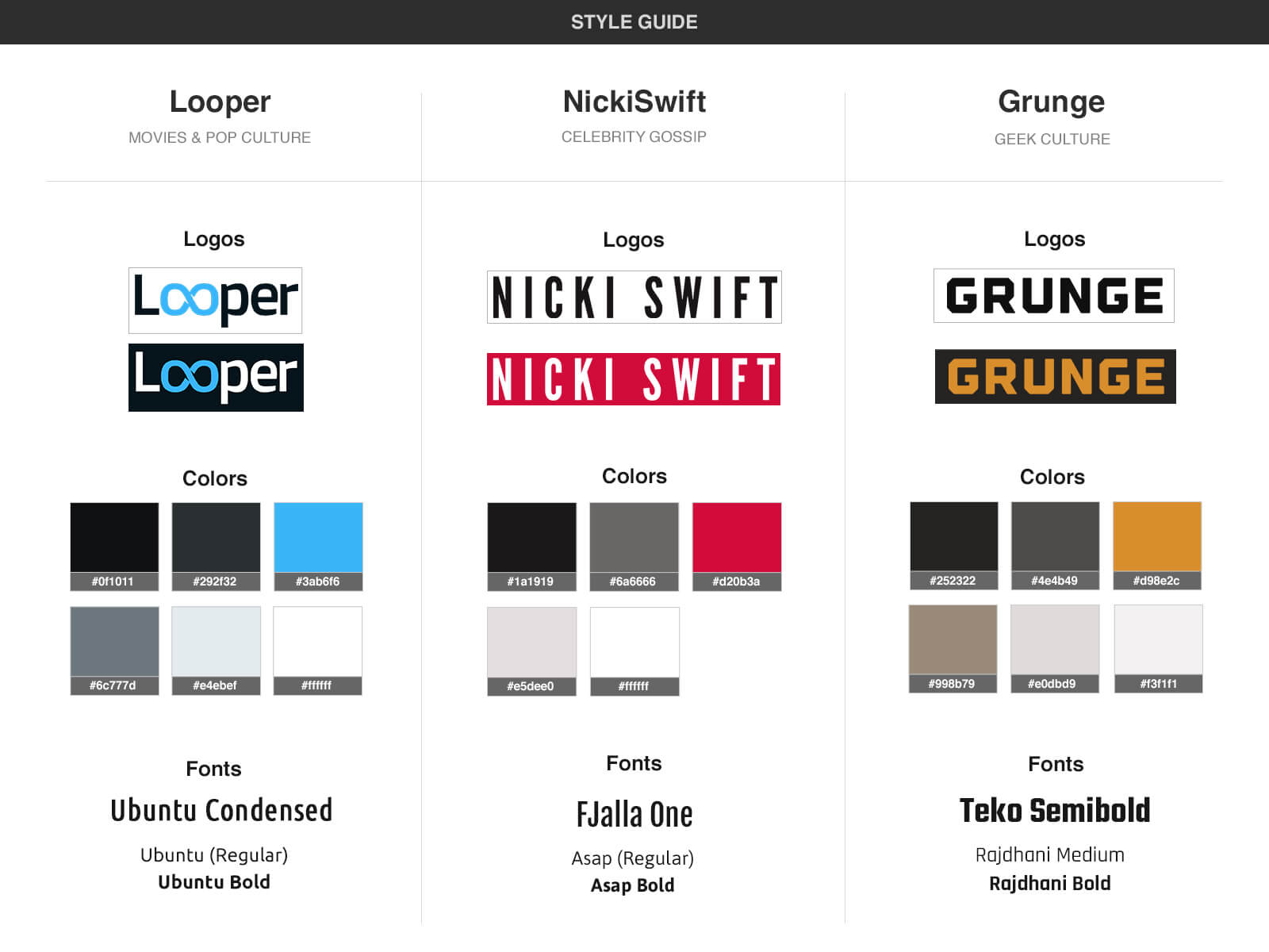
With the exception of the logos which were designed by a third party, I developed each brand’s unique identity and gave each its own set of style rules for fonts, colors, headers, and dividers while working from the same overall template. Taking all desktop and mobile views into account, I generated over 100 mockups for five sites covering all pages and important views. In addition, I wrote CSS snippets and rules to aid the developers in translating the designs accurately.
The following is a selection of the mockups I delivered in this phase.
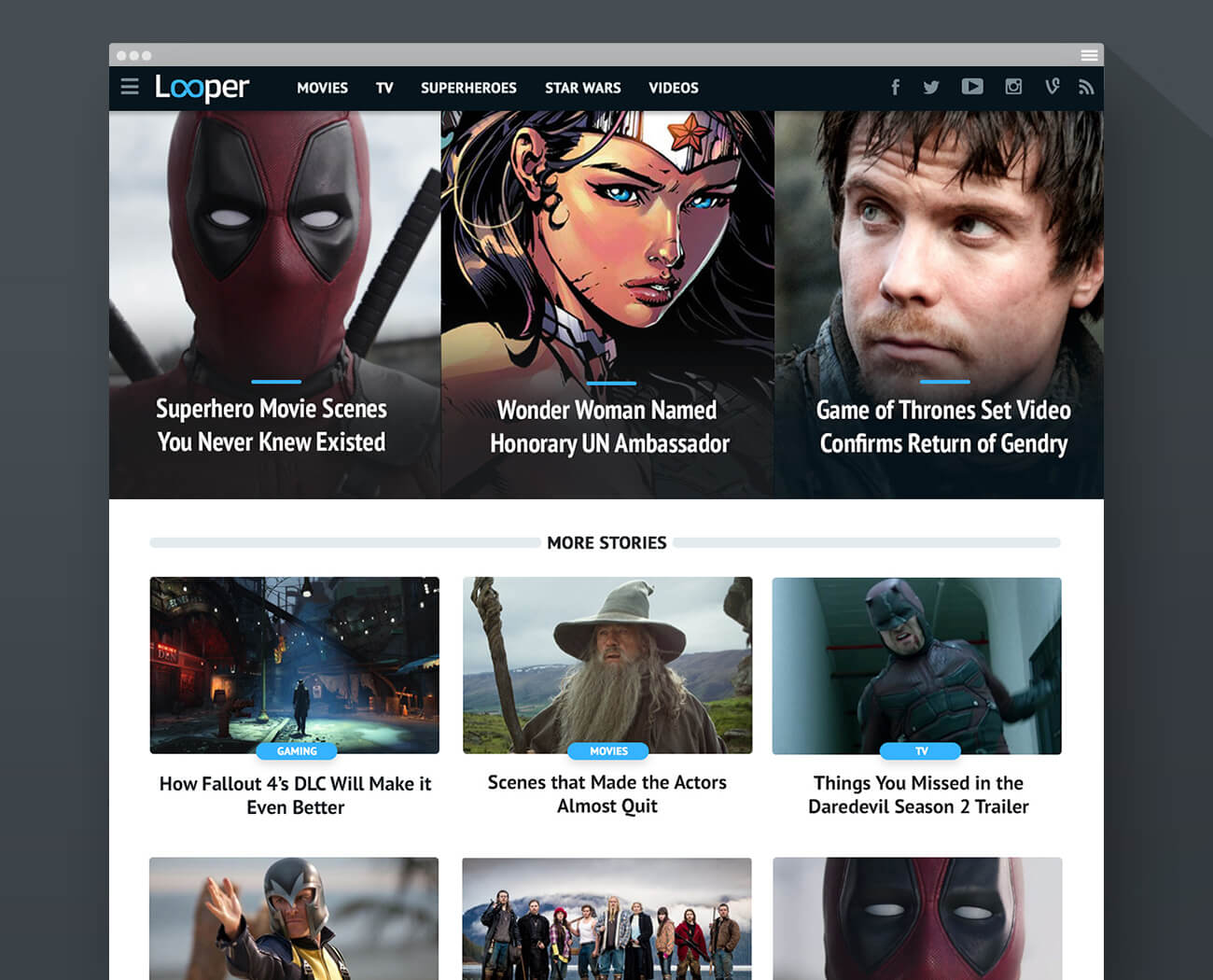
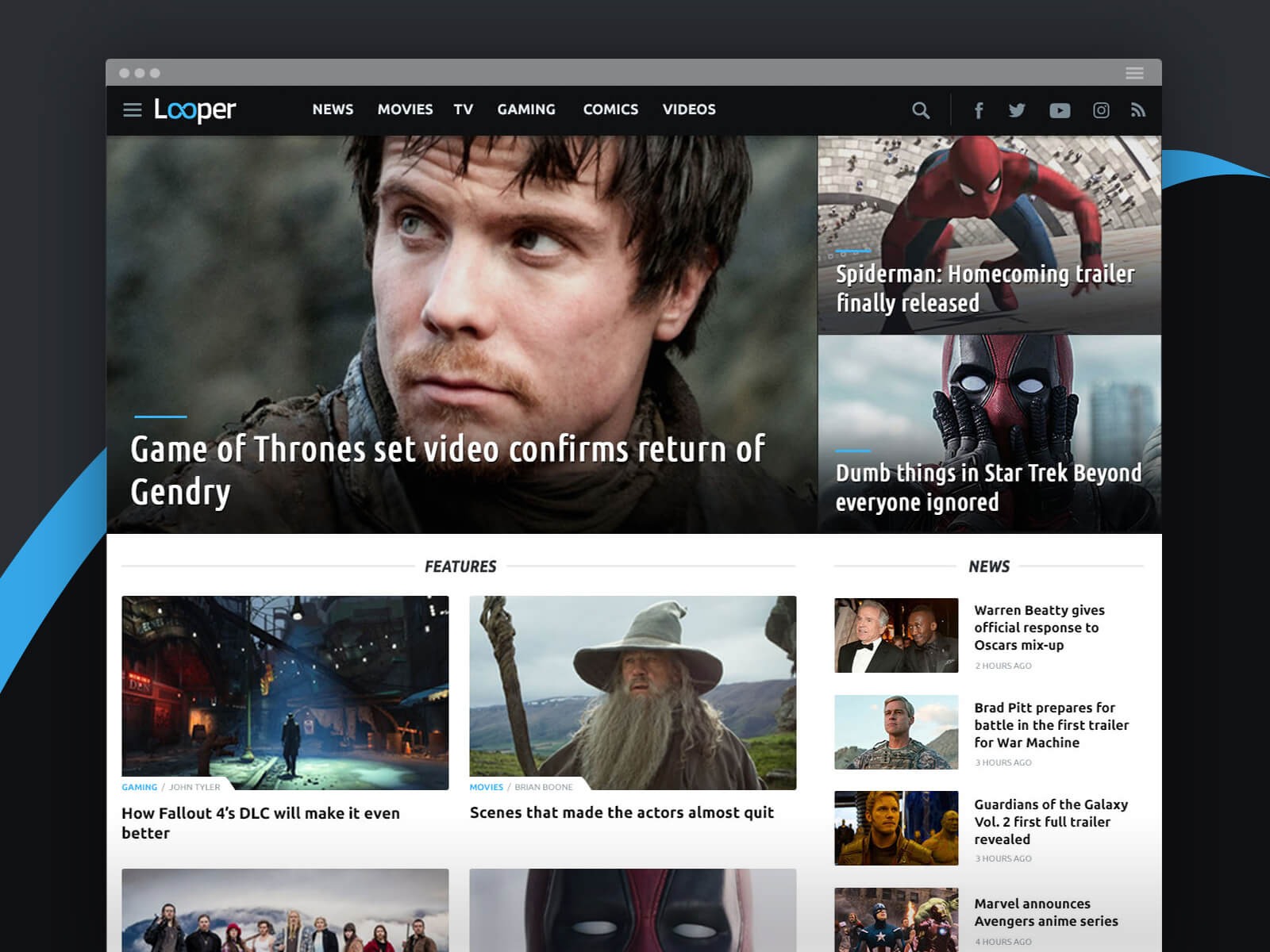
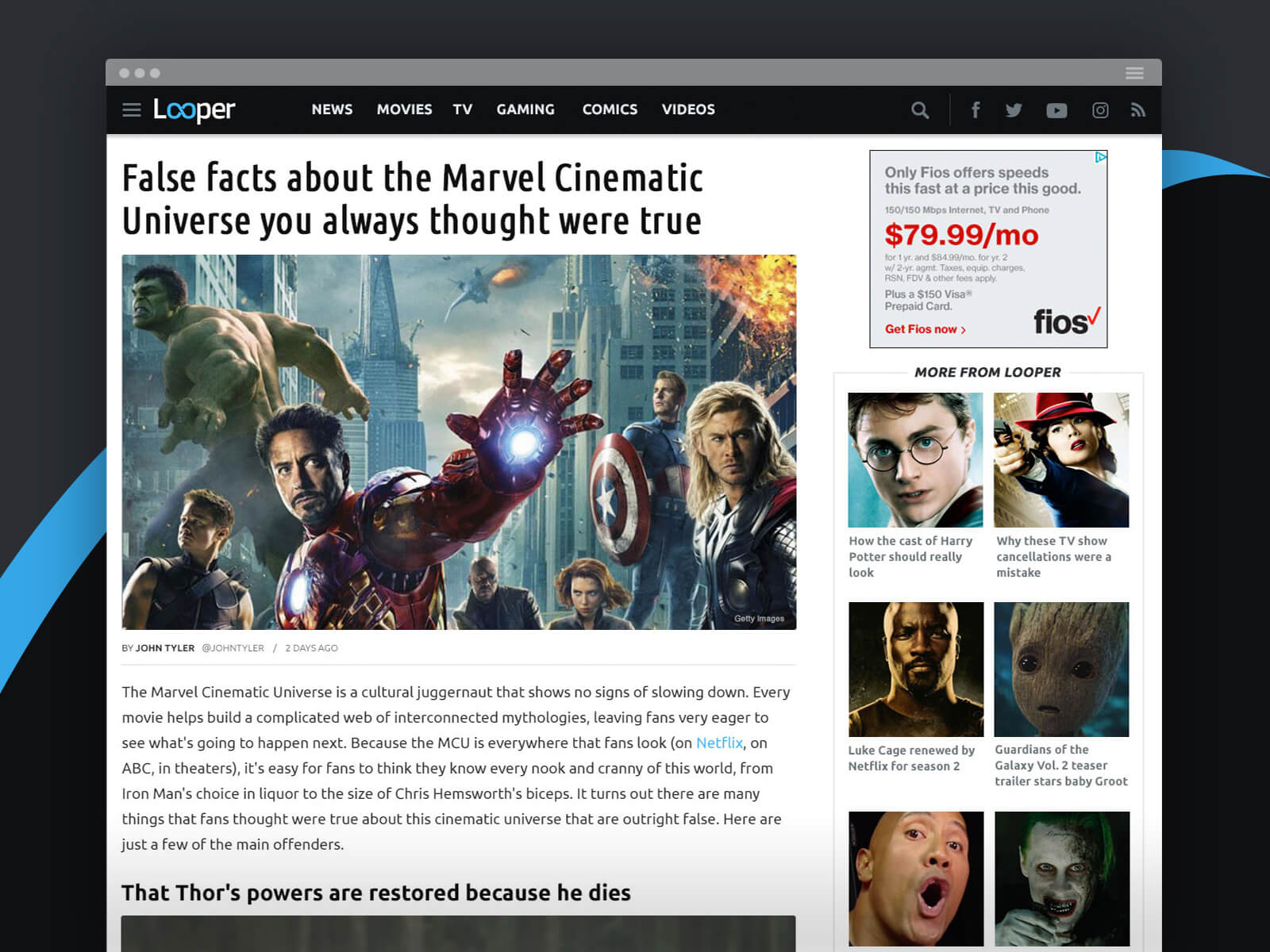
Looper home — desktop
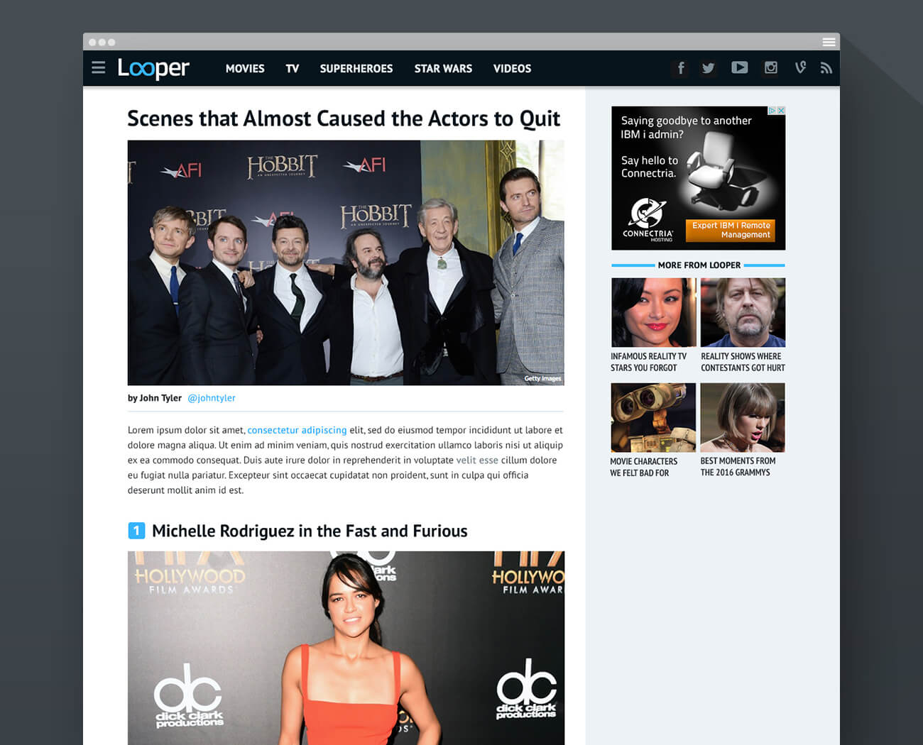
Looper article — desktop
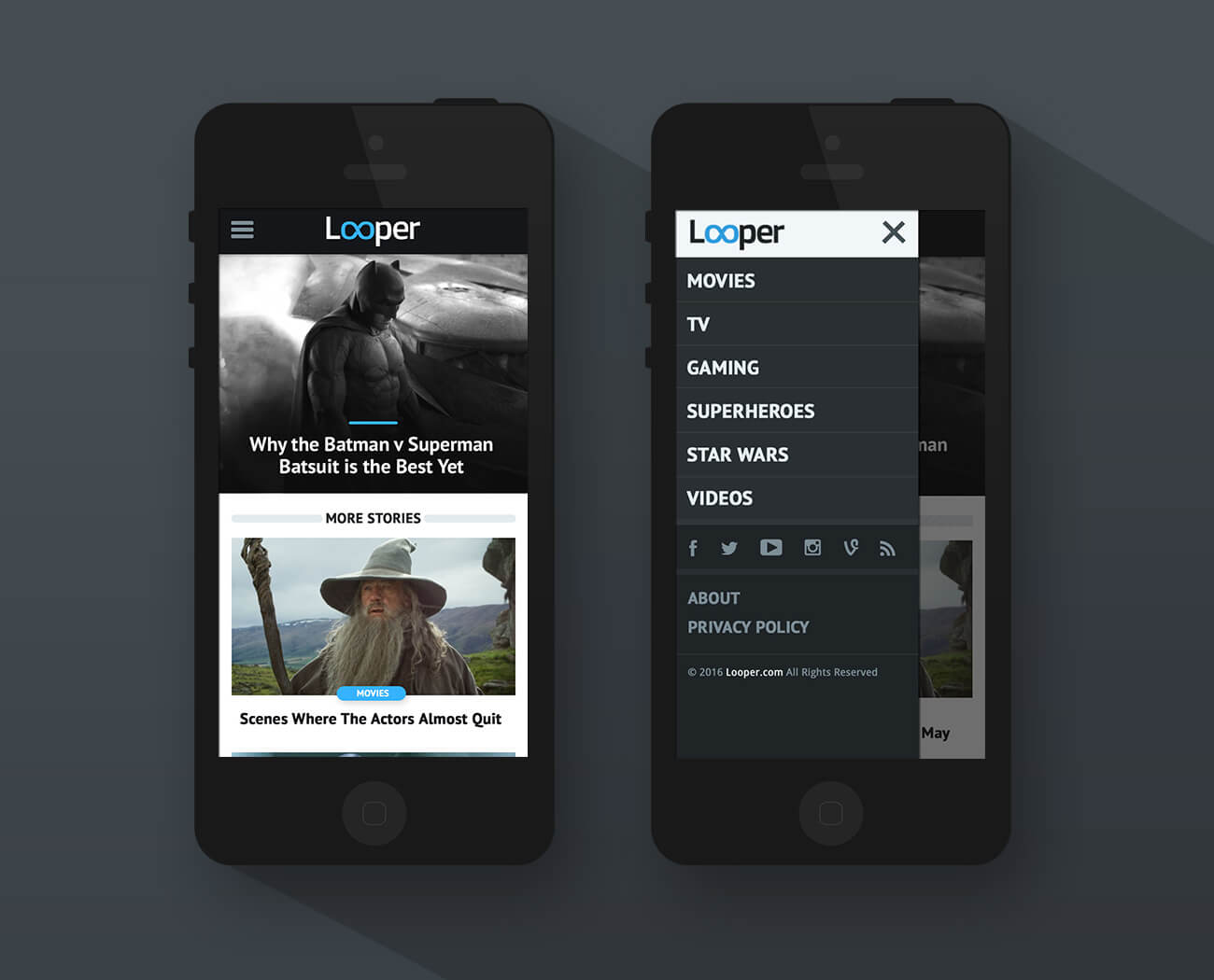
Looper home — mobile
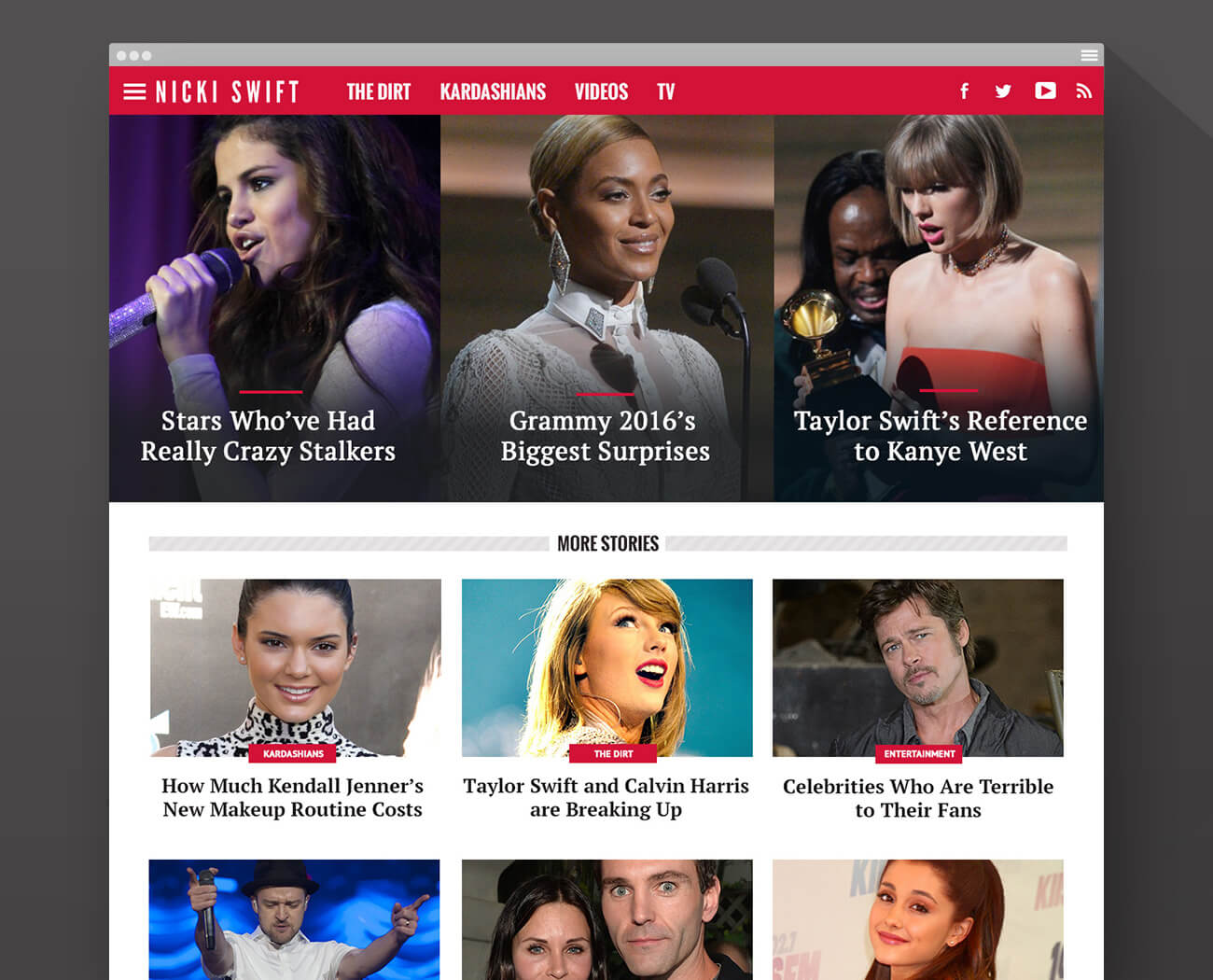
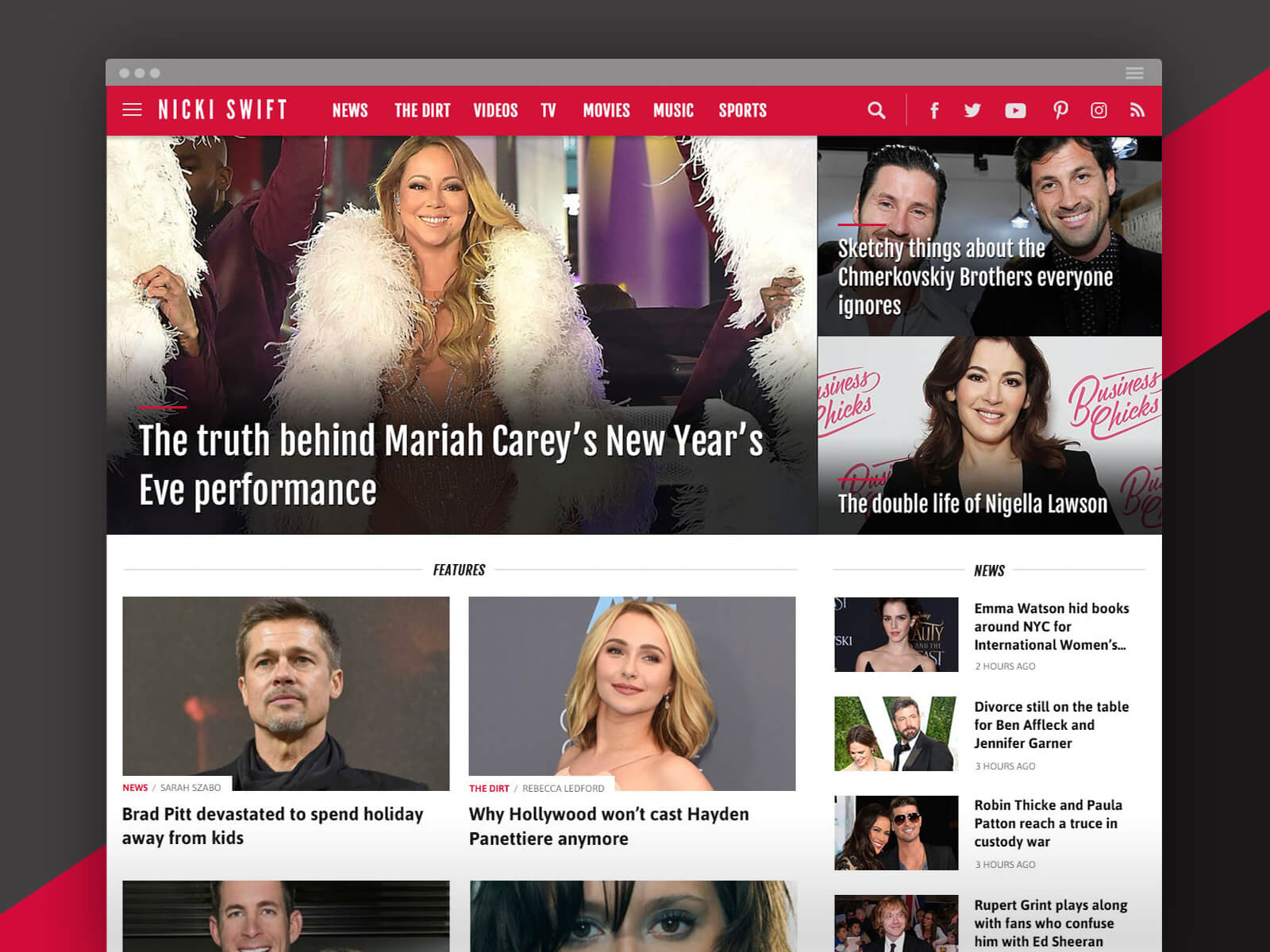
Nicki Swift home — desktop
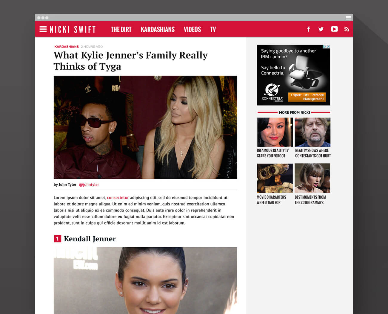
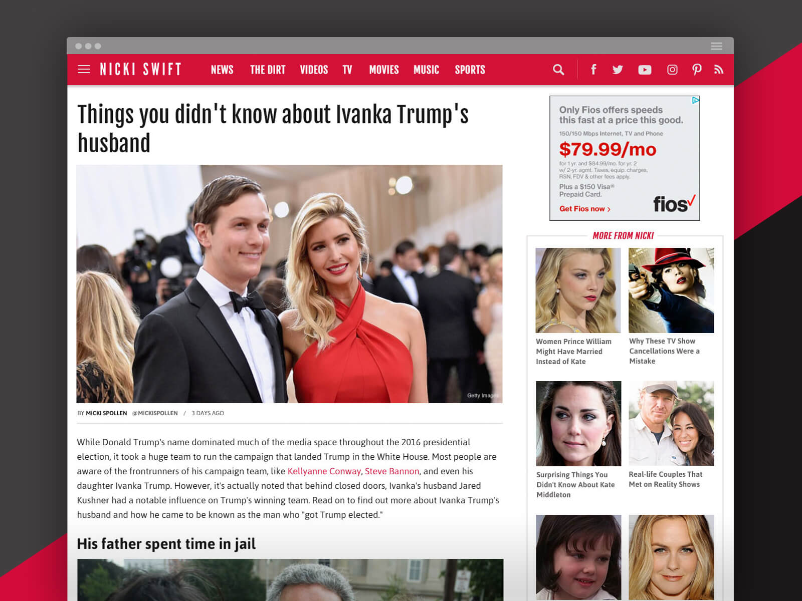
Nicki Swift article — desktop
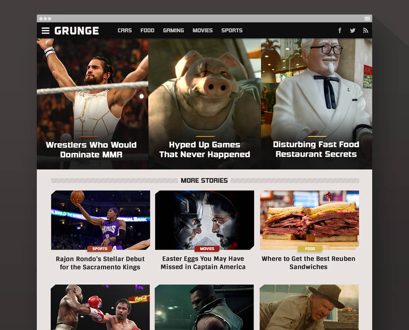
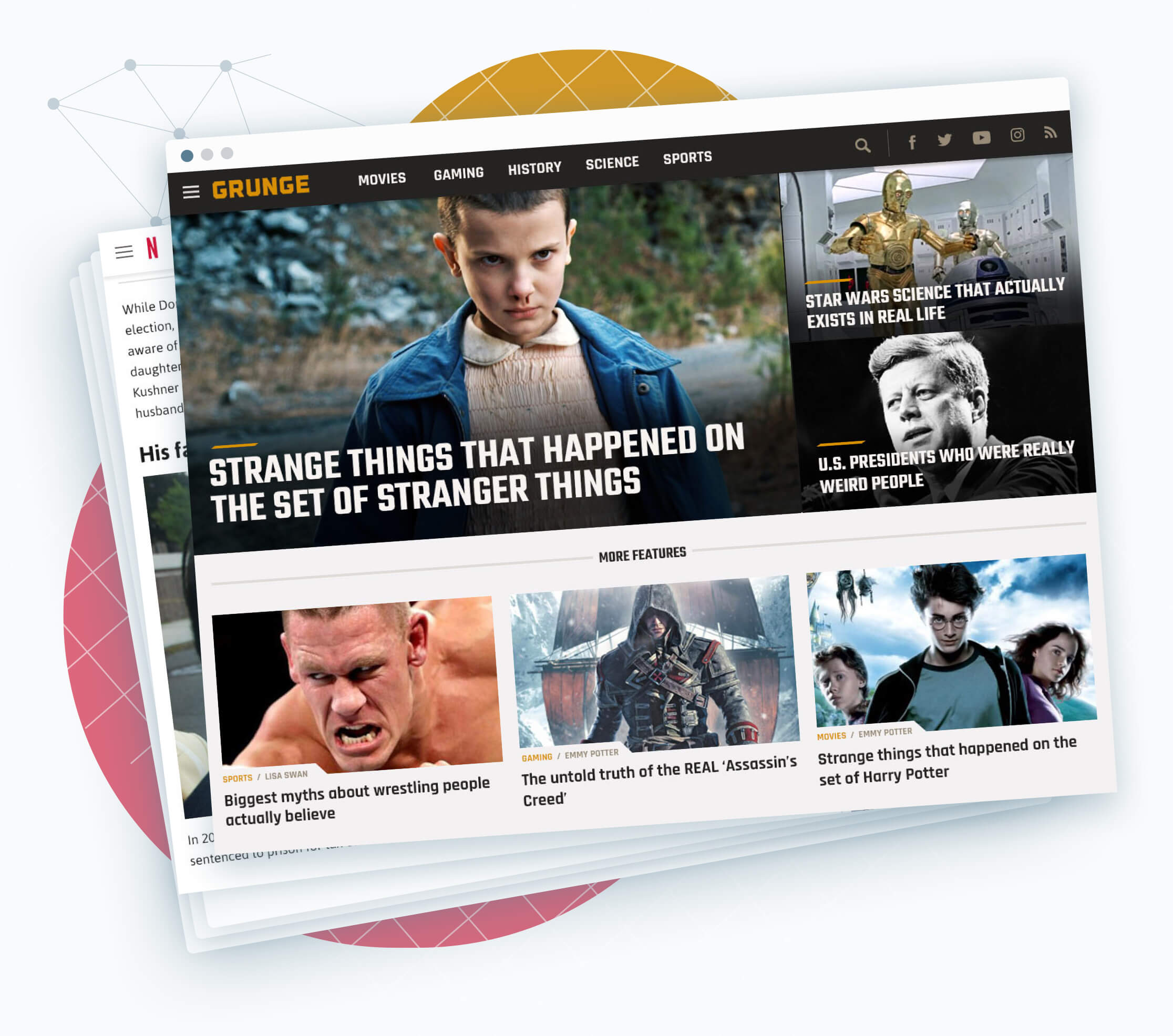
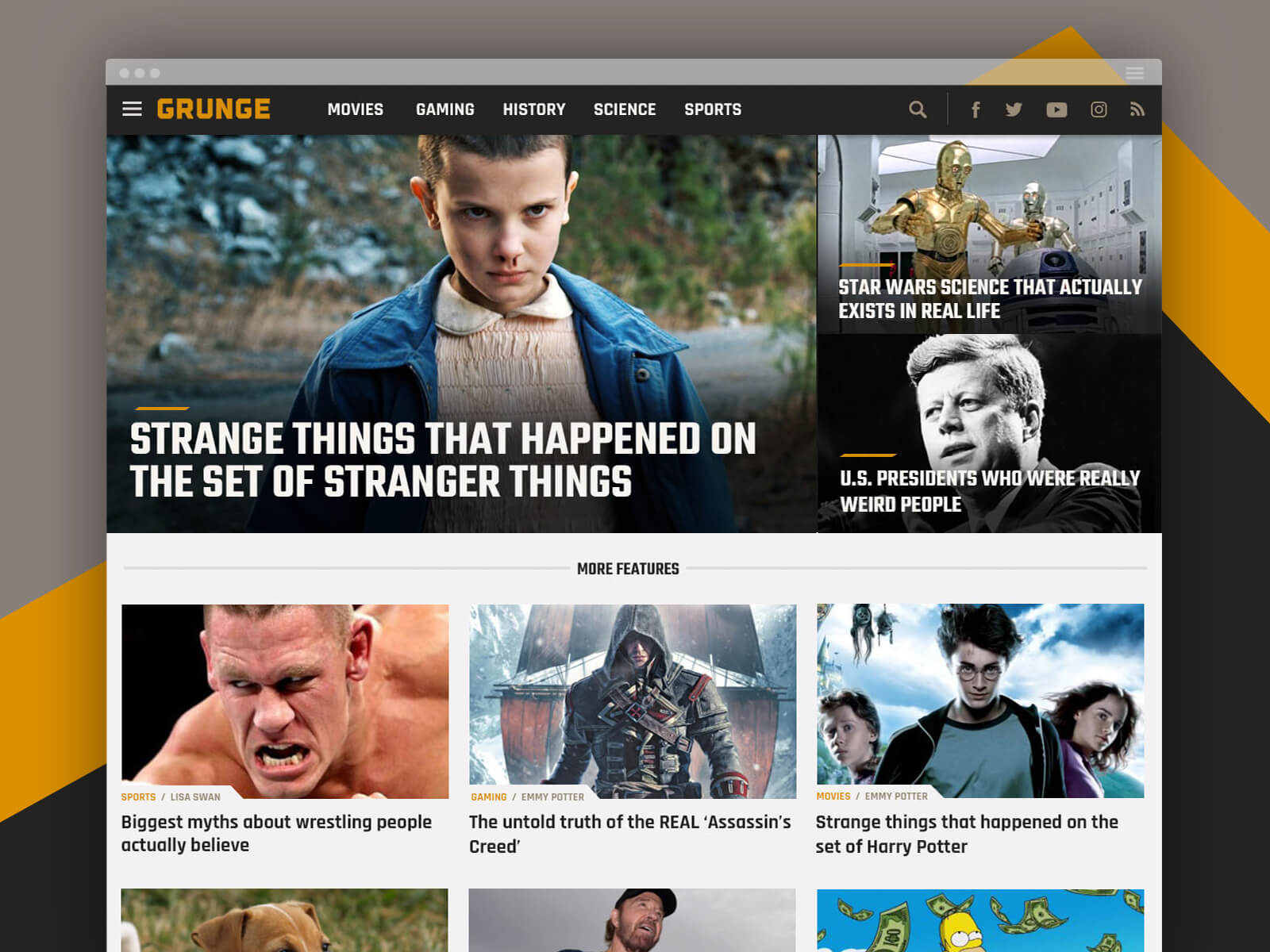
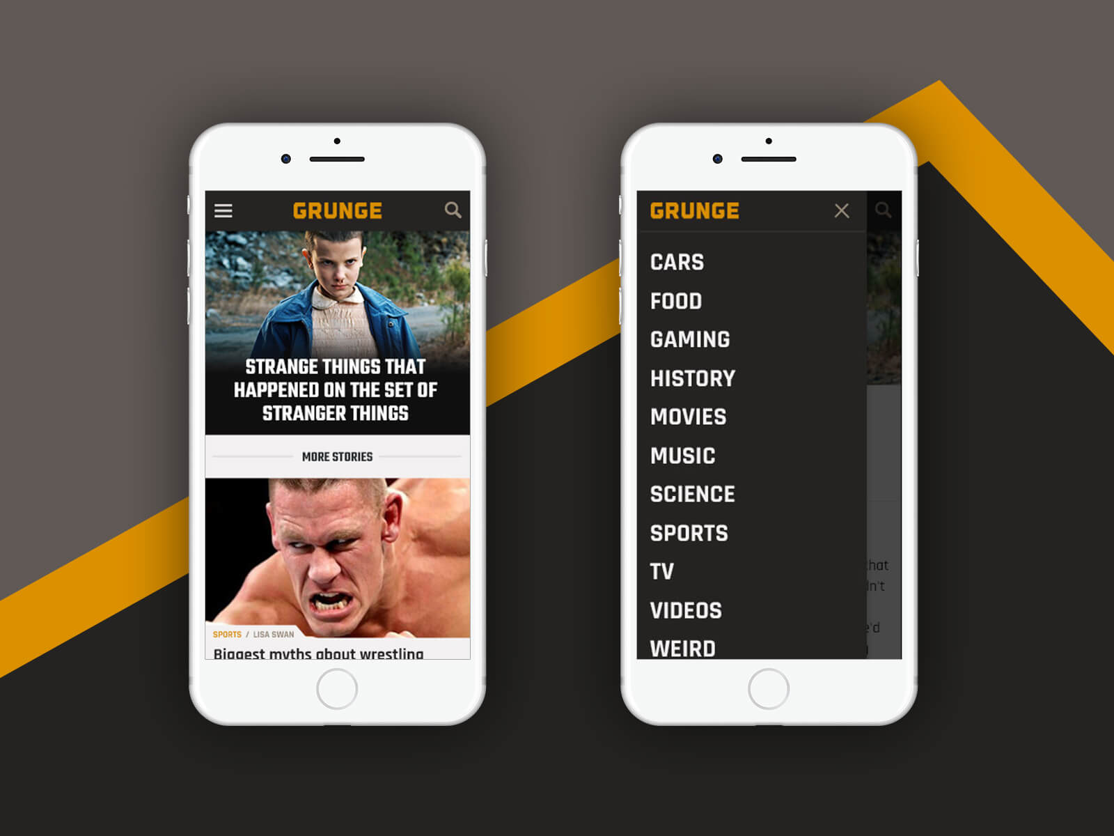
Grunge home — desktop
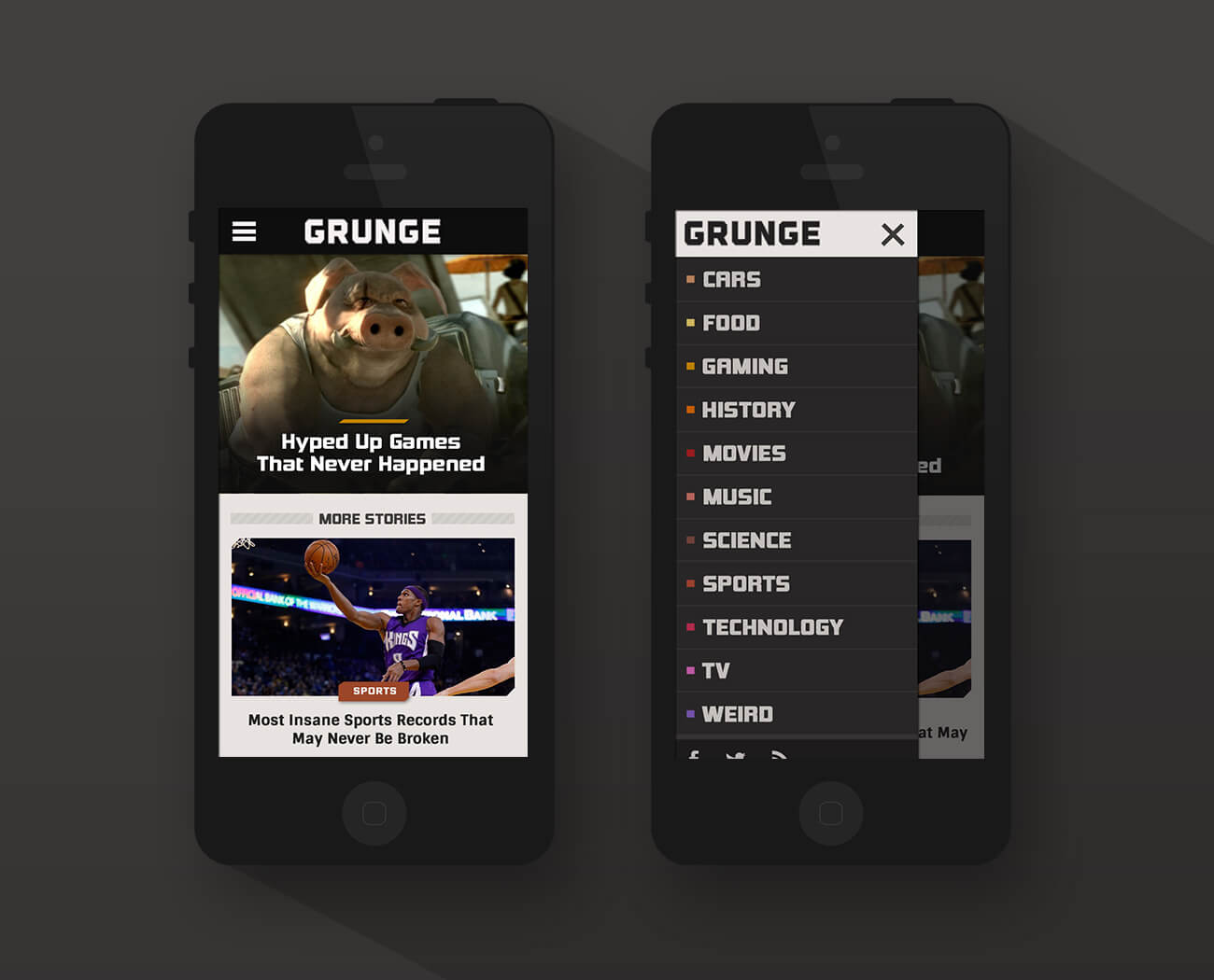
Grunge — mobile phone
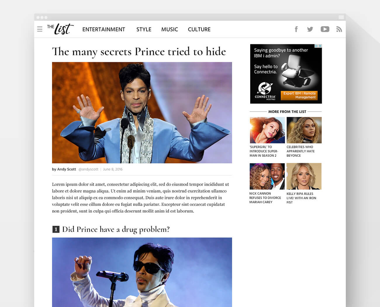
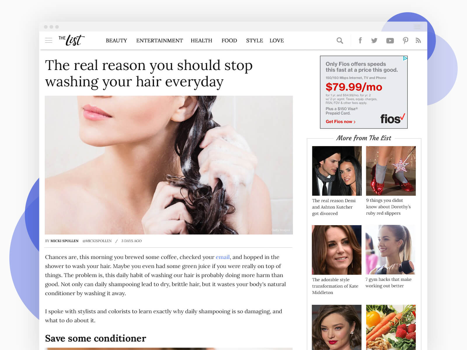
The List article — desktop
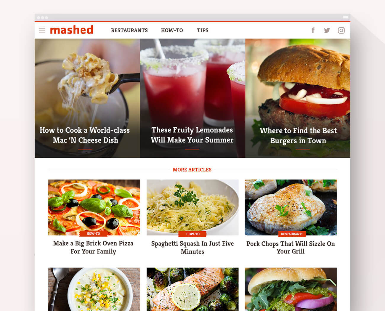
Mashed home — desktop
Phase II Designs
While the new site designs were contributing toward positive results for the brands, each of them experiencing rapid growth trajectories over the following several months, I was asked to continue refining the designs, including the overall template, while introducing a dedicated news column on the Looper and NickiSwift home pages. The product owners sought to increase pages per visit (and hence ad revenue) by incorporating even larger images and headlines and imbuing the sites with an even more elevated, premium look. In addition, the development and editorial teams wanted to reduce the number of different image sizes and image ratios to improve ease and efficiency in publishing articles.
In this second phase, I reconstructed every page template, revisited each brand’s design, and came out with a large number of optimizations. On the home page, I defined a new configuration of featured stories that allowed for a single landscape image ratio to be used while keeping three features above the fold. I designed a more fluid layout, letting the content areas scale to 1600px and article images up to 1000px wide. I boosted body text sizes across the board. I gave the sites a more sleek and efficient look by streamlining the color palettes, reducing the number of fonts and font weights used, and deploying thinner dividers. And, as an improvement to the article page UX and to boost social sharing, I introduced an alternate header with the article’s title and a Facebook share button that appears once the user scrolls past the intro image.
I delivered over 100 high-fidelity mockups during the second phase. These designs covered various pages on desktop, mobile, and tablet.
Looper home — desktop
Looper article — desktop
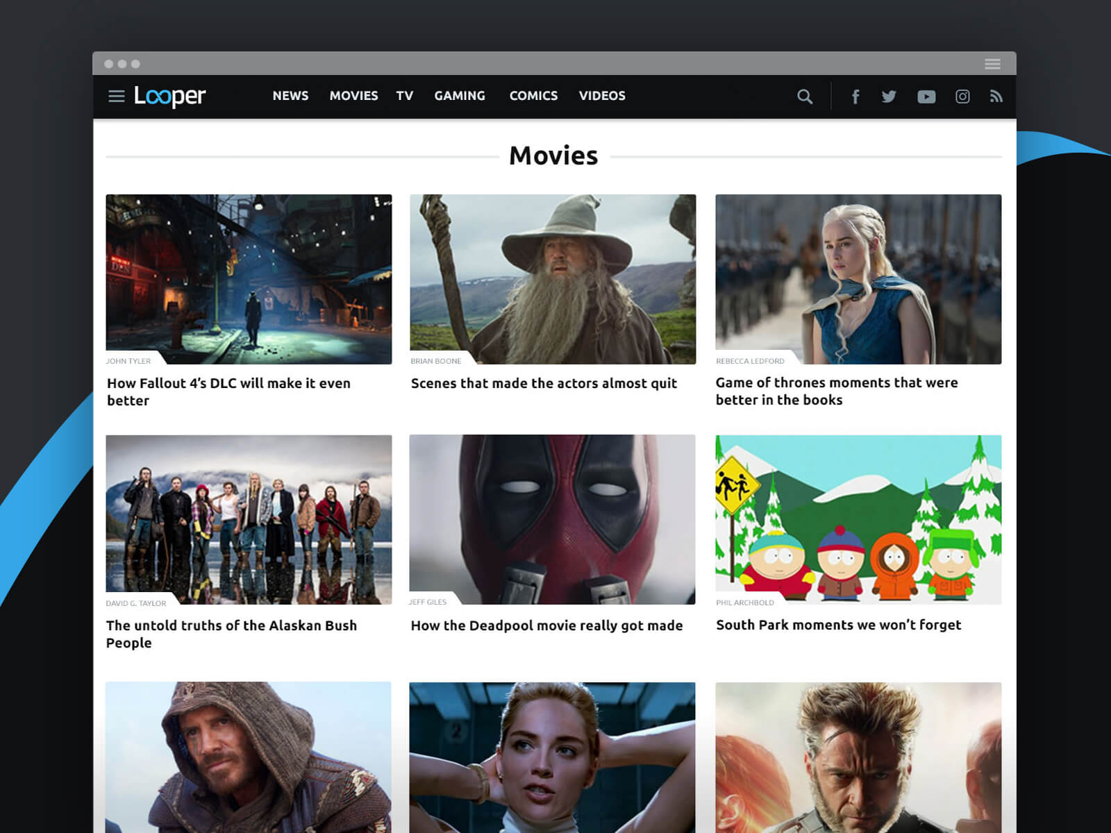
Looper category — desktop
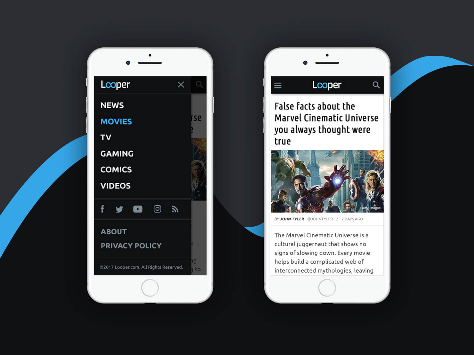
Looper mobile phone
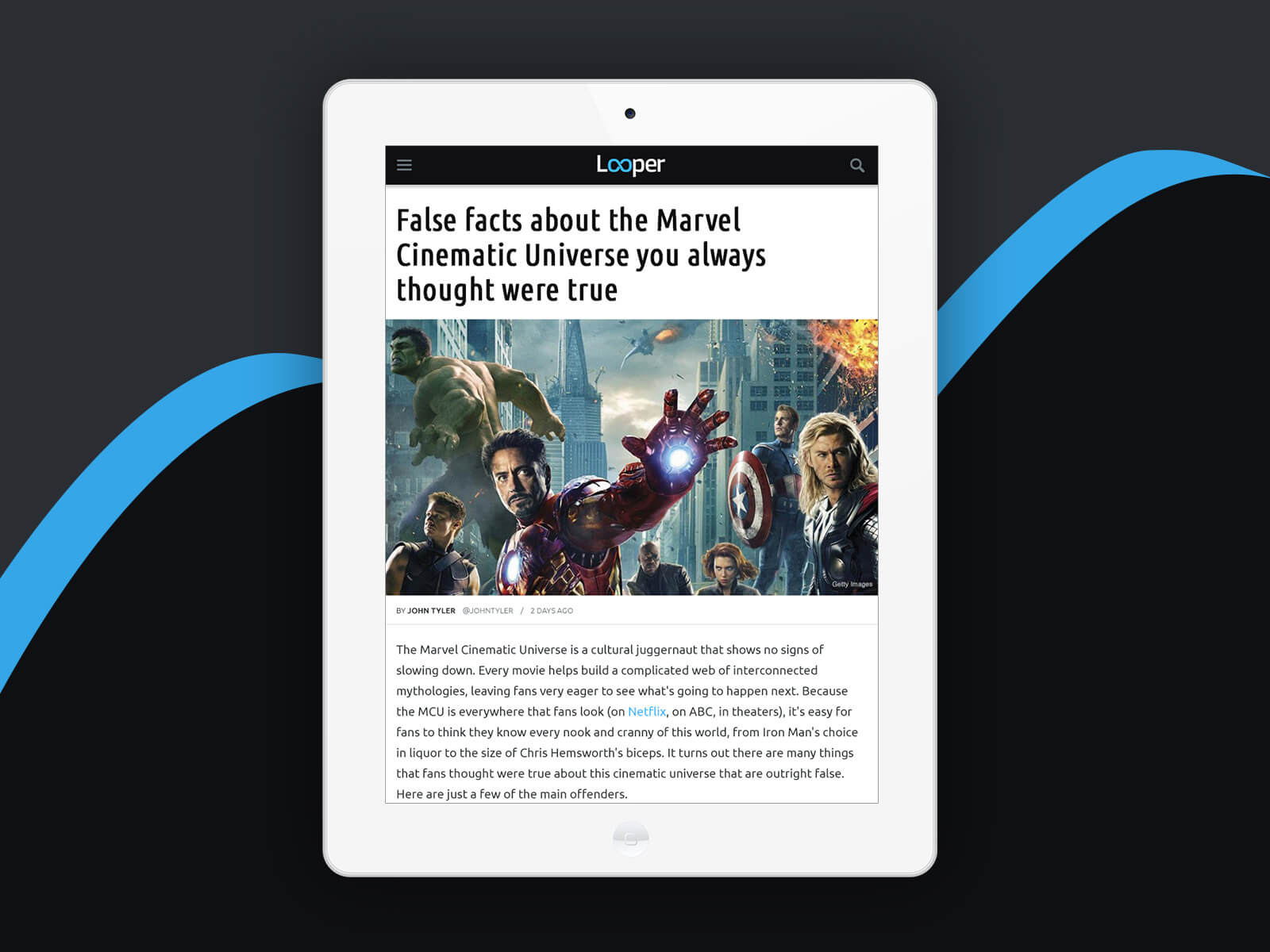
Looper article — tablet
Nicki Swift home — desktop
Nicki Swift article — desktop

Nicki Swift mobile phone
Grunge home — desktop
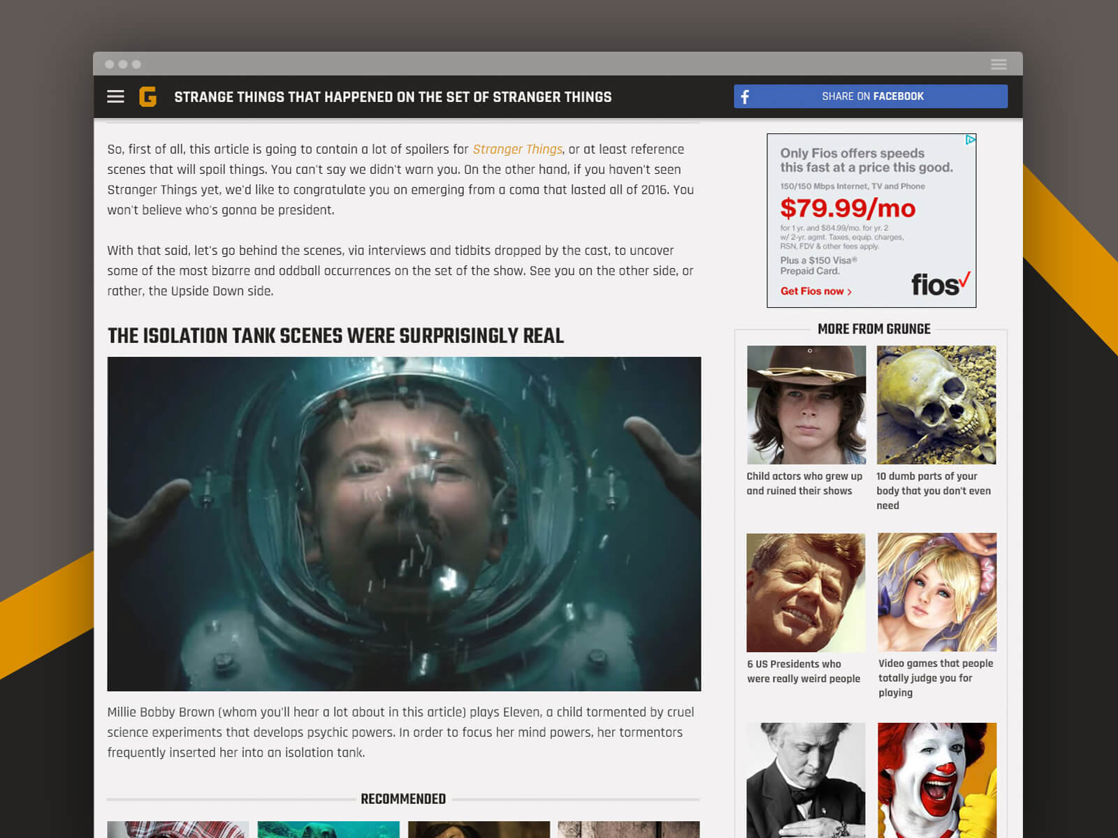
Grunge article scrolled — desktop
Grunge — mobile phone
The List article — desktop
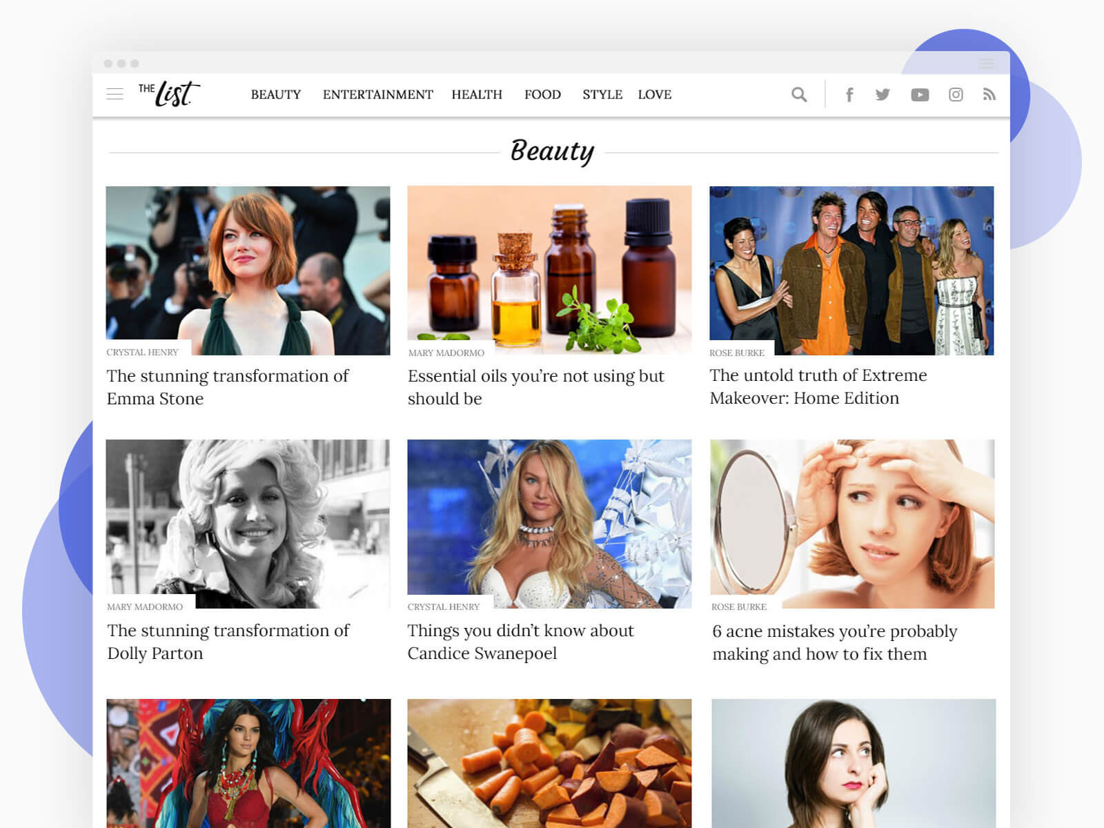
The List category — desktop
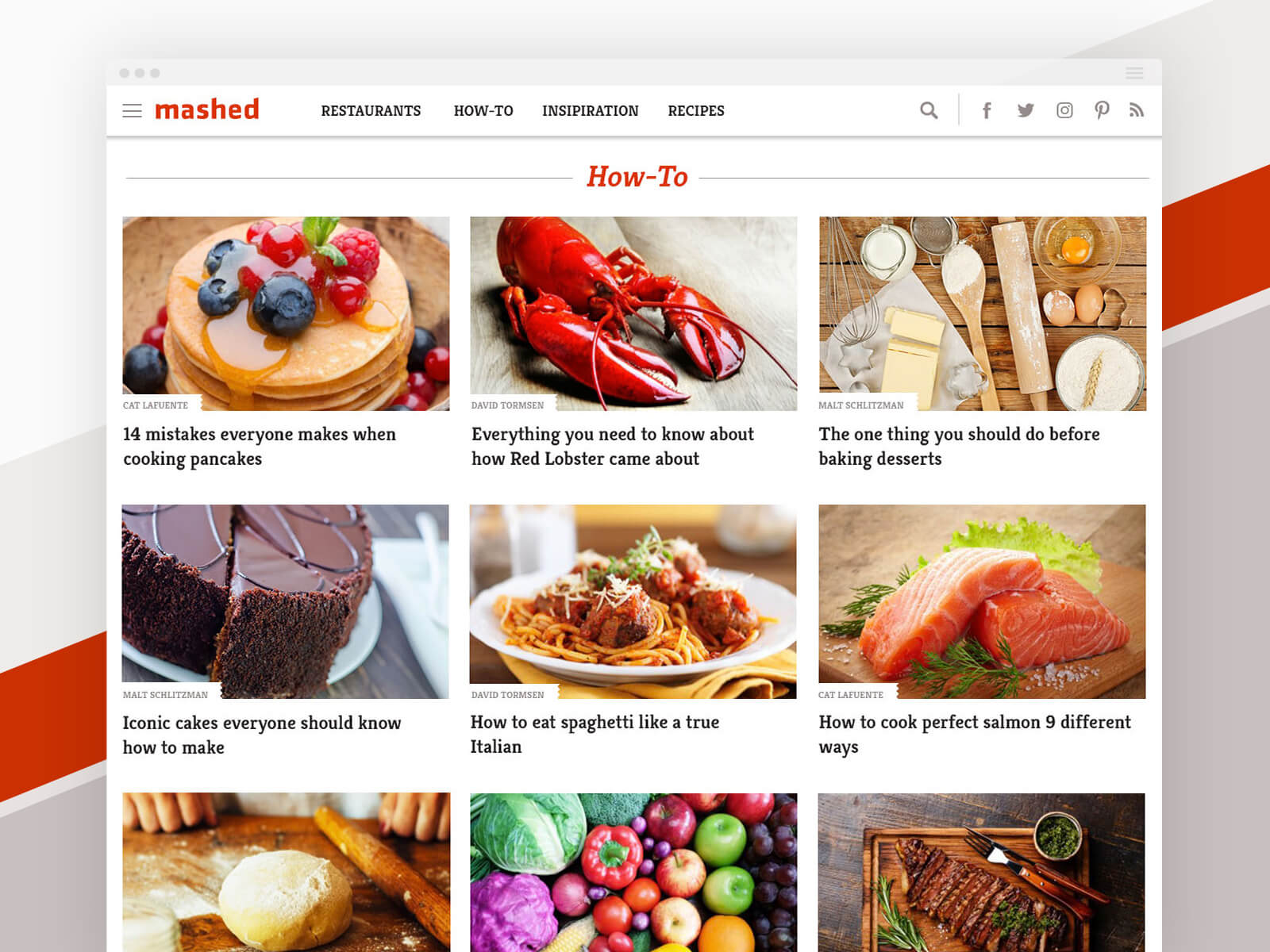
Mashed category — desktop
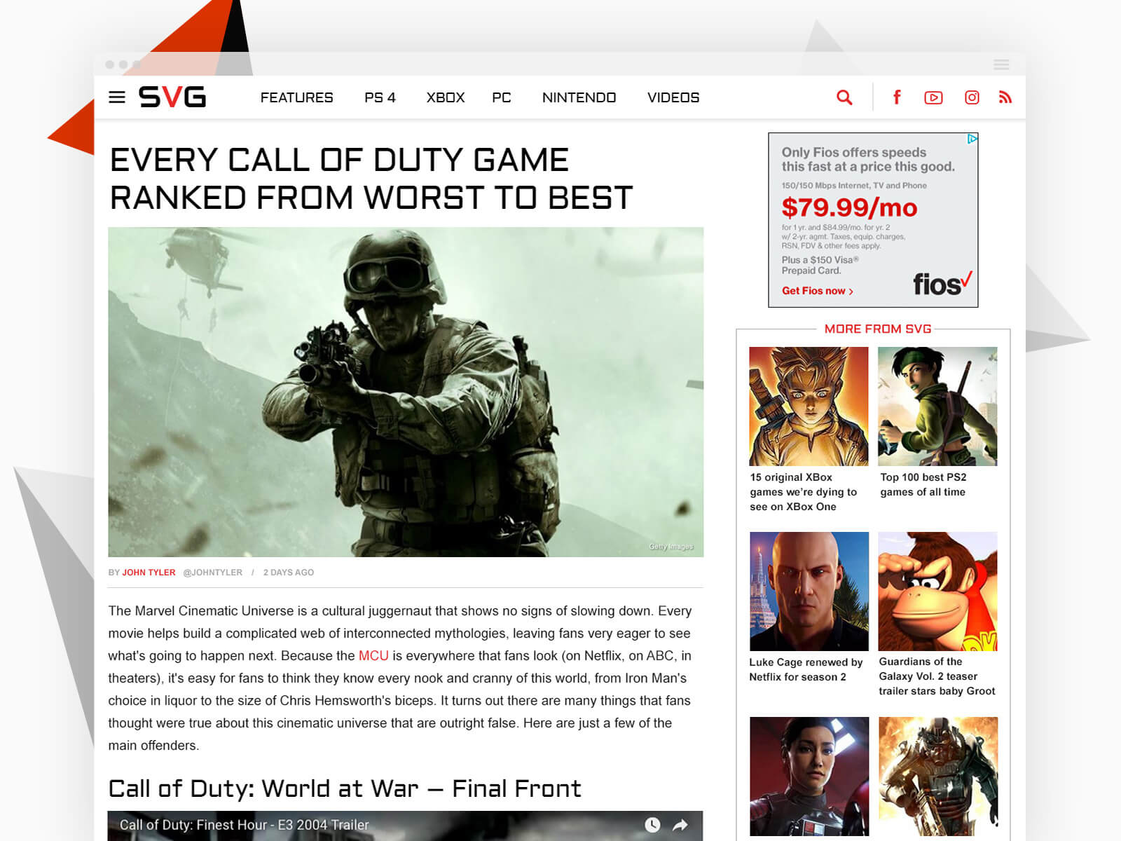
SVG article — desktop
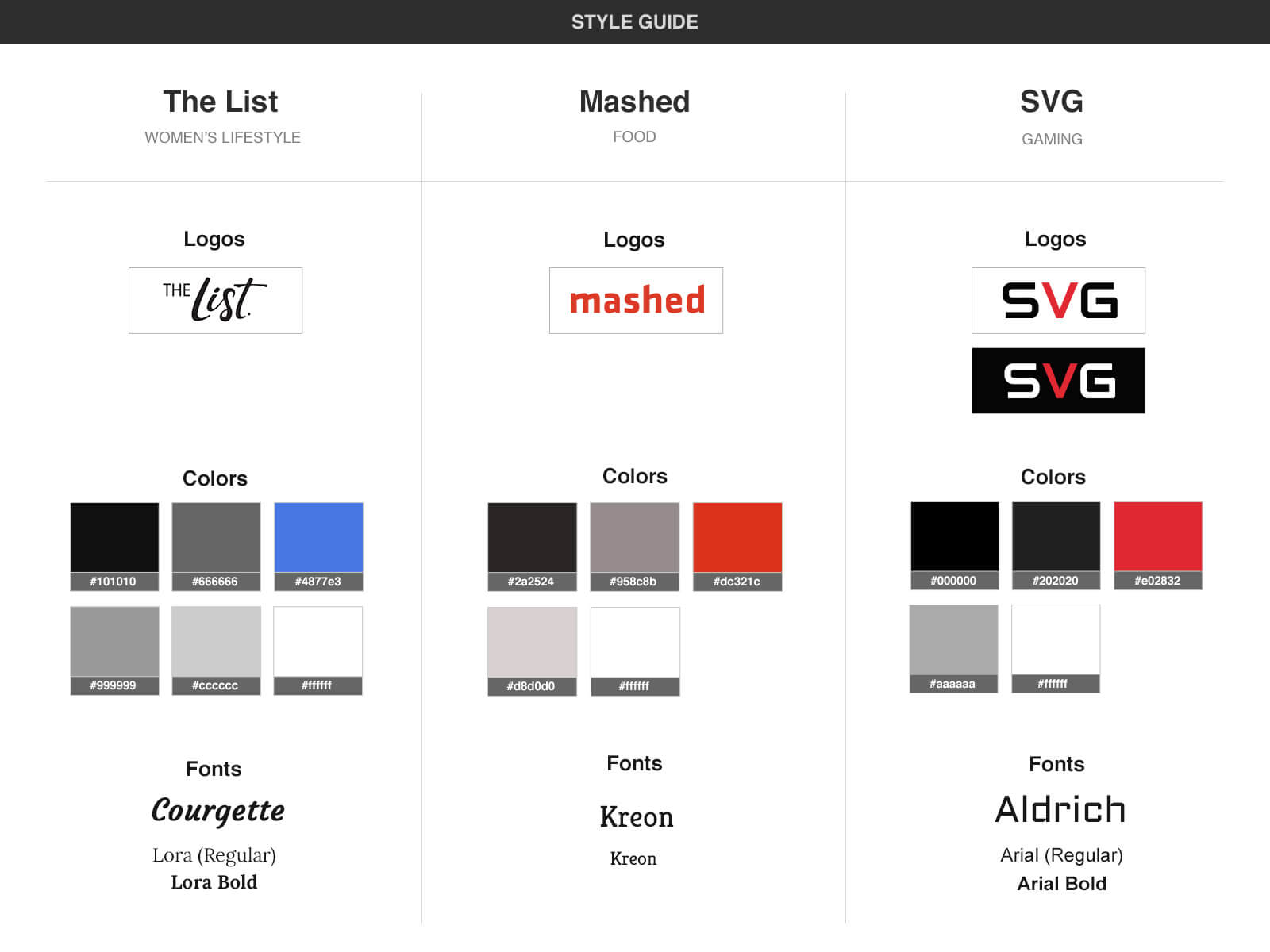
Style Guides & Specs
Once the new set of mockups were approved for development, I wanted to ensure an efficient re-coding and translation process, so I devised a thorough, comprehensive set of spec documents by leveraging the Photoshop Ink plugin. (The plugin allowed me to easily detail exact CSS-compatible values for margins, padding, fonts, colors without checking and typing each value manually).
I created a “base” set of specs for a generic template that would be shared by all of the sites, and then individual sets of specs that would apply to each site alone. This way, the developers could easily separate global styles from site-specific styles which had been an issue for them in Phase I. Below is just a sampling of over the many documents created.
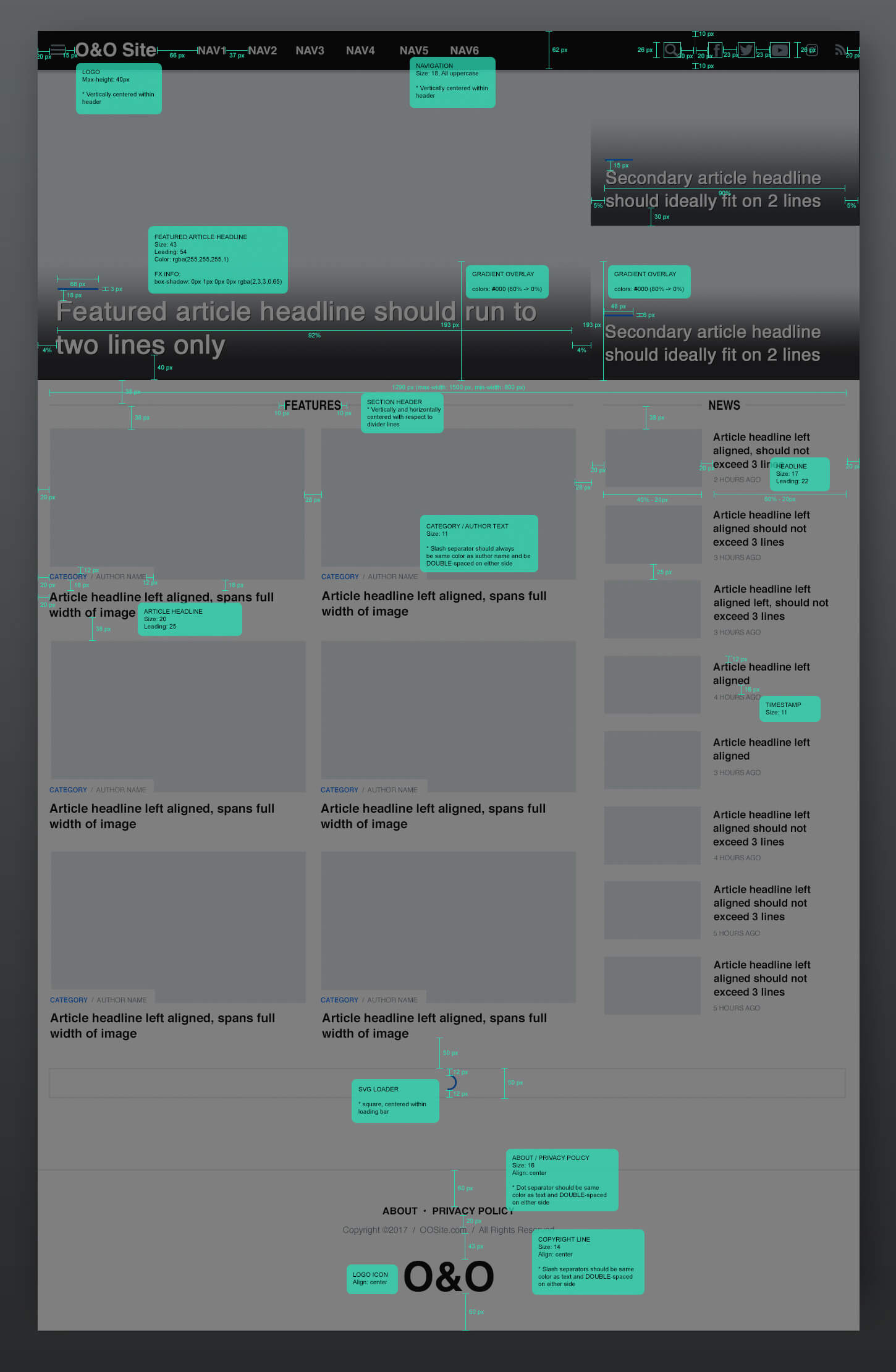
Global template spec document for desktop home pages
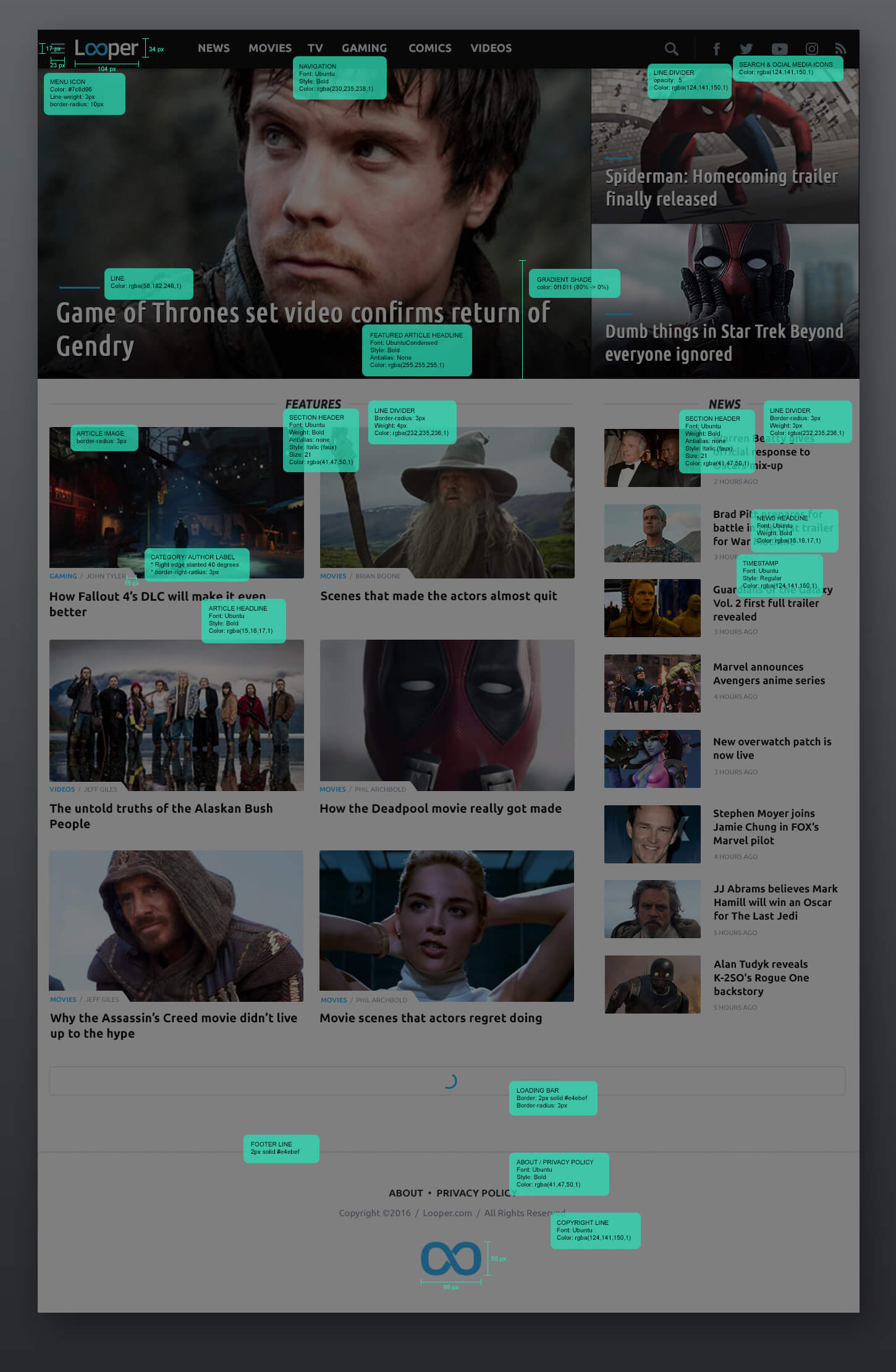
Looper spec document for desktop home page
In addition to the spec documents, I designed a more general set of style guides for the marketing and video teams to maintain brand fidelity.
Outcome
As of this writing, the latest designs have been successfully applied to all 6 sites. The mobile designs have also been ported to Apple News under my guidance. PPV (pages per visitor) and TOS (time on site) showed a notable improvement with the rollout of Phase II.
Live Sites
- Looper (movies & TV): looper.com
- Nicki Swift (celebrity): nickiswift.com
- Grunge (geek culture): grunge.com
- The List (women’s lifestyle): thelist.com
- Mashed (food): mashed.com
- SVG (gaming): svg.com
Retrospective
The final designs, which serve six distinct brands, mark a vast improvement over the originals. The biggest upgrades in my view came from applying and enforcing consistent style and structure rules across each site.
When I began this design process, Photoshop was still my tool of choice for web design, and the one that the development team preferred as well. I found that one of the bigger challenges involved managing all of the design files in Photoshop. Much of my time was spent organizing folders and updating layer comps (something I did a very good job of doing), and I found that getting designs to be translated accurately in the browser required combinations of PSD handoff, rigorous spec creation, in-browser inspections, and active delivery of CSS corrections. By Phase II, the process was greatly improved, with a bigger payoff, as my spec documents helped the developers to create more efficient front-end code and to minimize translation errors. Nonetheless, if I were to start over, I would probably choose to design the project with Sketch and Zeplin, which together make for a better UI workflow and asset management system, and then work to get the development team invested.